How to Choose the Right Color Palette for Your Home
This post may contain affiliate links. For more information, please see our disclosure policy.
With countless decor styles to be inspired from, choosing the right color palette for your home can be overwhelming. Learn how to find the best color scheme for your own home that meets your style and suits your functional needs.
When choosing a color palette for your home, many things come into play. Far more than you probably realize! While the idea of scrolling through Pinterest for hours picking our favorite home decor pictures is tempting, and we all do it (guilty as charged!), choosing the suitable color scheme for your home is not as easy as buying a paint color we like online. We need to consider a few factors of our own homes, lifestyles, and needs first.
![]()
How to Choose the Right Color Palette for Your Home
A huge tip I’ve learned as a home decorator is to get clues from things we already own. Observe the things around your home you love the most. Have a look at magazines and take out any image that sings to you.
Check out your Pinterest’s latest pinned images… can you spot a trend there?
A color you continue to chose? Is there a particular style present in most of your favorite images? Take time to observe and take notes! Try to find a common trend that keeps repeating in your style to scale down your options.
Before we dive into the nitty-gritty of how to choose your home’s colors, let’s get some much-needed inspiration first!
Monochromatic – Earthy Tones
Monochromatic color schemes are a simple yet bold way to make a statement in your home decor. In this boho-chic living room, you can see how every color is a variation of browns and tans. White helps balance everything out, a few pops of green add an extra natural feeling, and the layered textures make this a serene and airy room.
Monochromatic – Shades Of Blue
From light blue to rich and deep blue shades, this library offers a lush and intimate setting to curl up and read your favorite novel.
Analogous – Yellows & Pops of Orange
Analogous – Blue & Green
Complimentary – Yellow & Purple
Complimentary – Blue & Brown
For a masculine yet delicate living room decor, the complementary colors of blue and brown are your best allies. Play with metallic accents to reflect the natural light and add cream carpets or furniture to keep things balanced and airy.
Triadic – Yellow, Blue & Red
With only a couple of details using this triadic color scheme, this room shows how there’s no need to go all out in terms of decor to make a visual impact.
Triadic – Olive Green & Blue
We often see triadic color schemes in kid’s rooms, but this captivating space is proof you can use triadic color schemes to feel and look grown up as long as you play around with the color variations.
In this case, a harmonious color trio of olive green, soft yellow, and blue ties the room together flawlessly.
Color Theory 101 – Color Palettes in Home Decor
Now, let’s get more technical to really nail down the color palette of your dreams!
Knowing the basics of color theory is a total must to get the right feel and create a harmonious space. But, don’t worry. I won’t get into too many details as color theory is a subject all of its own!
Here are some key concepts you need to know about color theory when choosing a color scheme for your home:
When we talk about color, we need to go all the way to the start—the color wheel.
As you probably remember from school days, the color wheel is a system that organizes and shows how colors interact with each other.
We can do so many things with this information, but in terms of creating color palettes using the color wheel, here are some of the best color harmonies you can use to find the right combination for your home.
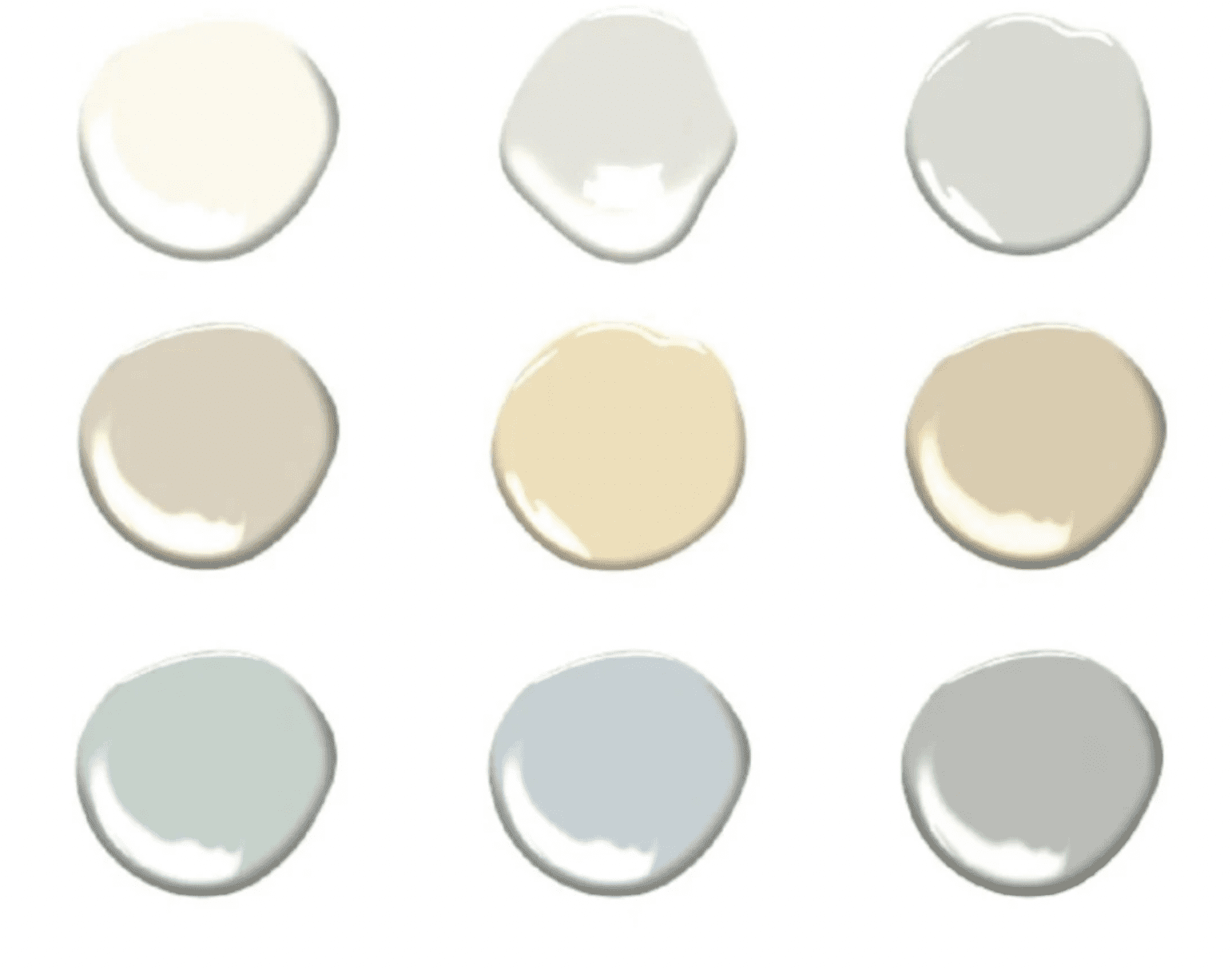
Color in Decor – Hues, Tints & Shades, Explained:
- Hue: A hue is the dominant pigment in any color we see.
- Tint: A tint is a result of mixing a color with white. Tints allow us to give any color more lightness, like pastels.
- Tone: A shade is what we get when we mix a color with grey. The result is often a muted and unsaturated version of the color we add grey to.
- Shade: When you mix any color with black, you get a shade of that color. This color category is great for creating lush and rich colors!
Color Schemes – Color Harmonies:
Monochromatic:
If you thought monochromatic was synonyms of black and white, think again! A monochromatic harmony is a selection of one color in all its different hues.
Analogous:
An analogous color scheme is created when you select three colors next to each other on the color wheel. That color trio falls into the analogous category.
Complimentary:
Complimentary colors are two colors on the opposite side of the color wheel.
Triadic:
We get a tetradic color scheme when we pick (at least) 3 colors in the color wheel that are evenly spaced out from each other.
How to apply these color theory schemes to home decor:
These are some helpful questions I’d recommend to ask yourself before making any decision:
Things to consider and ask yourself when choosing a color scheme for your home:
What mood do you want your space to have?
Try to think about what you want to feel when entering the room.
What type of lighting does space have?
Will you need to use a lot of artificial light or does the space has natural lighting?
What type of space are you working with?
If you’re renovating one room or an entire house, it’s essential to consider the architectural style and work around it.
As you can see, color in interior decor is an essential element to consider when designing a space!
Does your home decor have a specific color scheme? Would you change it? Let me know down below in the comments, I’d love to know!
Great ideas! Would you please share where you bought the electric candelabra lamp that is on the white and glass table in the living room? Thanks!
Thank you! It’s an antique that I purchased at a yard sale about 5 years ago
Nice article Janet! I have a tuxedo color scheme, but am struggling with a third color to add to it. I see a lot of green in accents used with it, and I suppose since black and white are neutral, I can pretty much use anything! But they’re such strong colors – I know pastels don’t work with it, but any other thoughts about choosing an accent color?
Jane
Thank you Jane! Yes, you are fortunate in that you can indeed use almost any color as an accent. Green is making a huge comeback after being somewhat out of vogue for years. Take a look at the way that it’s used in this post – https://shabbyfufu.com/colorful-creative-and-chic-home-tour/
I love all the blues I stick with white all the way tho
I love the white living room with blue accents. I want to copy it as I am redoing my great room. Blue is my favorite color so this will be perfect for me. Where did you get the rug and that piece in front of the fire place? I have a beautiful antique “freeze” but it is not tall enough. RE any of the things in that room for sale in your Amazon store? Love your articles.
Hi Janet,
I have beige on my wall now the and the first floor is an open concept. I would like to change the color, although it works well and I get a lot of feedback for it. I like the grey shade on your wall could you share the hue’s name and brand. Thank you for sharing so many great ideas,
Sorry for the delay Edmee but my wall color is Benjamin Moore White Dove. It’s my favorite tested over time!
Hi Janet. Thank you for this clear and very excellent article.
I need help in choosing a paint and furniture for a living/dining room area and a den.
I want a fresh/airy, inviting, classic environment. Current all of my walls have a light yellow undertone and I feel the rooms look dated.
Lastly, can you advise me on who sells sofas made with solid hardwood, and high rub fabrics?
Warm regards,
Renee
Who makes the blue rug in the triad room of yellow, blue and white? LOVE it! And your blog!!
Carolyn
So glad that you love the blog Carolyn! Unfortunately I don’t have the scoop on that rug, sorry.
So nice of you to respond—thanks for trying!
What is the name of the green color you used in the 9 color samples?
great post Thank you
love the white room I have a cape cod house never will buy one again don’t know what to do with it my other houses had 12 ft ceilings now I have 8 foot and feel boxed in hate this house