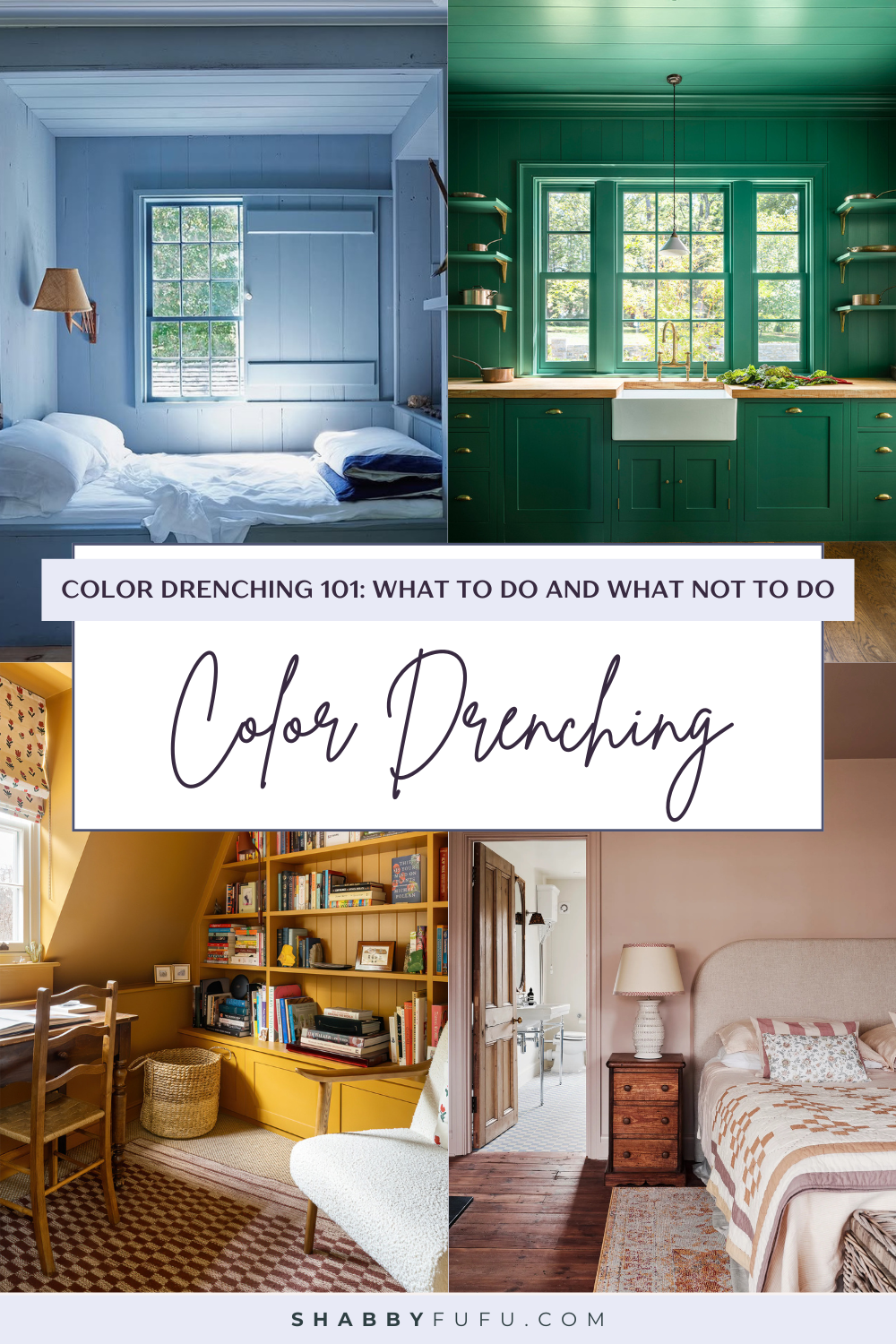
Color Drenching 101: What to Do and What Not to Do
This post may contain affiliate links. For more information, please see our disclosure policy.
Learn what color drenching is all about! Get the scoop on the best rooms to color drench, the dos and don’ts, and so much more. Interest? Read on!

Shying away from colorless aesthetics, 2025 is the year we all are embracing colorful homes. One exciting new trend to try? Color drenching!
Color drenching is a painting trend that isn’t going away anytime soon, and for a few pretty good reasons!
Bold yet surprisingly versatile, color drenching is a technique that’s been around the block for ages but is getting renewed appreciation.
This color trend is quite simple, y’all.
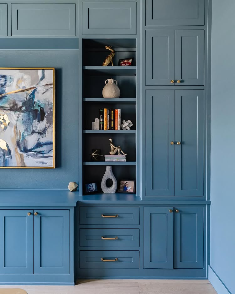
It’s a room where you paint every surface, from the walls to the trims and even the molding, baseboards, built-ins, and ceiling, in the same color.
Whether you’re drawn to a vivid emerald green, a moody midnight blue, a warm terracotta, or a classic cloud gray, the result is a room that packs a serious punch while creating an enveloping feel that can be dramatic and soothing.
If y’all have been playing it safe with white walls and colorful accessories, now is the time to experiment with a little ‐or a lot- of color!
The transformation can be nothing short of magical. Just think about a modest-sized office suddenly feeling like a jewel, with every corner thoughtfully considered rather than just the focal wall.
Color Drenching 101: What to Do and What Not to Do When Bathing Your Home in Color
Y’all might think this sounds intimidating, but I promise that color drenching can work for virtually any aesthetic, from minimalist to maximalist. Throughout this guide, I’ll show y’all what y’all need to know to do color drenching right.
From selecting the perfect shade to avoiding common pitfalls that can make your dreamy monochromatic room fall flat. Ready? Let’s get into it.
How & Why Color Drenching Works
Ever walked into a room and felt instantly calm, energized, or cozy? That’s color psychology at work, y’all!
Monochromatic spaces have a powerful effect on how we feel and interact with our surroundings. When we drench a room in a single hue, our brains process the space as a complete unit rather than a collection of separate elements.
This unified approach creates a sense of cohesion that’s seriously difficult to get in another way. Without the visual interruption of contrasting trim or ceilings, your eyes glide across the space.
Because color drenching erases these harsh transitions, it gives you incredible versatility for any room size or lighting situation:
In smaller rooms with plenty of natural light, enhance that openness by color drenching with light hues that make the space feel airy and expansive.
For small rooms lacking natural light, you have two fantastic options: Go with very light colors that help open up the space, complemented by thoughtfully layered lighting sources.
Or take the opposite approach and fully embrace the intimacy! Choose rich, darker colors to create a deliberately cozy space, then enhance the space with strategic lighting and semi-gloss or satin finishes that beautifully bounce light throughout the room.
It all depends on your specific space and the feeling you want to create!
Choosing the Right Color
This may sound like stating the obvious, but picking the perfect shade for color drenching is where you can make or break your color drenching dreams.
To avoid getting it wrong, I suggest y’all start by looking at your home’s architecture. Is it traditional with lots of molding details? Modern with clean lines? The bones of your home can help guide your color choice!

For 2025, there are some gorgeous trending shades for color drenching designs:
- Earthy terracottas and dusty pinks
- Misty and bright greens
- Mid-tone and overly saturated blues
- Soft mushroom and greiges
- Rich and deep purples
Whatever shade catches your eye, testing is non-negotiable, y’all!
Paint behaves differently depending on your lighting situation, so don’t skip this step. That perfect sage green? It may look just stunning in a north-facing room but turn sickly under south light.
So, grab some sample pots and paint large swatches on different walls in your chosen room. Check them at different times of day and in artificial lighting, too. This extra step can save you from a costly color mishap!
Color Drenching 101: Room-by-Room Guide
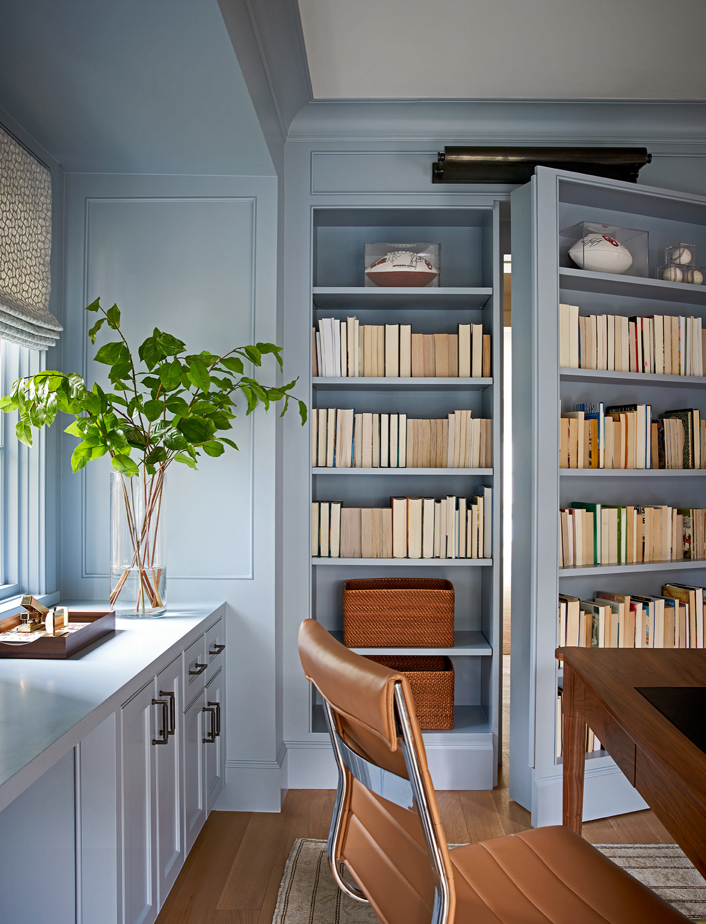
Small Spaces: Perfect for Your Color Drenching Debut
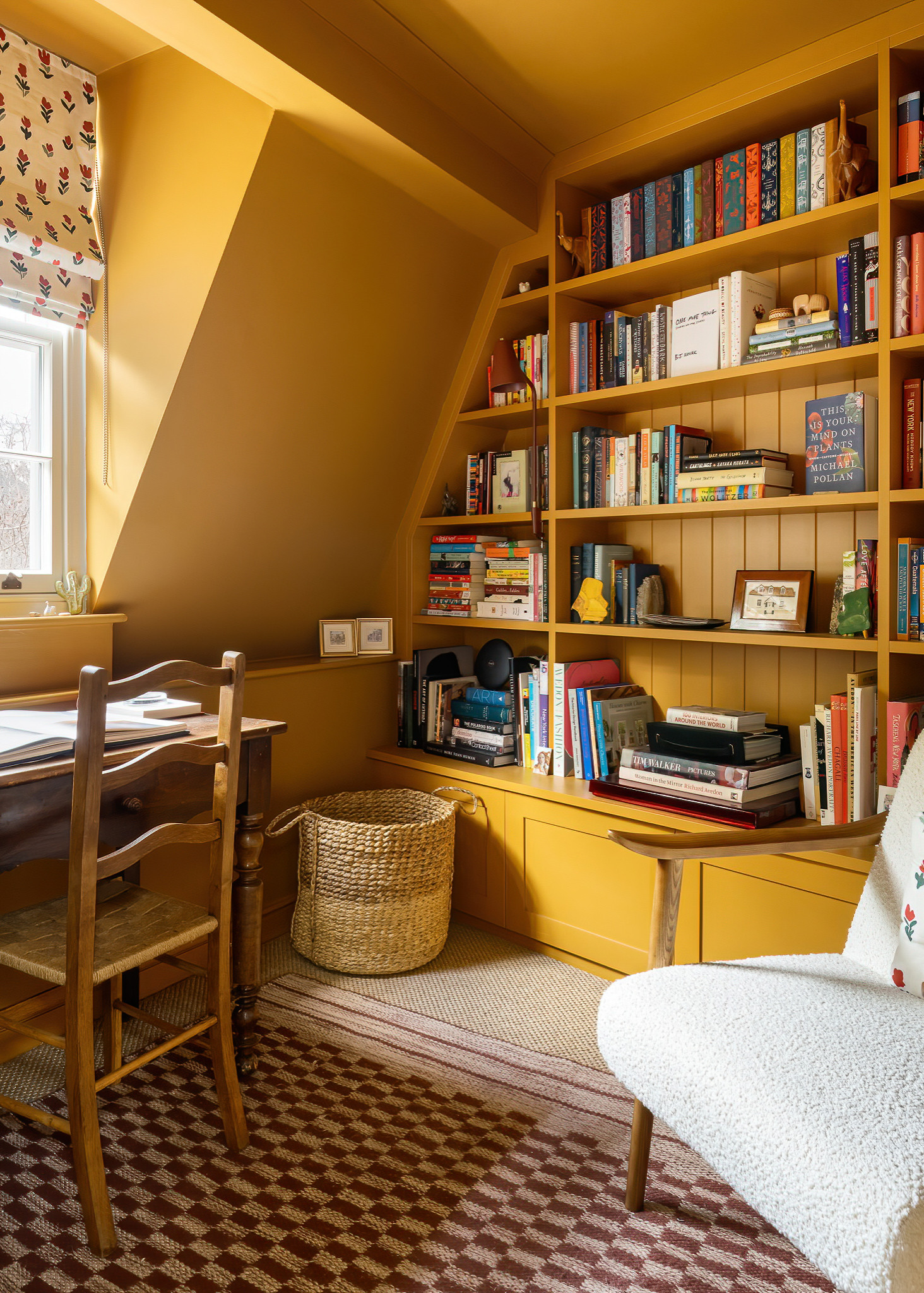
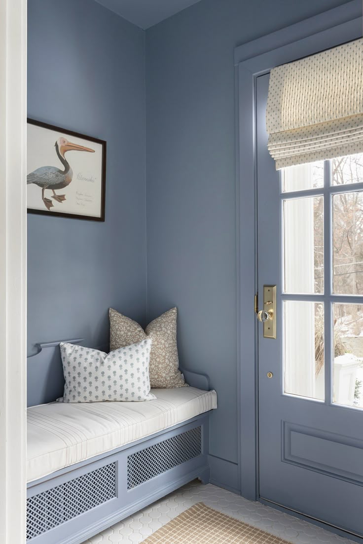
Not quite ready to commit to color drenching your entire home? Small rooms are the perfect playground to experiment with this bold technique! Mudrooms, powder rooms, pantries, home offices, and even enclosed hallways make ideal candidates for your first color drenching adventure.
These smaller spaces let you test the waters without overwhelming your home (or your painting stamina). A color-drenched powder room in a rich emerald or moody plum creates an unexpected color statement that’ll wow your guests. Meanwhile, a drenched study in a soothing sage or navy can transform your little home office space from regular to spectacular.
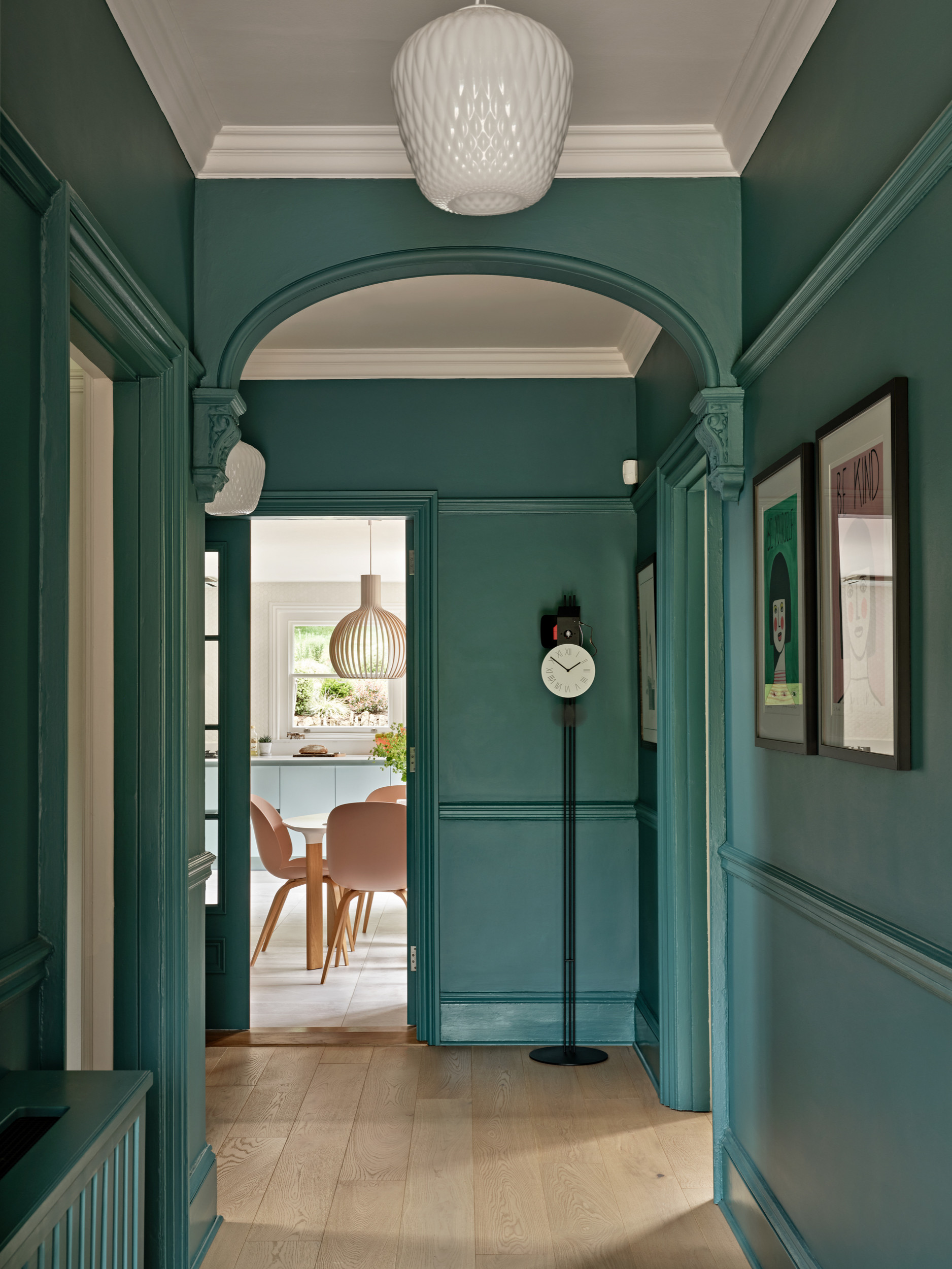
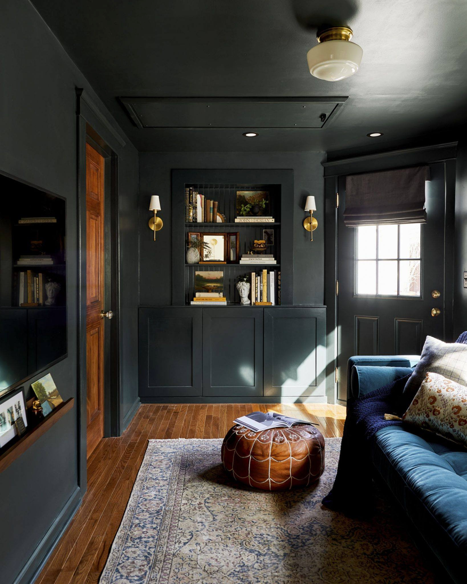
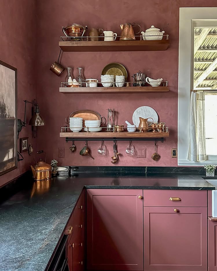
Living Room: Create Cozy & Enveloping Spaces with Color Drenching
Your living room is where y’all unwind, entertain, and spend most of your waking hours at home. Now, this makes it a perfect spot to do some color drenching. It’ll help you cozy up the entire room, making it a more unique enveloping space.
For larger living spaces, y’all better consider deeper tones like chocolate browns, forest greens, or charcoal blues! These richer hues not only look just stunning, but they also help to bring walls inward, grounding large spaces in a cocooning-like effect.
For smaller living rooms, softer tones like dusty rose, pale sage, or warm greiges are wonderful options for a more airy feel that maintains the brightness but adds a little bit more of that intimate factor.
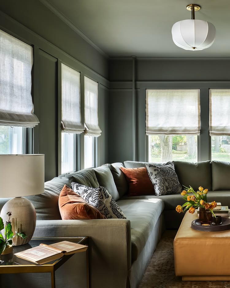
The key to a successful color-drenched living room? Texture, y’all! When working with a single color, varying textures are crucial. Mix velvet pillows with linen curtains, boucle throws with smooth ceramics—all in varying shades of your chosen color for a space that feels layered rather than flat.
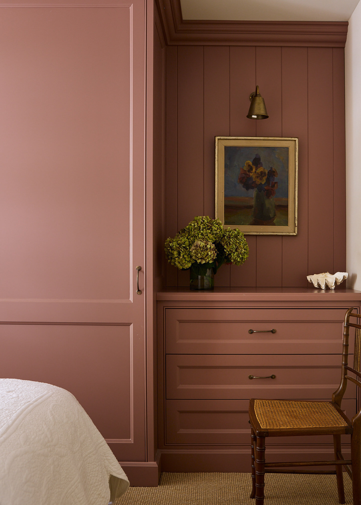
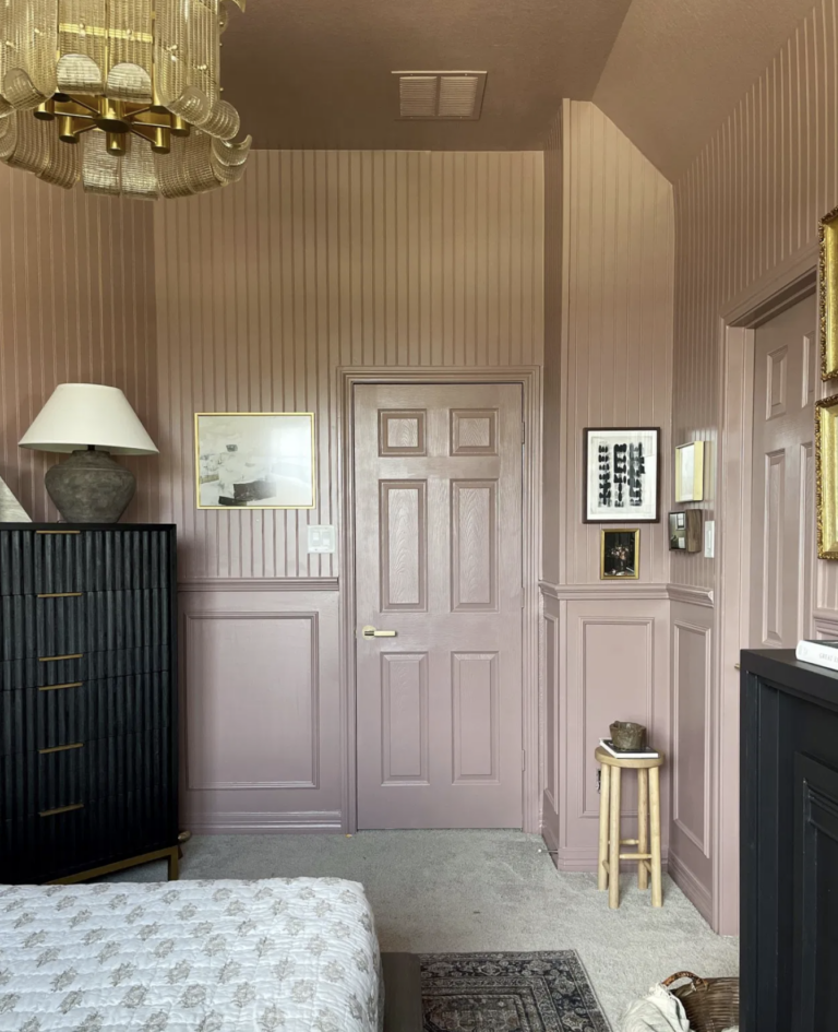
Bedrooms: Crafting Your Dreamy Hideaway
Bedrooms are one of the most personal spaces in our homes, making them ideal candidates for color drenching. To nail color drenching in such an important room, your approach depends entirely on the vibe you’re after.
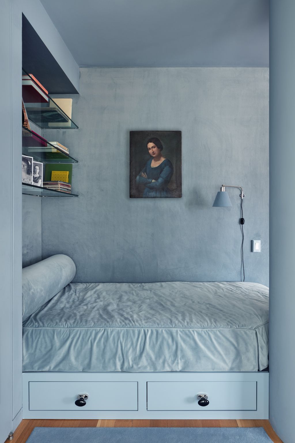
For a restful aesthetic, cool blues and greens are perfect for that serene vibe that invites you to relax and sleep. Taking these colors across every surface—walls, trim, ceiling, and even furniture—will make for a unique space that’s harmonious and serene yet uniquely creative.
Craving something more energizing? Warm, saturated colors like terracotta, golden yellow, or even a dusty pink will give you a bedroom that feels vibrant and alive. These warmer tones are especially lovely in rooms that don’t get much natural light!
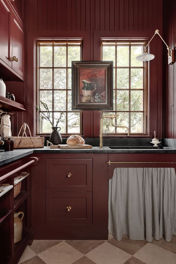
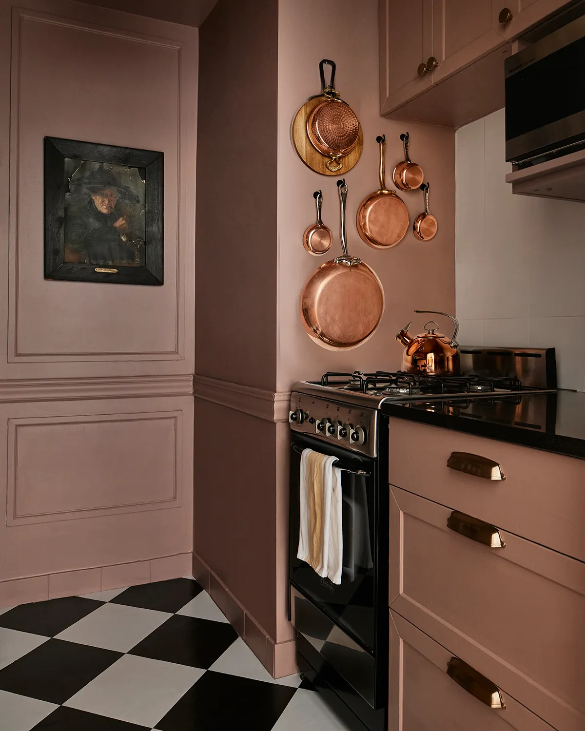
Kitchens: The Unexpected Color Drenching Canvas
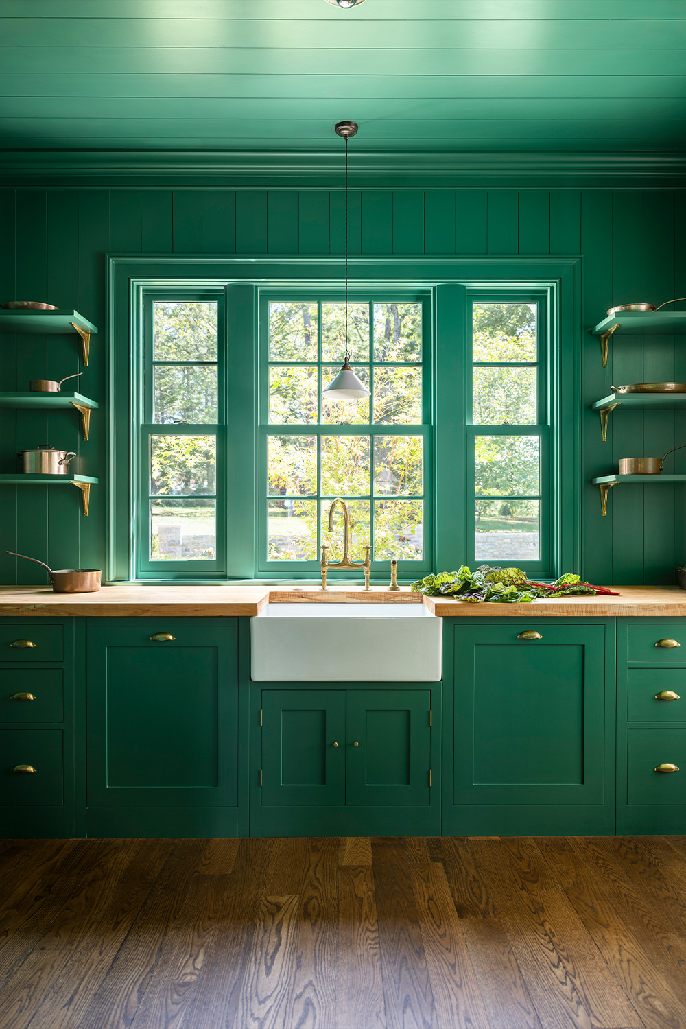
Kitchens make amazing candidates for color drenching, delivering dramatic transformations. Imagine your cabinetry, walls, and ceiling wrapped in a soft olive green instead of predictable colors.That’s color psychology at work, y’all!
Not ready to commit fully? Try drenching just your lower cabinets and walls while keeping the upper cabinets light for a cohesive look without going all-in.
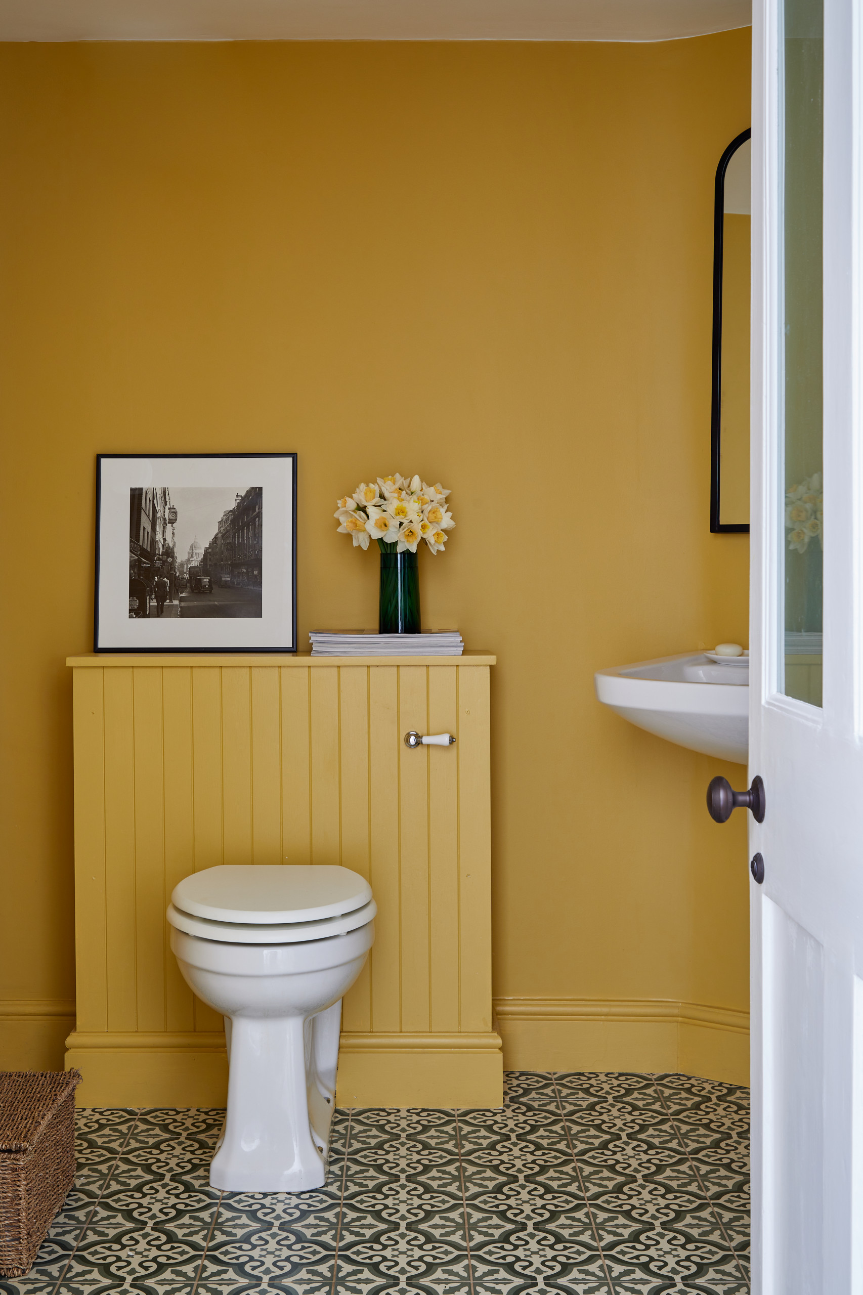
Bathrooms: A Small Space To Make A Big Color Drenching Statement
Bathrooms were made for color drenching! These typically smaller rooms become unforgettable design statements when wrapped in one bold hue.

A sure way to effortlessly elevate your bathroom is to drench it in a rich and unexpected color. Think aubergine, emerald, or even a dramatic dark purple for a powder room that guests won’t stop talking about.
The magic of color drenching in bathrooms is how it unifies all those hard surfaces—tile, porcelain, chrome—into one cohesive design.
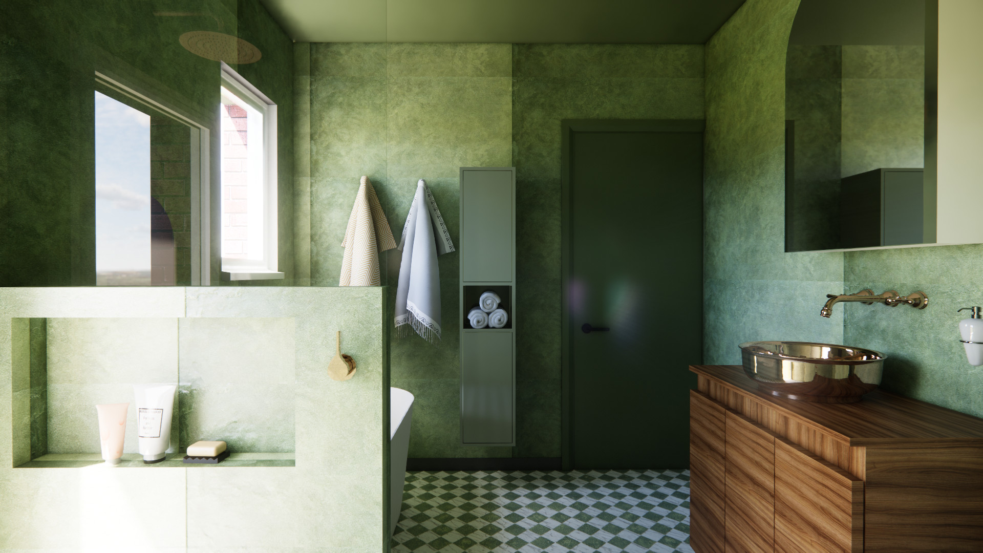
Even the most basic builder-grade bathroom can turn into a pro designer creation when you use this technique correctly.
The Do’s of Color Drenching
Do Vary Textures Within Your Color Palette
When you’re using a single color, using texture right will add a designer finish to your color drenching room.
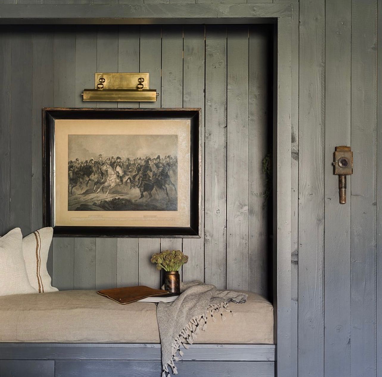
To do it right, mix matte and glossy finishes for a subtle contrast that adds depth without breaking your color story (more on that below!). Then, pair your color drenching background with velvet pillows against linen upholstery or glossy ceramics atop a nubby wool rug—all in your chosen hue.
Incorporate natural materials like wood, rattan, or stone to add warmth and prevent your space from feeling flat. Even in a completely blue room, a wooden coffee table or woven basket adds that necessary texture break.
Do Play With Paint Finishes
Your paint finishes are the real game-changers in color drenching! Varying the sheen creates a subtle dimension that catches light differently throughout the day.
Try a velvety matte finish on walls for a rich look that hides imperfections. Then, punch up architectural details with satin or semi-gloss in the same color. Baseboards, crown molding, and window frames in a higher sheen will catch light and create definition.
For the truly bold, consider a high-gloss ceiling! This unexpected finish reflects light beautifully and adds a bit of extra height to your space.
Don’t overlook specialty finishes like limewash or chalk paint, which add beautiful texture and movement that keeps large expanses of color from feeling flat.
Do Consider Using Different Shades of the Same Color
Color drenching doesn’t limit you to one exact paint hue! Creating a tonal palette with varying shades adds richness and dimension. Try going 20% lighter on your ceiling or 10% darker on built-ins and architectural features.
This subtle variation maintains the cohesive and wrapped feel while highlighting architectural details without interrupting the flow.
Do Anchor With Neutrals Where Needed
Even the most committed color enthusiast needs moments of visual rest. So, you’ll need to add a couple of strategic neutral elements to give the eye a place to land. Think natural wood floors, a creamy marble countertop, a simple bedding arrangement, or linen curtains in a complementary neutral color.
These thoughtful breaks prevent the color from becoming overwhelming while actually making your chosen hue pop even more.
Do Embrace Ceiling and Trim Opportunities
The ceiling is your fifth wall—don’t ignore it! Taking your color across it will bring that enveloping feeling that makes color drenching so special. For the brave, try going a shade darker on the ceiling for a truly cocooning effect.
The Don’ts of Color Drenching
Don’t Choose a Color You’ll Quickly Tire Of
That electric lime green might look amazing on Pinterest, but could you live with it every day? When color drenching, you’re committing to seeing a lot of one color, so make sure it’s one you absolutely love.
Classic colors with some gray or brown undertones have more longevity than super trendy or brighter options. If you’re color commitment-phobic, start with a sophisticated neutral like a warm greige or soft sage.
Don’t Forget About Lighting
Lighting can make or break your color drenching project! Consider both the direction your room faces (north-facing rooms get cooler light, while south-facing spaces are warmer) and your artificial lighting plan.
Don’t Skip the Testing Phase
This might be the most important “don’t” of all time, folks! Never commit to a color drenching project without testing your paint extensively first. Those tiny paint chips from the hardware store aren’t enough, y’all.
Paint large swatches on multiple walls and live with them for a few days. Check your color in morning light, afternoon sun, and evening lamplight before making the last call. This extra step can save you from an expensive mistake!
Don’t Feel Obligated to Drench Every Single Element
While color drenching involves painting many surfaces the same color, some elements actually stand out beautifully against your drenched backdrop.
Art with complementary colors, a statement light fixture, or a vintage furniture piece with too much character to paint over—these can all remain as beautiful contrasting elements.
Color drenching is about creating a mood and an experience, not following strict rules. Whether you like the idea of a fully immersive color experience or are looking for an excuse to try out a moody color palette, y’all can adapt this technique to suit your personal style!
Are y’all ready to try color drenching in your home? Whether you’re going bold or keeping it subtle, this trend is all about creating a space that feels intentional and cohesive. Let me know in the comments—would you go all-in with one color? And if you do, tag me on Instagram @shabbyfufu so I can see your beautiful transformations!
Want more home decor and interior design tips and ideas? I’m sure you’ll love these decor guides. Have a look!
The 90s Are Back! How to Bring The 90s Decor Revival Trend Into Your Home
Textured Wall Treatments: How to Elevate Your Walls With Limewash, Plaster, and More
The Art of Decorating: How Statement Pieces Transform Your Home