Lee Boulevard Home Tour – A Historic Home Renovation
This post may contain affiliate links. For more information, please see our disclosure policy.
Welcome back to the blog, friends! Today’s home tour is such a good one, so better grab your coffee and get cozy, because we’re stepping inside a historic home renovation on Lee Boulevard that I have been dying to share with y’all.
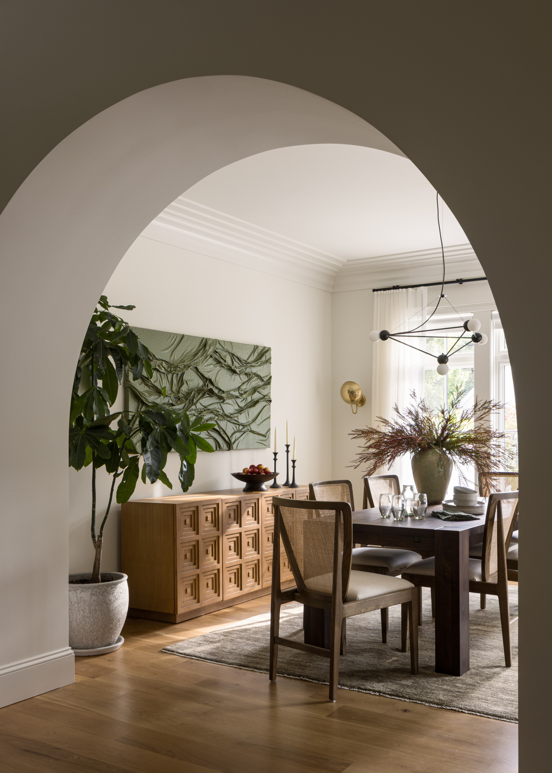
This home tour has that quiet, collected, this-house-has-always-looked-this-way feeling that takes so much elegance to pull off. It’s an elevated look that calls for a lot of restraint, which is something much harder to get right than we all give it credit for.
Piling on more pattern, more finishes, more of everything, isn’t exactly easy, but it has a stronger emotional pull for most of us. The change is immediate and dramatic, and that alone is tempting.
Instead, restraint when decorating a historic home takes a bit more time, more pondering, more patience, and far more editing. And this home? Well, this home is just what a restrained approach looks like.
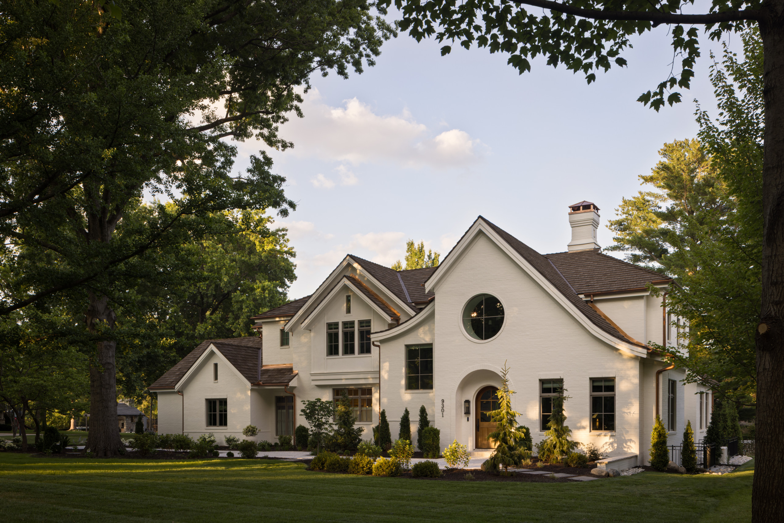
Here, the interior design leans into repetition and proportion, so much so that it turns into one running thread across the whole home.
It’s easy to spot once you catch it: the same warm white oak running through the floors, the beams, the doors, even tucked into cabinetry details, so your eye never gets tripped up moving from room to room.
The moody colors, like the navy built-ins, the olive green hues, the stone fireplace surround, stay grounded down low, while the walls and ceilings stay soft and light above, giving every space room to breathe.
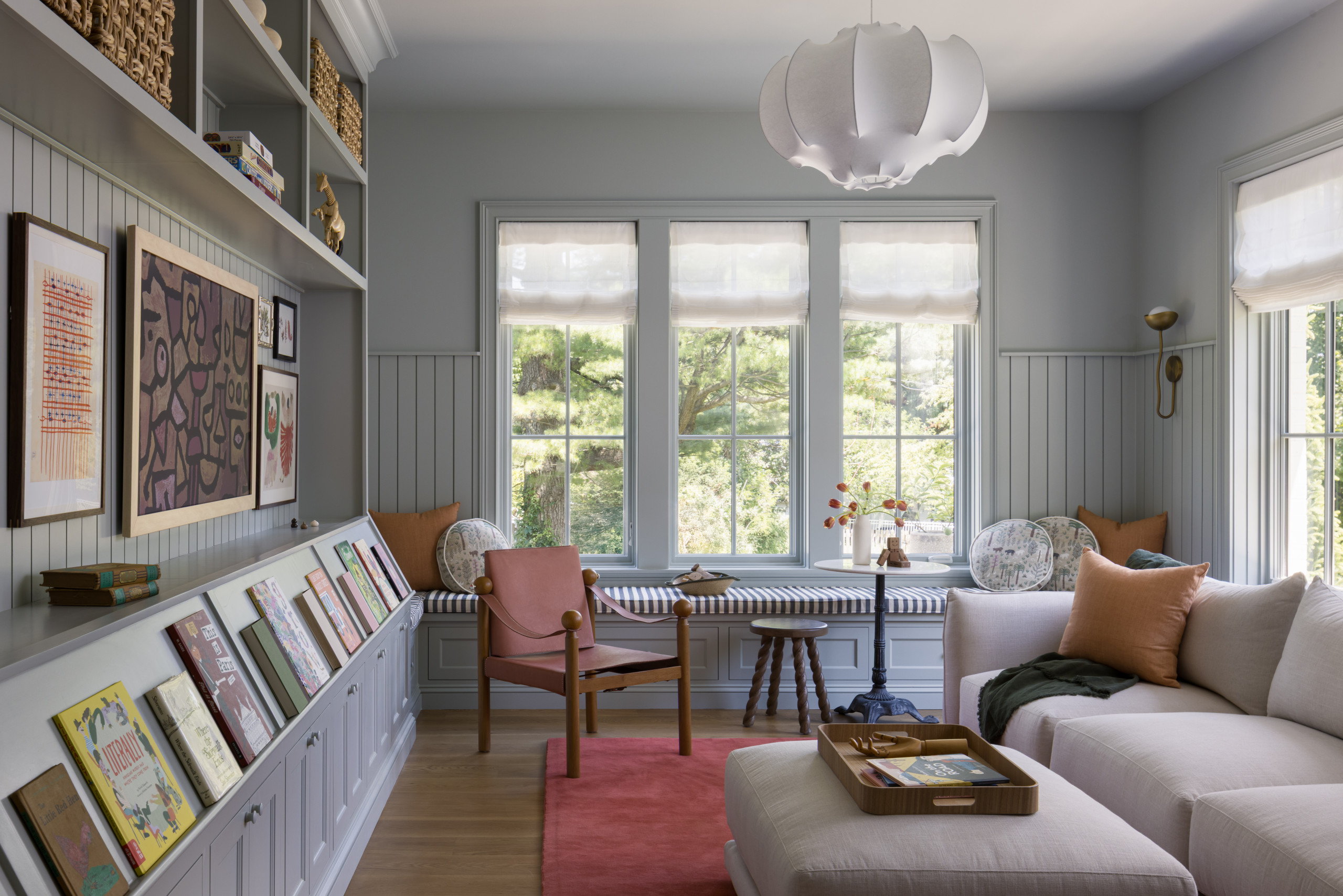
And instead of overly carved millwork, the architecture does the talking, through panel proportions, casing thickness, beam dimensions, and gorgeous arched doorways.
Lee Boulevard Home Tour – A Historic Home Renovation
So if you’ve ever wondered how to bring a big historic home back to life, or how to use just a handful of materials to create a home that feels endlessly elevated, y’all are going to love this home tour!
Go grab a drink and let’s walk through it, shall we?
A Historic Home Renovation Home Tour – An Elevated Entry
Let’s start right where every good story should…at the front door!
Y’all know I’m a sucker for a great entry, and this historic home renovation home tour has one that’s a perfect example of what I mean when I say the best renovations don’t fight the bones of a house, they honor them.
A pretty archway welcomes us followed by an arched front door, making it clear from the start that architecture is leading the way, and the styling simply steps back to let it.
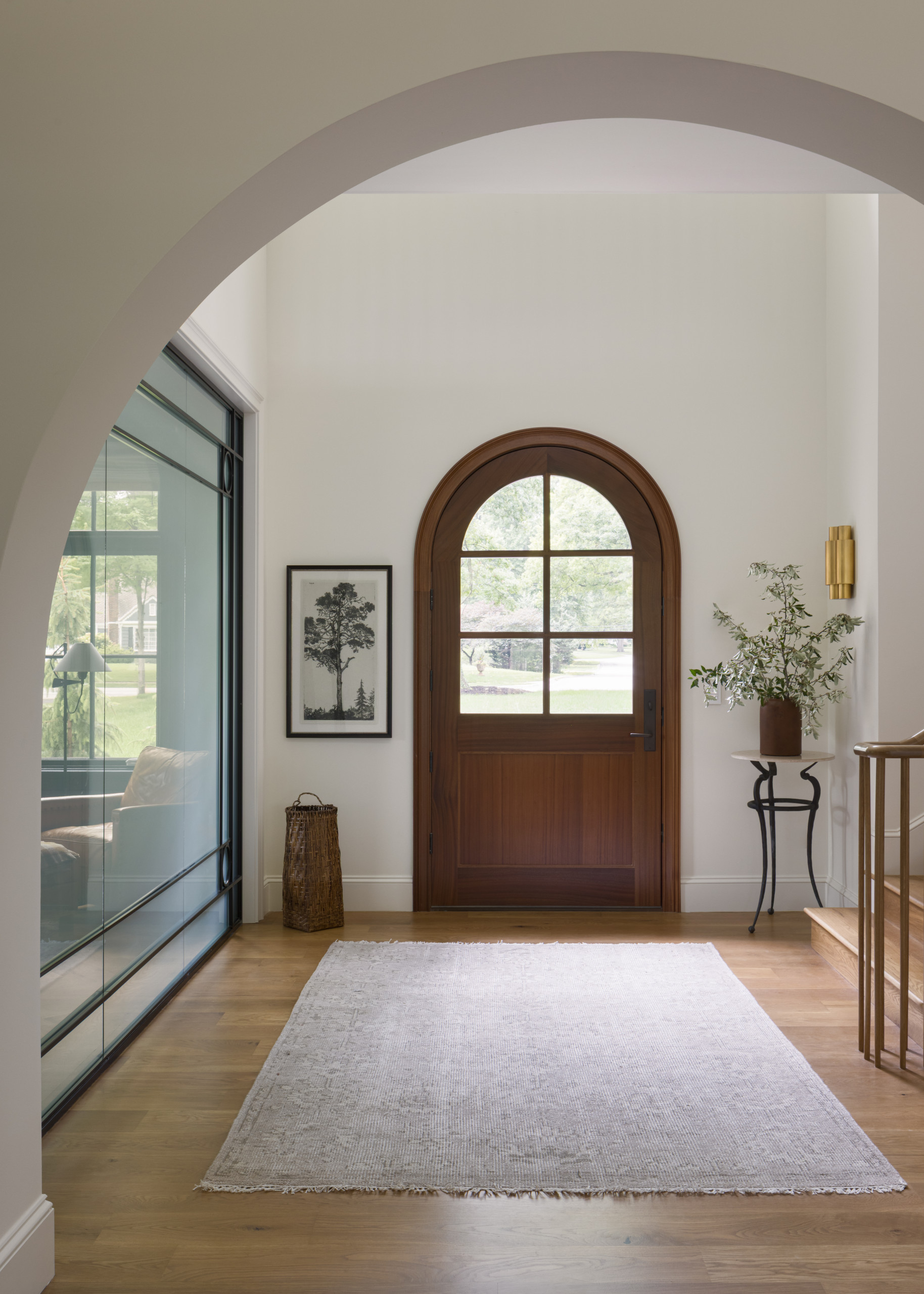
The floors are that same warm white oak we’ll see again and again, laid in wide planks. And look how little action the background is getting.
A simple black-and-white botanical print, a woven basket, an iron accent table with a little greenery. The decor is simple but elevated.
The Living Room
Step through that next arch and you land in the living room.
With a vaulted, wood-clad ceiling featuring exposed beams, this space has such a pretty character.
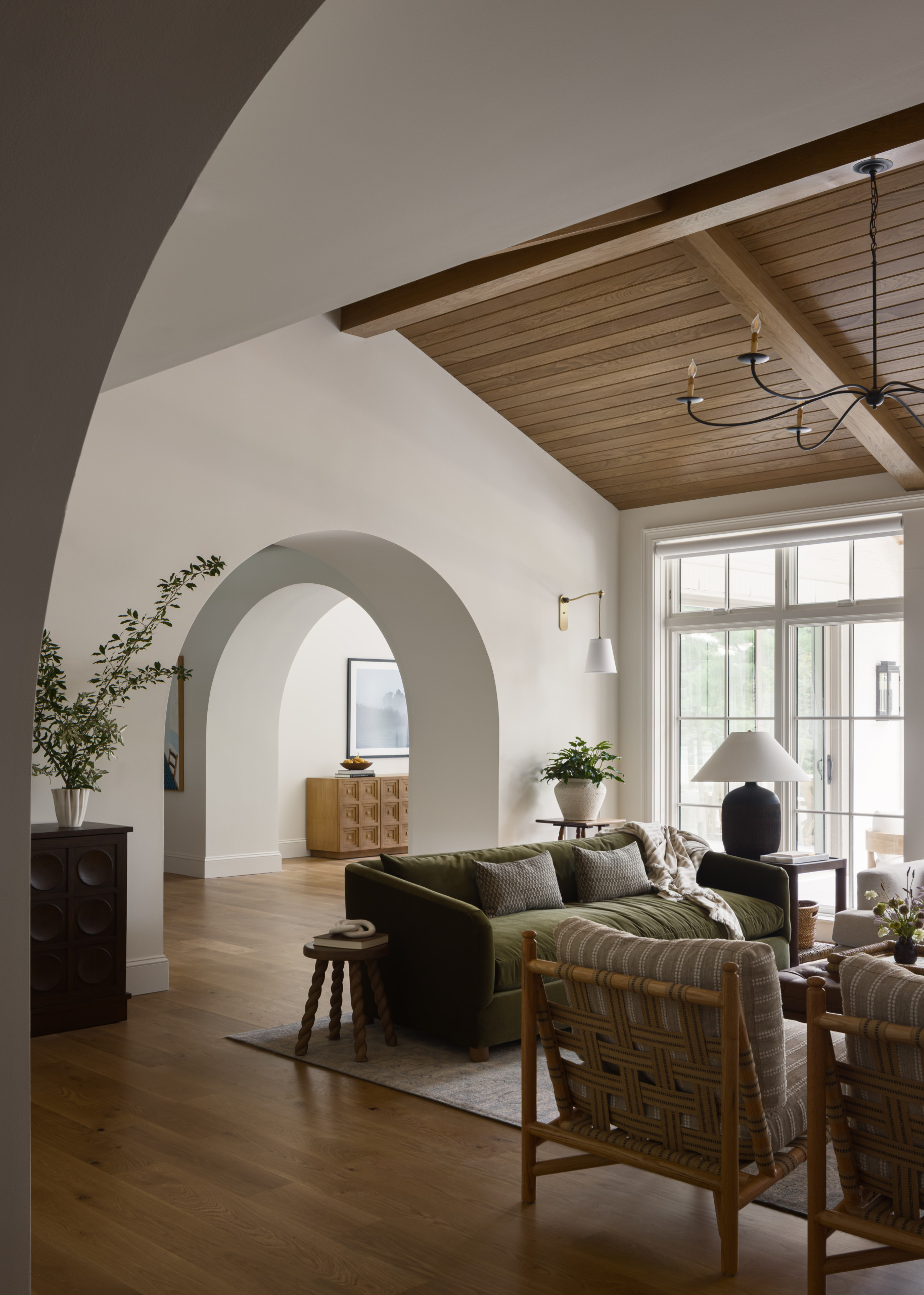
I really enjoy the arrangement design here. Everything is placed to look up.
The furniture is intentionally kept low and streamlined, so your eye travels past the seating and straight up into those beams. Even the fireplace, in honed, matte stone, keeps its cool instead of turning shiny and showy.
Take notice too, of how the built-ins flanking the fireplace are simple, flat-panel. There’s no carved trim in sight. While a simple detail, it shows restraint to keep visual hierarchy.
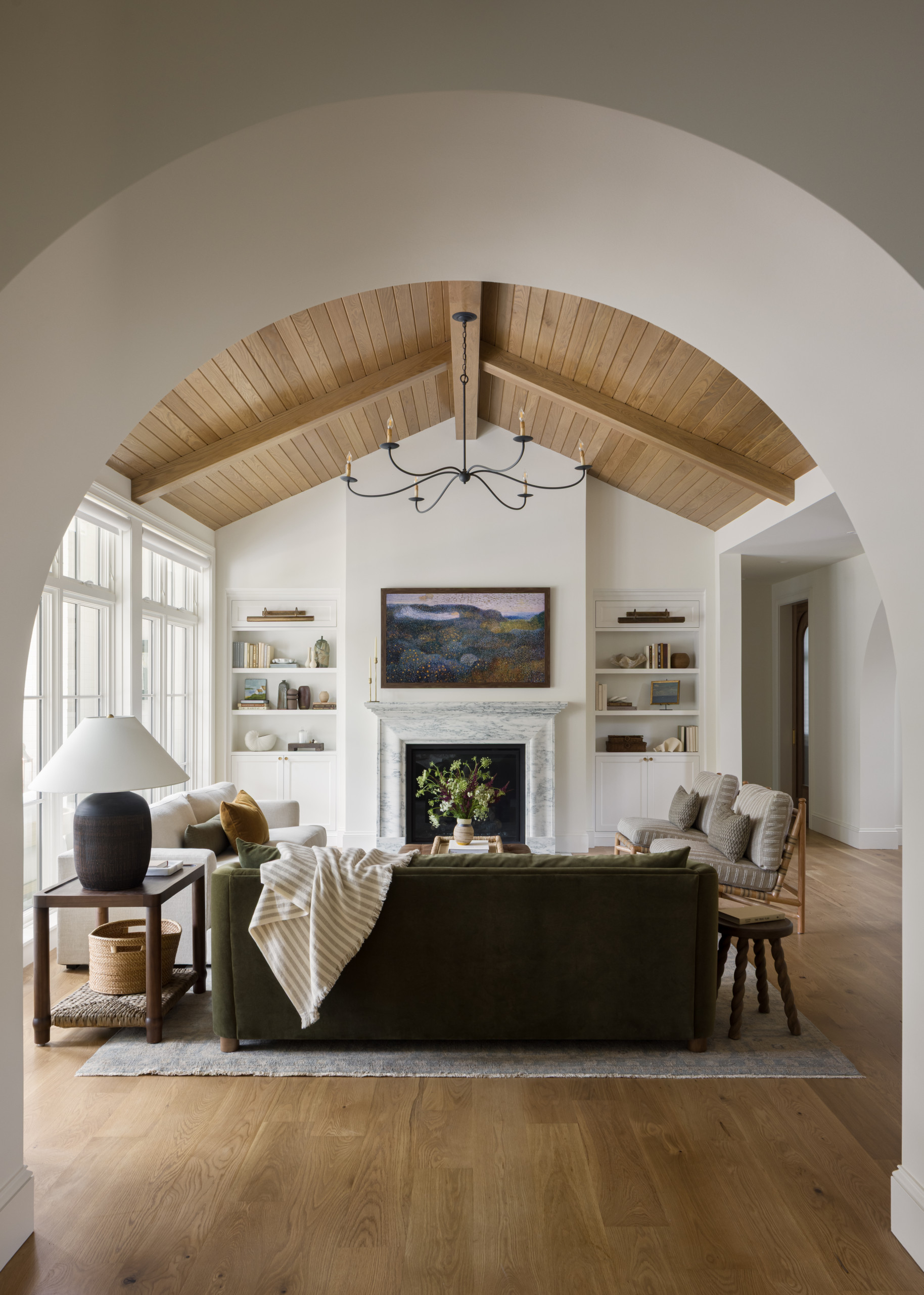
The room already has a vaulted ceiling and an arched entry doing the heavy lifting, so the cabinetry doesn’t need to compete for attention.
So, before you add another layer of trim or a bolder finish, ask what your home’s original architecture is already doing for you. Sometimes the most elevated move is simply to build everything else — decor, layout, even furniture placement — around what’s already there, and let it shine.
The Kitchen
Walk through one more arch and you land in the kitchen, and it’s a good one, y’all!
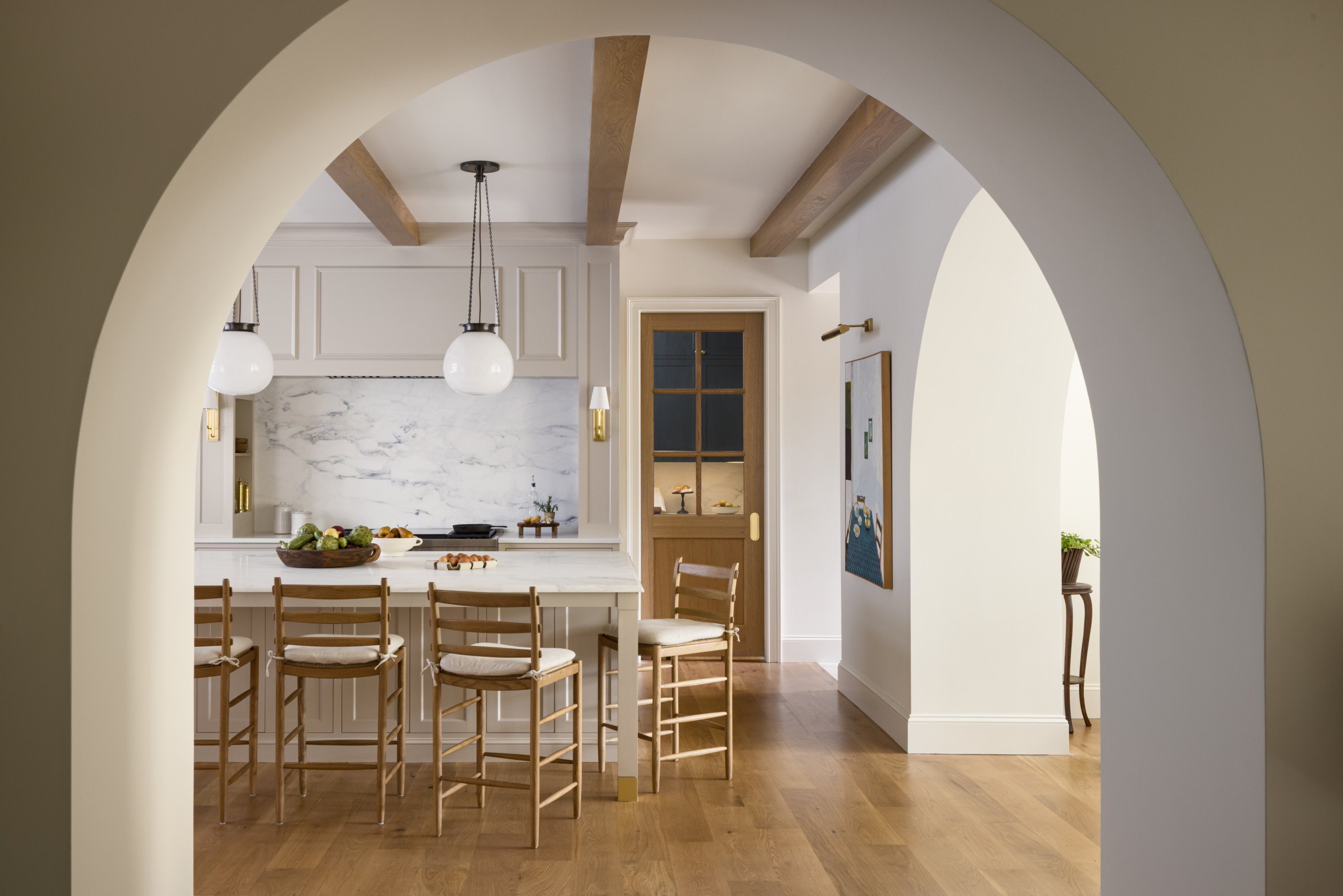
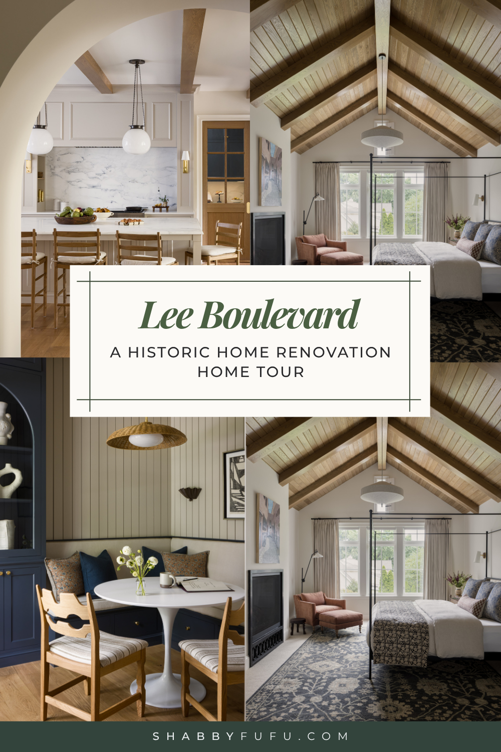
The cabinetry is a soft, creamy neutral with simple beadboard-style panel doors, nothing raised or heavily detailed, which leaves plenty of room for that honed marble backsplash and countertop to do the talking.
It’s beautifully veined, but matte, so it still fits right in with everything else we’ve seen.
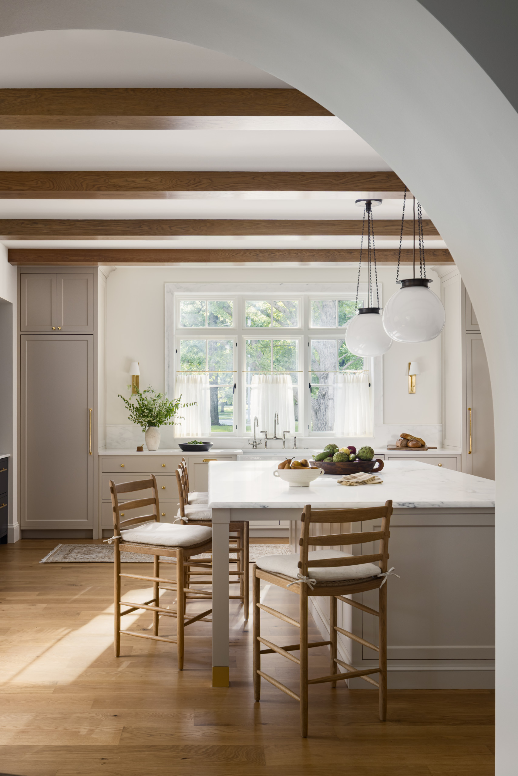
Even the barstools keep things consistent, natural wood, simple ladder-back style, nothing that pulls focus.
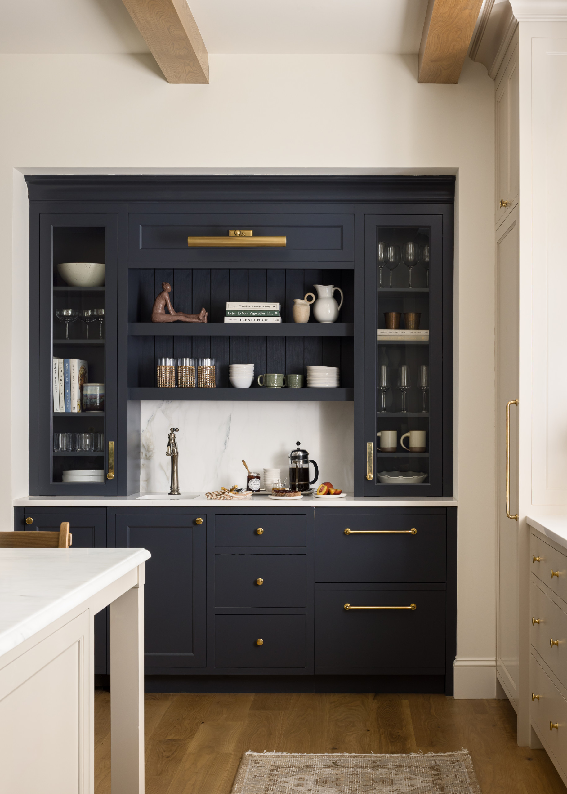
And past the island, there’s a little arched doorway with a paned glass door leading into what I’m guessing is a butler’s pantry, tucked in just as quietly as everything else in this house.
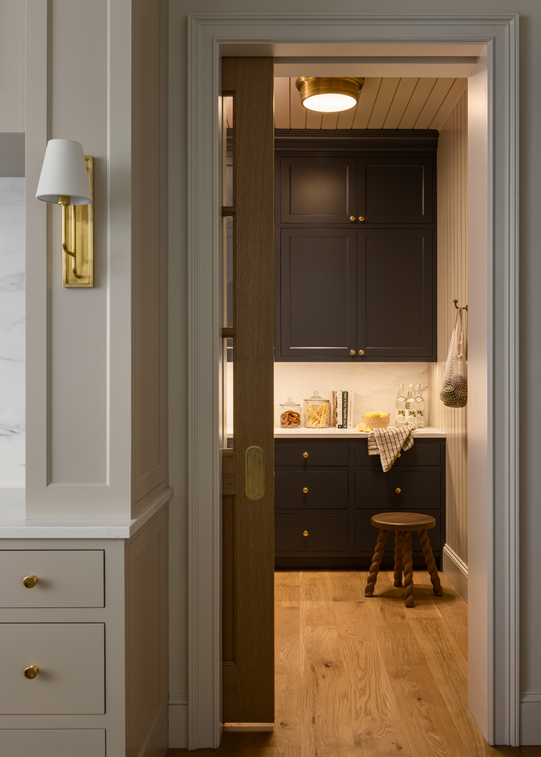
Then you’ve got the galley view down the other end, where the same discipline shows up again.
Shaker-style cabinetry, unlacquered brass fixtures already picking up that soft, lived-in patina, and just one beam overhead instead of a whole ceiling’s worth of detail.
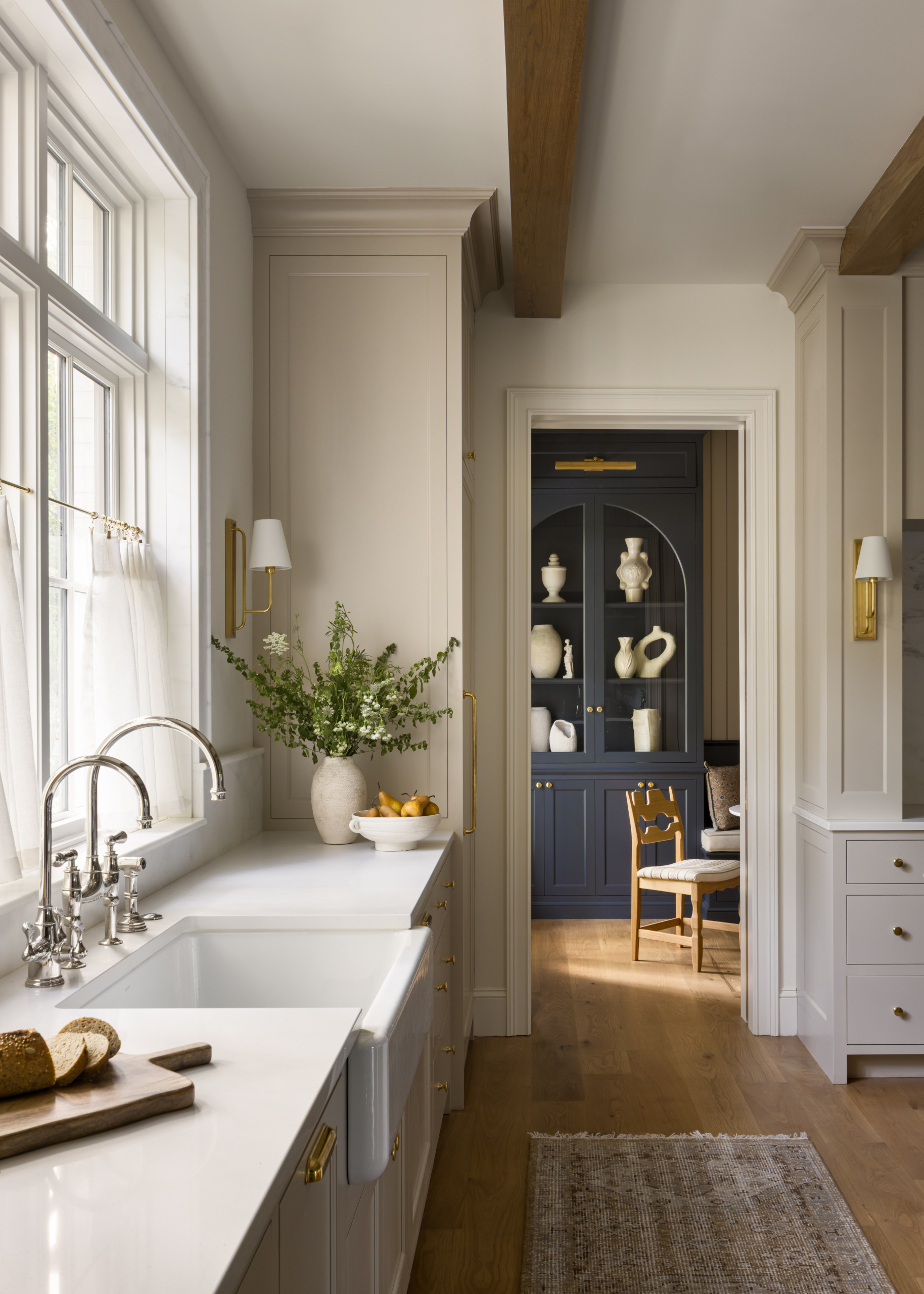
Through that doorway, a navy built-in hutch holds a small collection of cream pottery, just enough color to notice, not enough to steal the show.
The Prettiest Breakfast Nooks
And then there are the breakfast nooks, two of them, which might be my favorite little detail in this whole historic home renovation home tour!
Same built-in bench, same rattan lamps, same general layout, but each one gets to have its own personality.
The first nook leans soft and collected, cream paneled walls, a mix of block-print and solid pillows in warm rust and deep blue. A cozy little corner, perfect to linger over coffee with a good book.
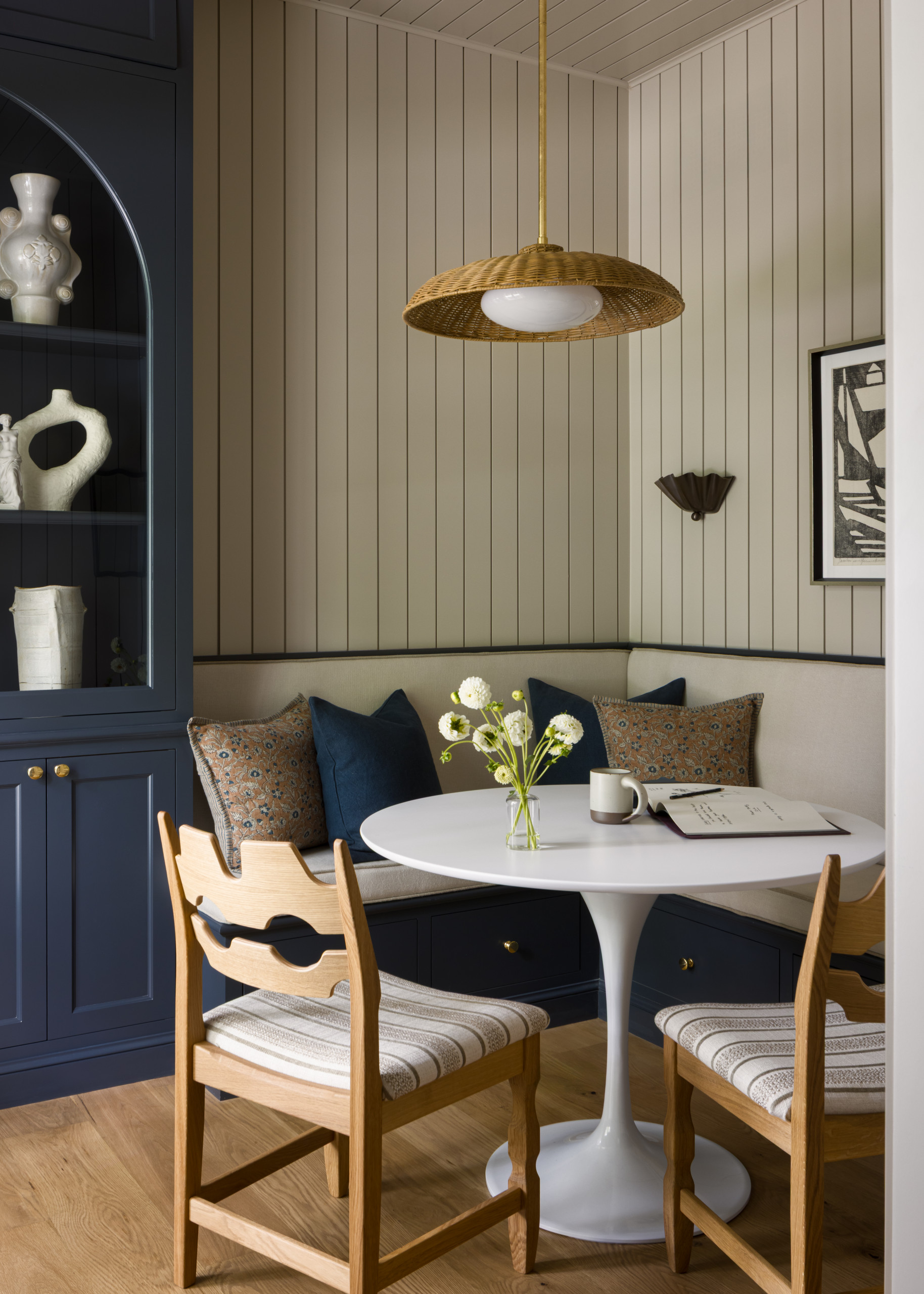
The second nook, tucked into a different corner of the house, takes a moodier turn.
The banquette is dressed with a patterned upholstery in navy and red accemts, paired with a sleek oval table instead of round, the same woven pendant overhead tying it back to its sibling nook.
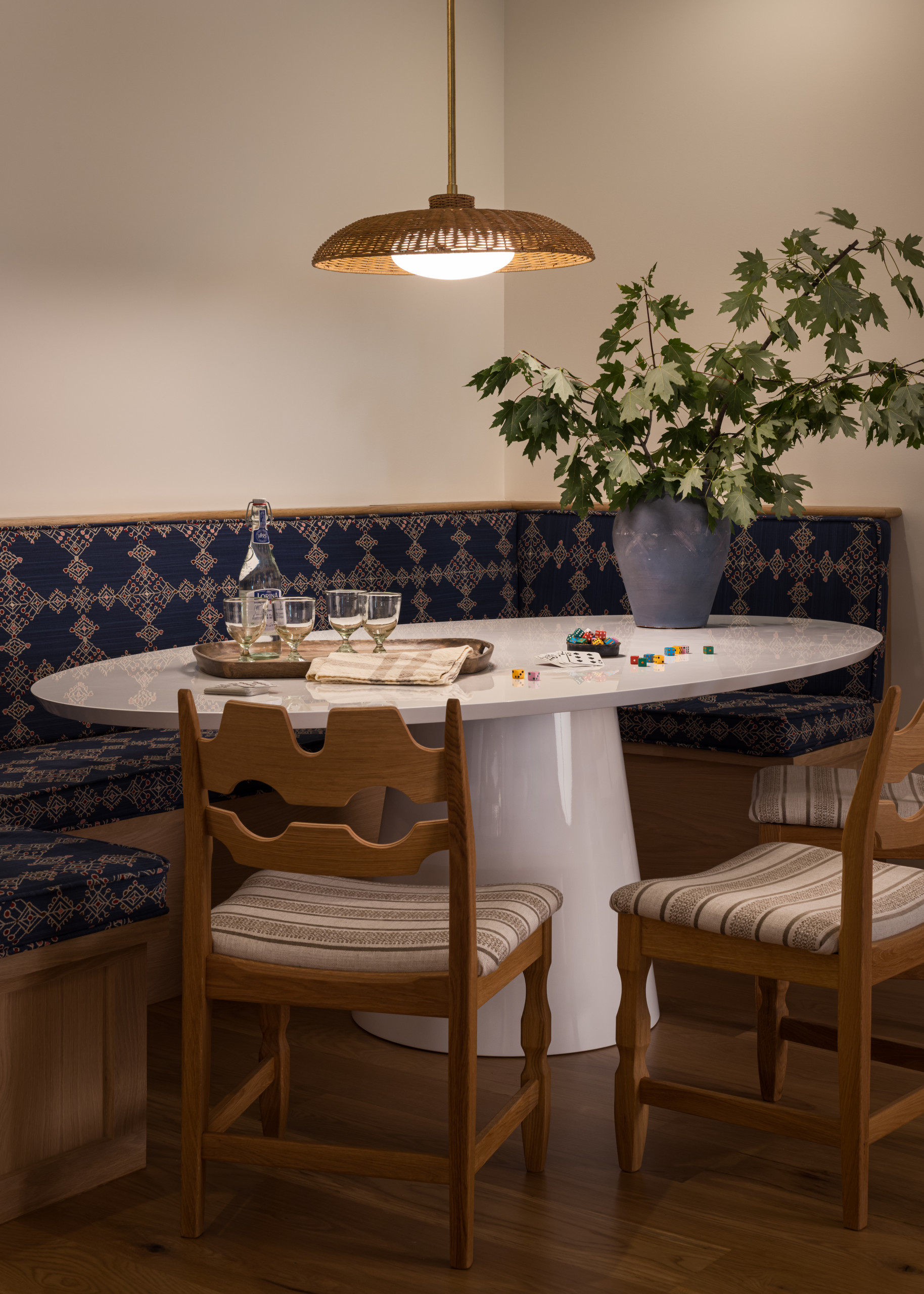
Same bones, different clothes, and that’s such a smart way to design multiple similar spaces in one home!
You get the comfort of repetition without anything ever feeling copy-pasted.
A Historic Home Renovation Home Tour – The Mudroom
The mudroom picks up that same moody thread, just dialed down a few notches. Instead of navy, we get a soft, sophisticated olive green, wrapping custom built-in lockers and storage from floor to ceiling.
It’s a color that reads as neutral and grounding all at once, which is exactly what you want in a room that has to work this hard.
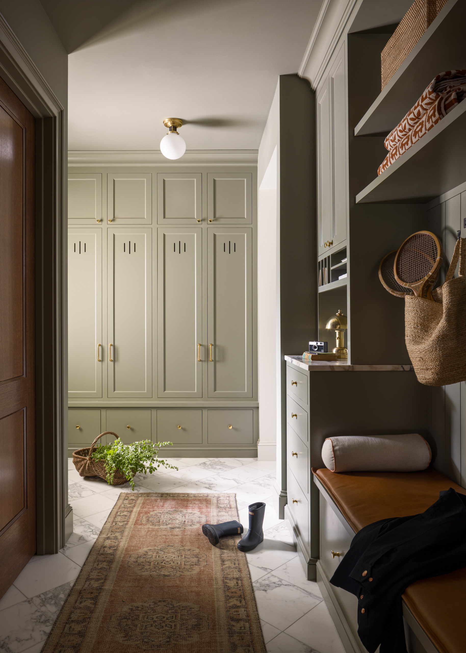
And work hard it does! Every inch here is planned. Lockers for coats, drawers for the small stuff, open shelving for baskets and bins, a marble-topped counter for catching keys and mail.
But it never once feels like a utility room, it feels like a genuinely beautiful space that happens to be practical too. And that’s the real trick with mudrooms, y’all! Especially if you have a large family. Function first, but finished with the same care as the rest of the house.
A Charming Family Room
In the family room, everything gets a little quieter on purpose. The walls, the trim, the furniture, all set into soft neutrals so your eye has nowhere to land except up, at that vaulted shiplap ceiling and the narrow little window tucked into the peak.
It’s a small architectural detail, but it’s doing a lot of work, giving the whole room a point of focus without a single loud color or busy pattern anywhere in sight.
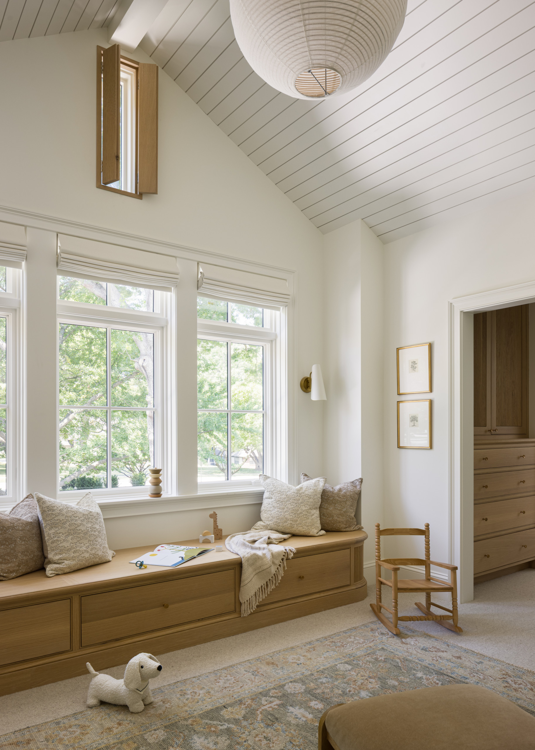
The window seat is the real heart of it, built right into the wall with drawers underneath for all that inevitable kid stuff, dressed simply with a few textured pillows and a cozy throw. A tiny rocking chair, a stack of framed botanical prints, a well-worn rug underfoot, that’s it, that’s the whole room.
And that’s exactly why it works so well for family time. When the architecture is this good, you don’t need to compete with it, you just need a few comfortable, durable pieces and let the kids (and the room) do the rest.
The Moody Study
Now for something completely different.
Walk into the study and the whole mood shifts, deep navy wraps the walls floor to ceiling, and against dark wood beams overhead, the effect is downright moody in the best way.
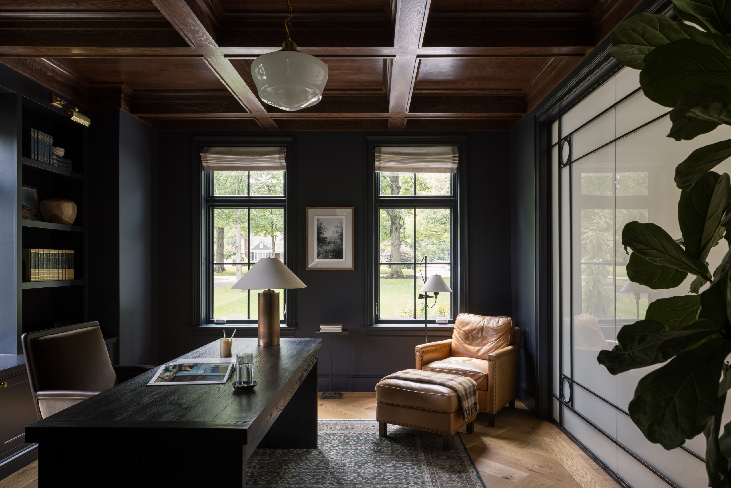
This is where that low-reflectance material story really gets to flex, matte paint on the walls, warm wood tones on the ceiling and desk, and a leather chair that’s soaked in just enough patina to feel like it’s always been there.
The Bathrooms
Now here’s where I’ll let you in on a little secret: bathrooms are usually where a home either sticks to its story or loses the plot completely, and this one sticks the landing every time.
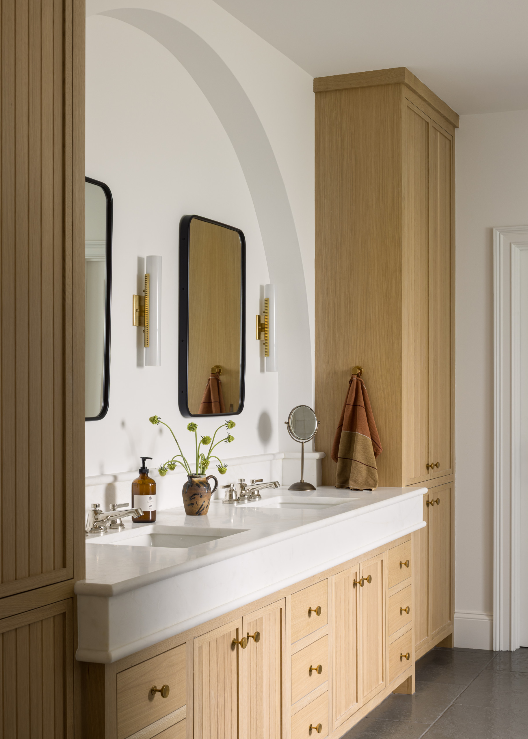
Take the primary vanity, all that warm white oak again, this time in a fluted, vertical grain that adds texture without adding a new material. Double sinks, brass hardware, marble backsplash kept simple and low-key.
It’s the same formula we’ve seen in the kitchen, just scaled down and softened for a more private space.
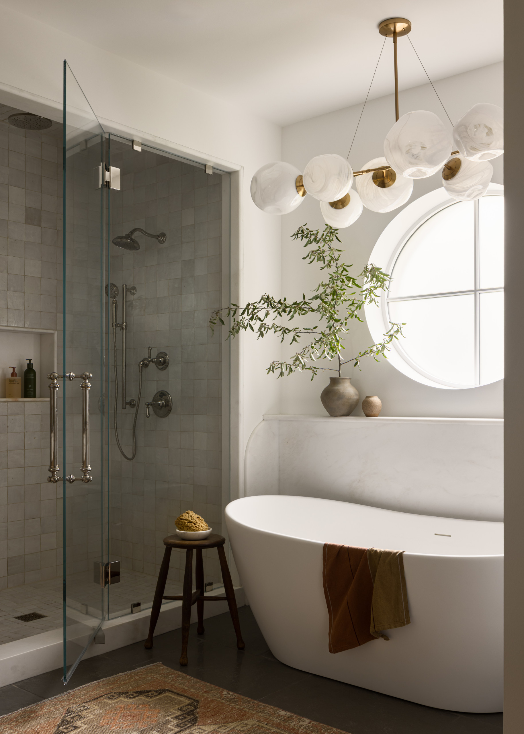
Then there’s the primary bath, which is a little more spa than a farmhouse. A round window pulls in soft light, a cluster of hand-blown glass globes hangs overhead like something you’d find in a boutique hotel, and the tub itself is simple and sculptural, no fuss, no carved detail, just a clean shape doing its job well. Even the shower tile stays in that same low-reflectance family, matte and handmade-looking rather than glossy and slick.
And then, be prepared for a full 180: the powder room. This is the one space in the house that goes properly moody and traditional, dark wood paneling, a botanical wallpaper in deep green, an antique-style arched mirror in a rich wood frame.

It’s a departure from everything else we’ve seen, but it still holds onto the home’s spirit, wood tones, low-reflectance finishes, and an architectural shape (that arched mirror) doing the decorative heavy lifting instead of ornate trim.
The Bedroom
Last stop, and what a way to end the tour. This bedroom takes that vaulted wood ceiling we fell in love with in the living room and turns the volume all the way up, exposed beams meeting at a dramatic peak, the same warm oak tone tying it right back to the rest of the house.
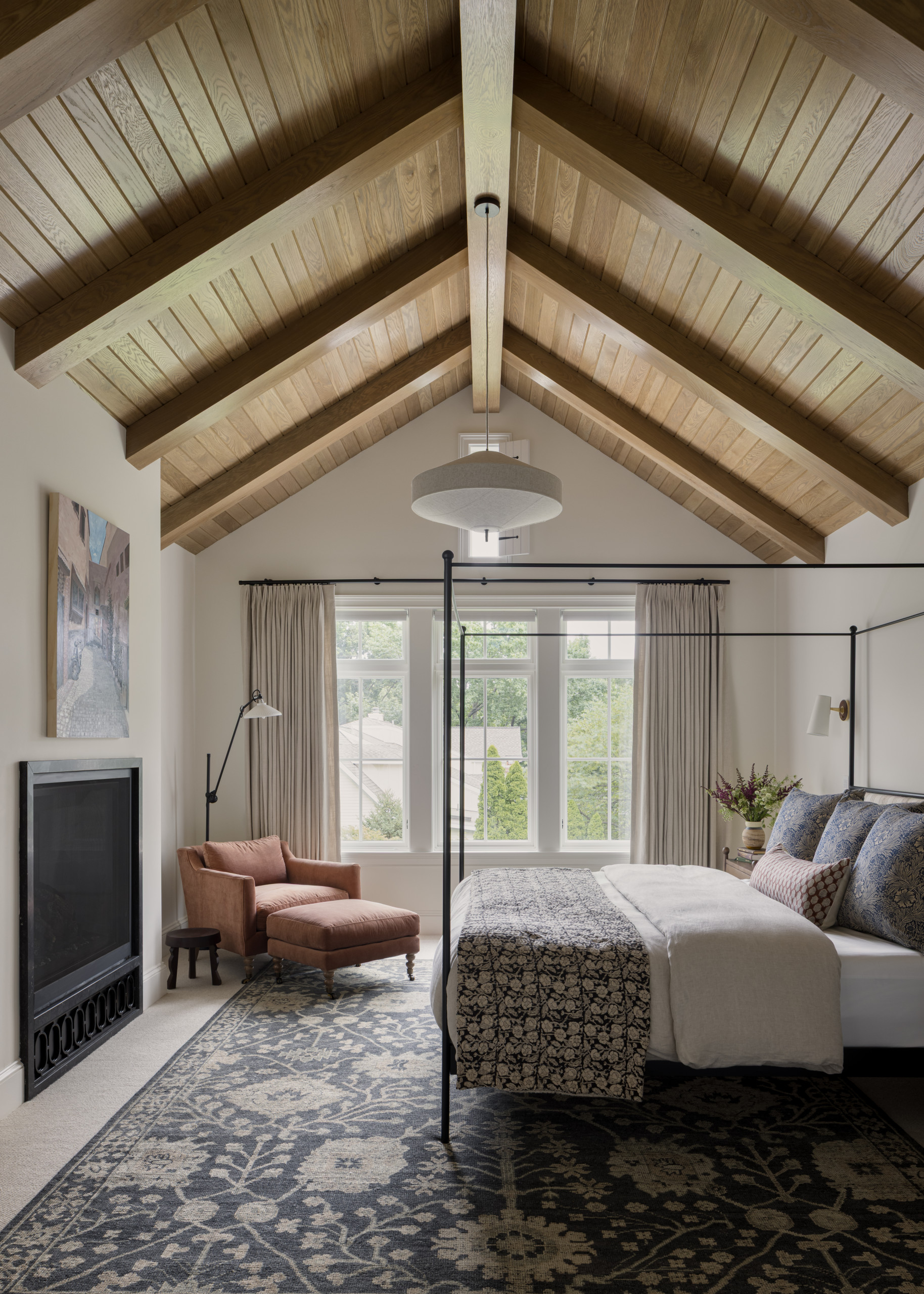
Down below, everything stays soft and restful, a canopy bed in simple black iron, layered bedding in muted blues and warm neutrals, a blush-toned armchair and ottoman tucked into the corner for reading.
The rug grounds the whole room in that deep, moody value we’ve seen throughout the house, while the walls stay quiet and pale so the ceiling gets to keep being the star.
And that, friends, feels like the perfect note to end on this home tour!
This historic home renovation really thrives in its elegant restraint. It repeats the same few honest materials, room after room, and letting the good proportions do the rest.
A Historic Home Renovation Home Tour – Get the Look
Loved this home as much as I did? I’ve rounded up some of my favorite pieces below so you can bring that same warm, collected feel into your own space, one thoughtful piece at a time.
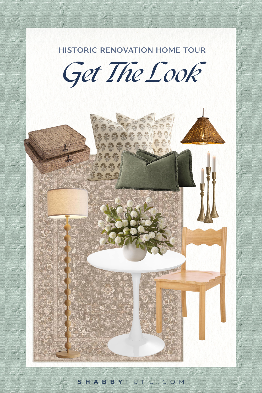
Boho Rattan Pendant Light | Small Rattan Chandelier | Scallop Wood Dining Chairs | Lumbar Throw Pillow Covers | Tulip Table | Floral Pillow Covers | Pompon Mum Branches | Cast Iron Taper Candle Holder | Flat Woven Wicker Storage Bins | Area Rug | Floor Lamp
If you take nothing else from this tour, let it be this: restraint, done well, is its own kind of luxury!
That’s a wrap on our tour of Lee Boulevard, y’all, and I hope it left you as inspired as it left me! I’d love to hear which room stole your heart, drop a comment below and let me know.
Prout’s Neck Coastal Home Tour: A Timeless Maine Beach House Interiors Full of Charm
A Dreamy California Home Tour: Modern Cottage Interiors
Project Roanoke: A Warm and Welcoming Modern Transitional Home Tour in Toronto
Very well done. I love the clean lines and uncluttered spaces.