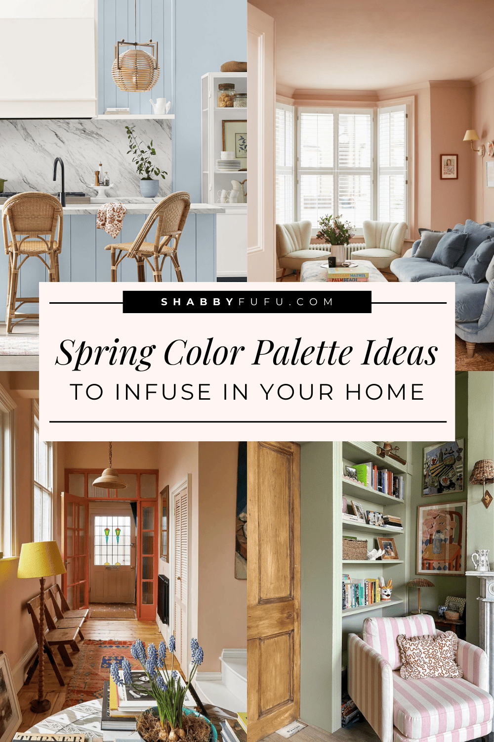
6 Delightful Spring Color Palette Ideas To Infuse In Your Home
This post may contain affiliate links. For more information, please see our disclosure policy.
It’s time to prepare for the seasonal change upon us and bring a touch of spring cheer into our homes!
As seasons shift, we often feel the need to revamp our interiors, especially after the long and dark winter months.
The secret to updating your home without undergoing a total overhaul? Enter color palettes!
We’ll be exploring some pretty and practical spring color palette ideas that will give your home a new fresh vibe without the hassle of a total makeover.
Spring Color Palette Ideas To Infuse In Your Home
By strategically altering the color scheme in your home, you can achieve a total transformation through small yet impactful decor details. That is the power of color!
Let’s learn more about spring color palette ideas, shall we?
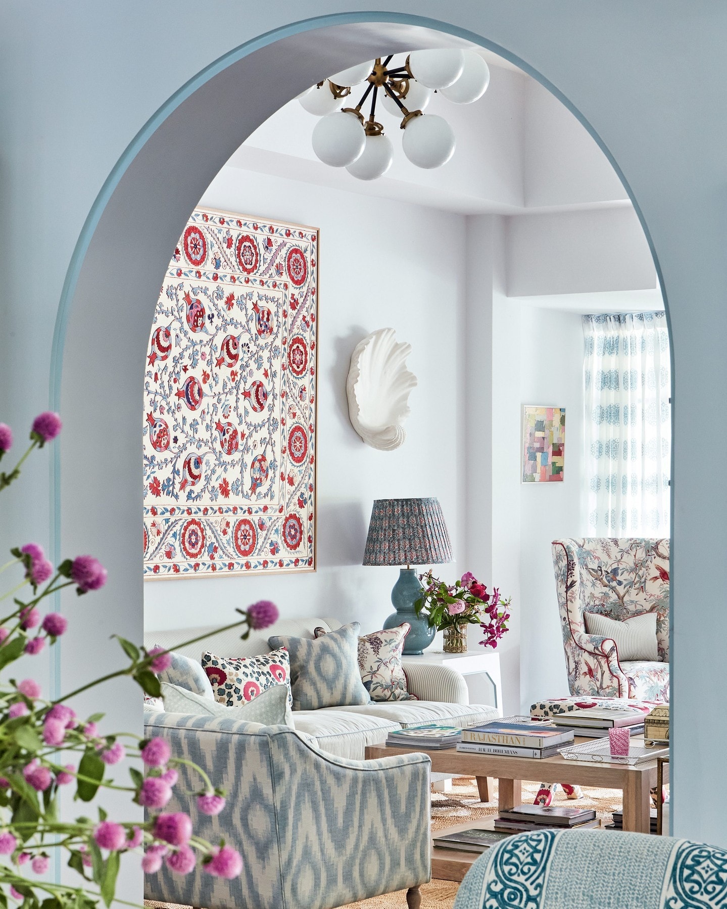
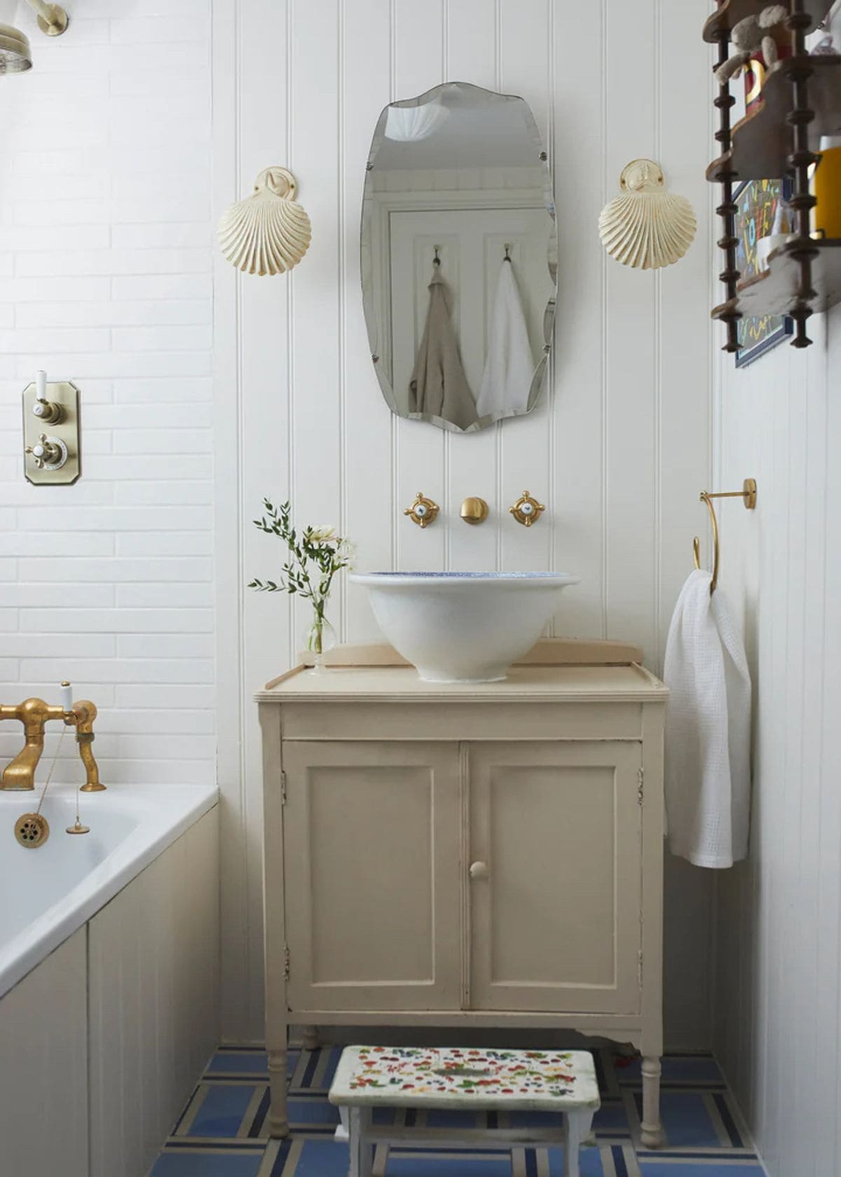
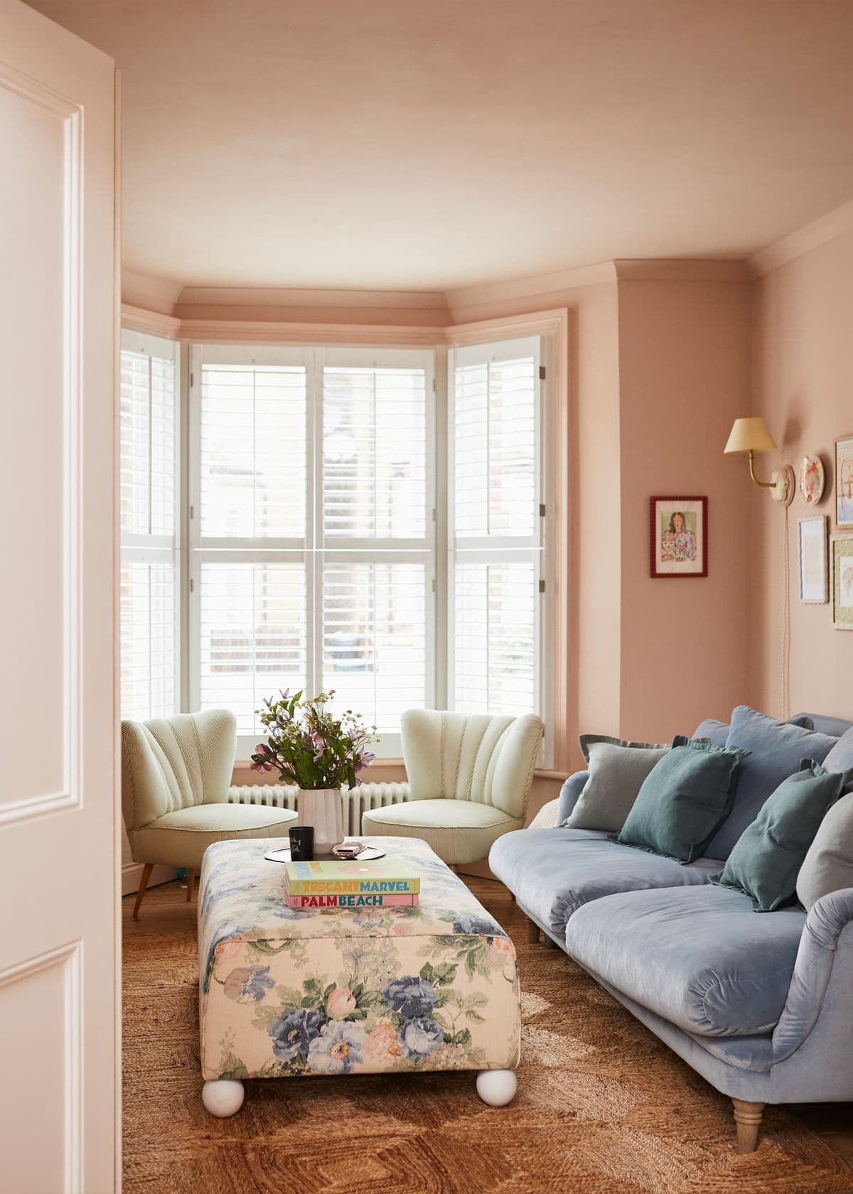
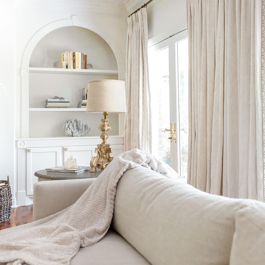
Coastal Elegance
I’m so excited with all the love the coastal decor style has been getting lately! It’s one of my ultimate favorite decor styles and how can it not be? It’s timeless and stunning!
The coastal color palette brings a serene and chic quality to any home, adding to a sophisticated yet laid-back elegance that is timeless.
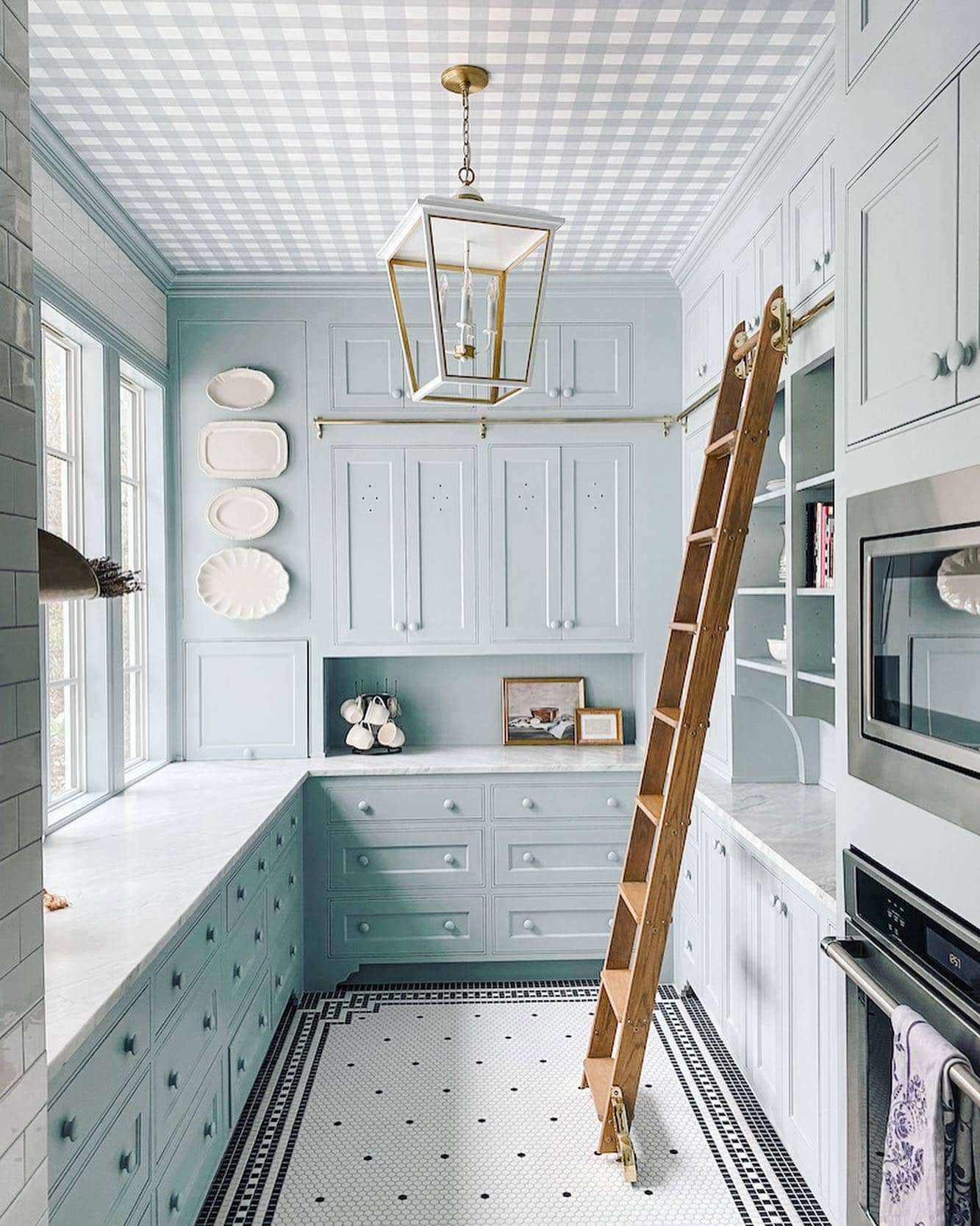
Besides making spaces feel larger and brighter, it’s a refreshing color story that will never go out of style. And, what better season to embrace the coastal vibe with sea-inspired hues than spring?
Within this spring color palette, you have a wide range of color options to explore. From the lightest pale blues with icy undertones to crisp sky blues or even opting for a slightly deeper mid-blue, for a more dramatic navy-inspired look.
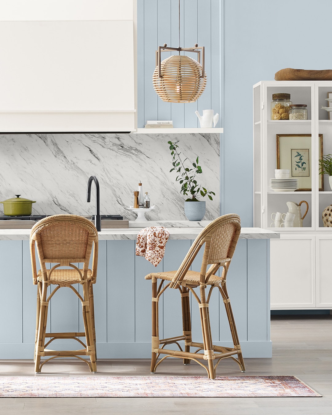
You can opt for a subtle and pale blue tone, such as the serene Upward from Sherwin Williams.
Pair it with soft whites, and light beiges, and incorporate darker blue elements for a touch of contrast.
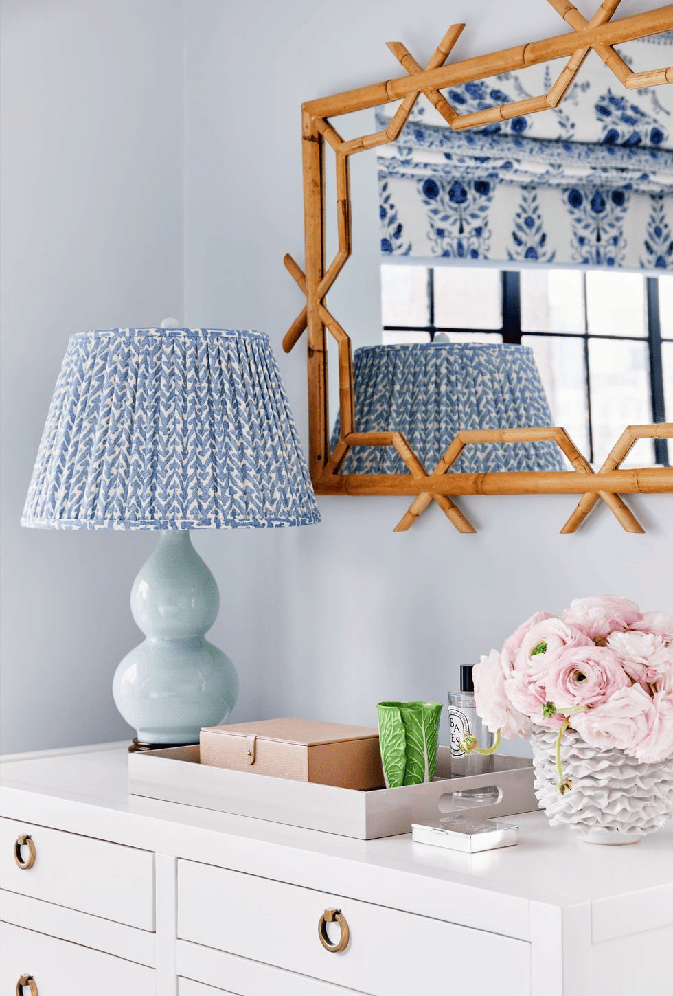
To enhance this palette, bring in natural elements with rich textures like rattan and bamboo. Introduce pops of green and soft pinks or light corals for added depth, creating a simple yet timeless color scheme that radiates ethereal style.
Recommended colors:
- Ethereal White – Sherwin Williams
- Dew Drop – Sherwin Williams
- Blue Lace – Benjamin Moore
- Upward – Sherwin Williams
- Natural Linen – Sherwin Williams
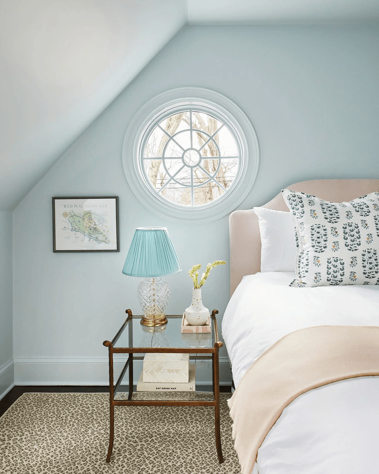
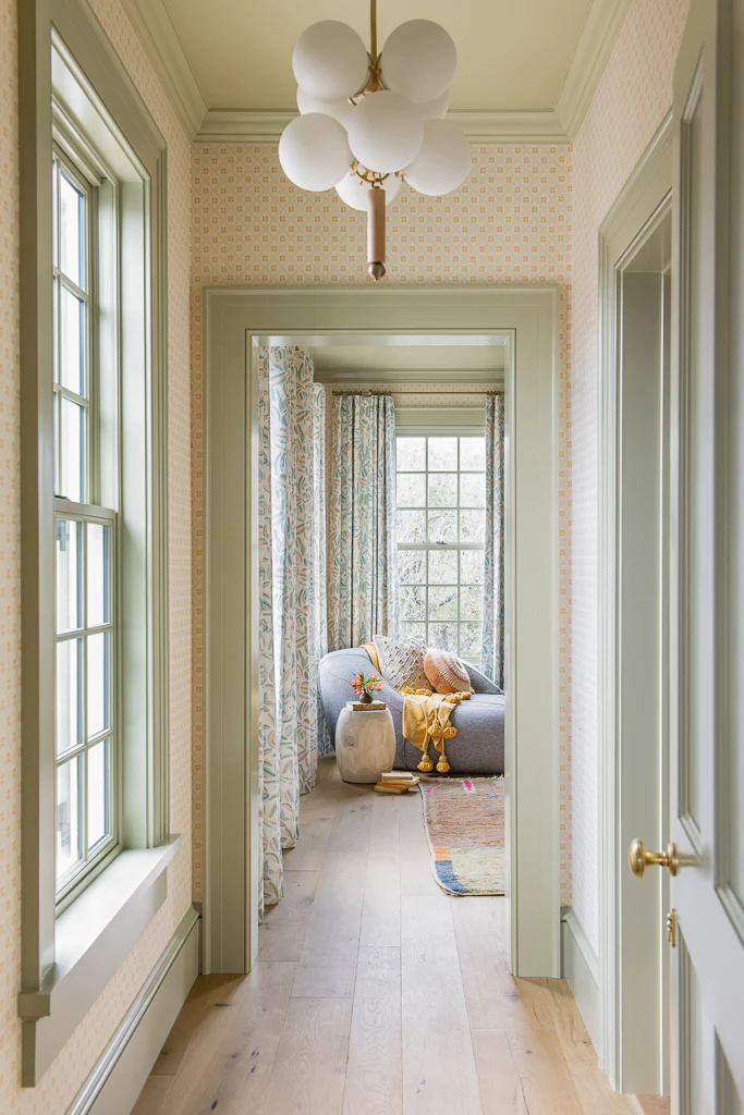
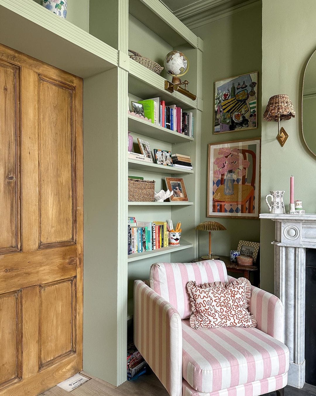
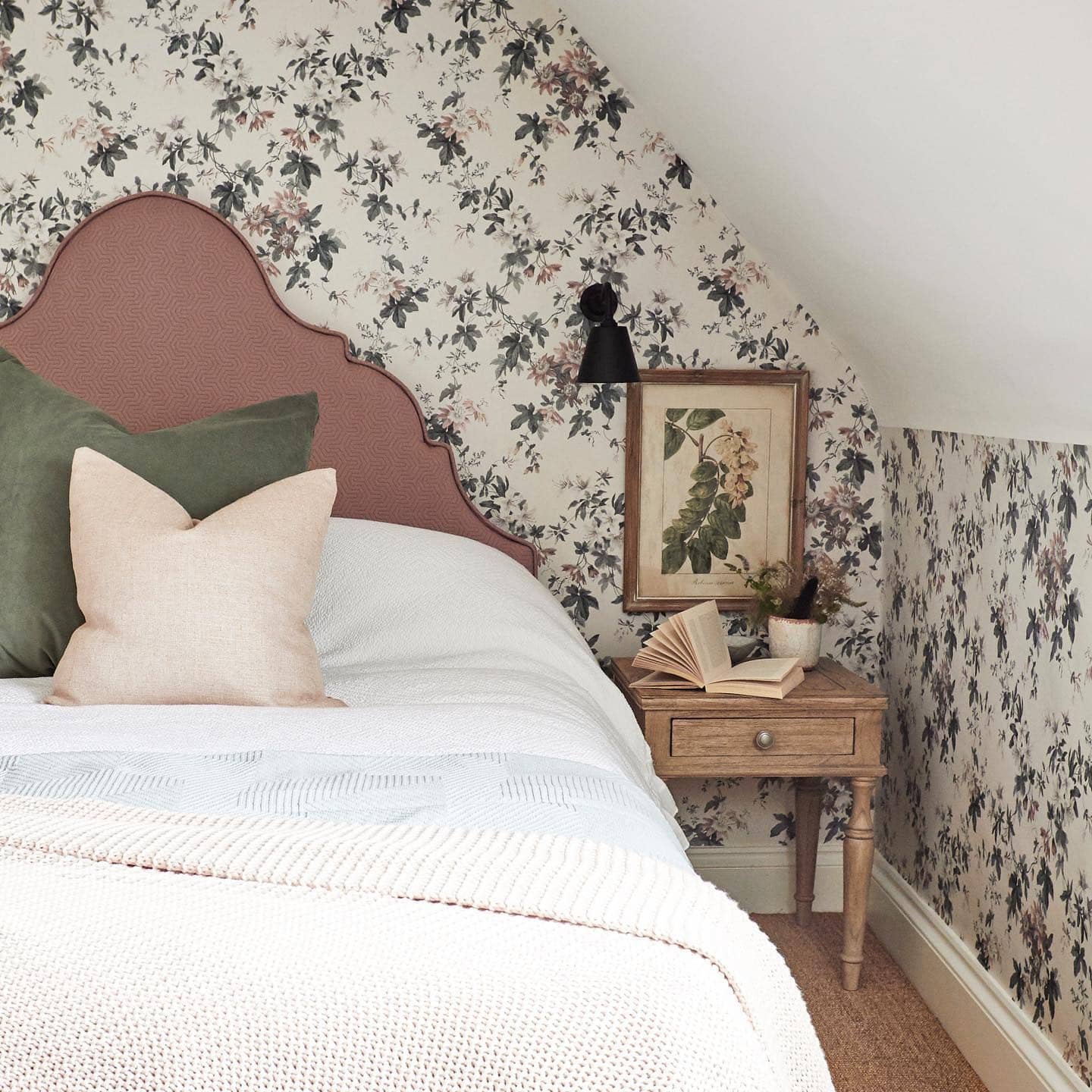
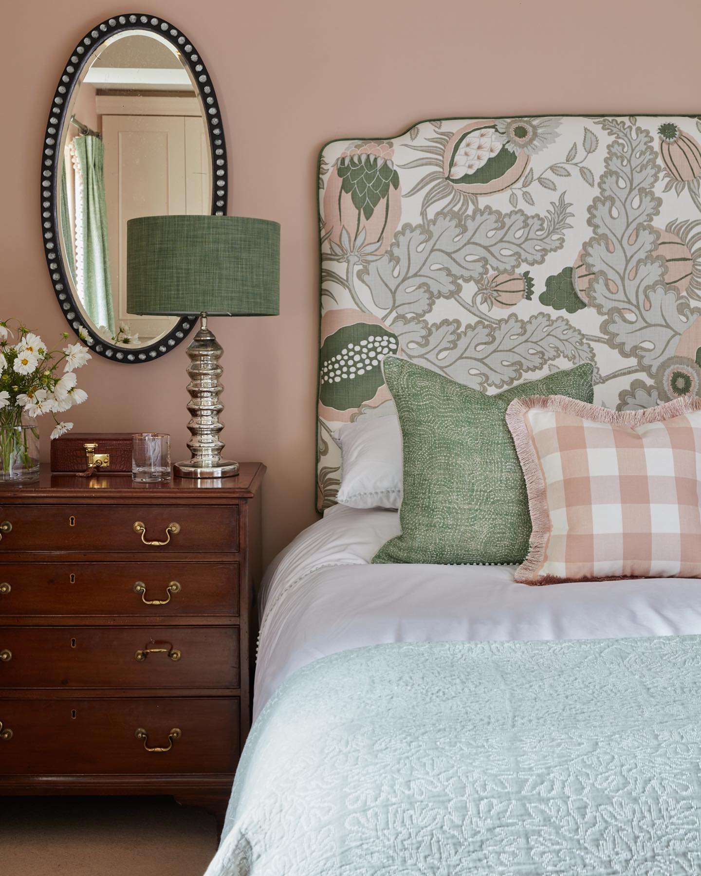
Vintage Pastels
With a sweet and playful touch, a vintage pastel spring color palette featuring soft peach, powder blue, pale yellow, and antique white brings forth a romantic and nostalgic option.
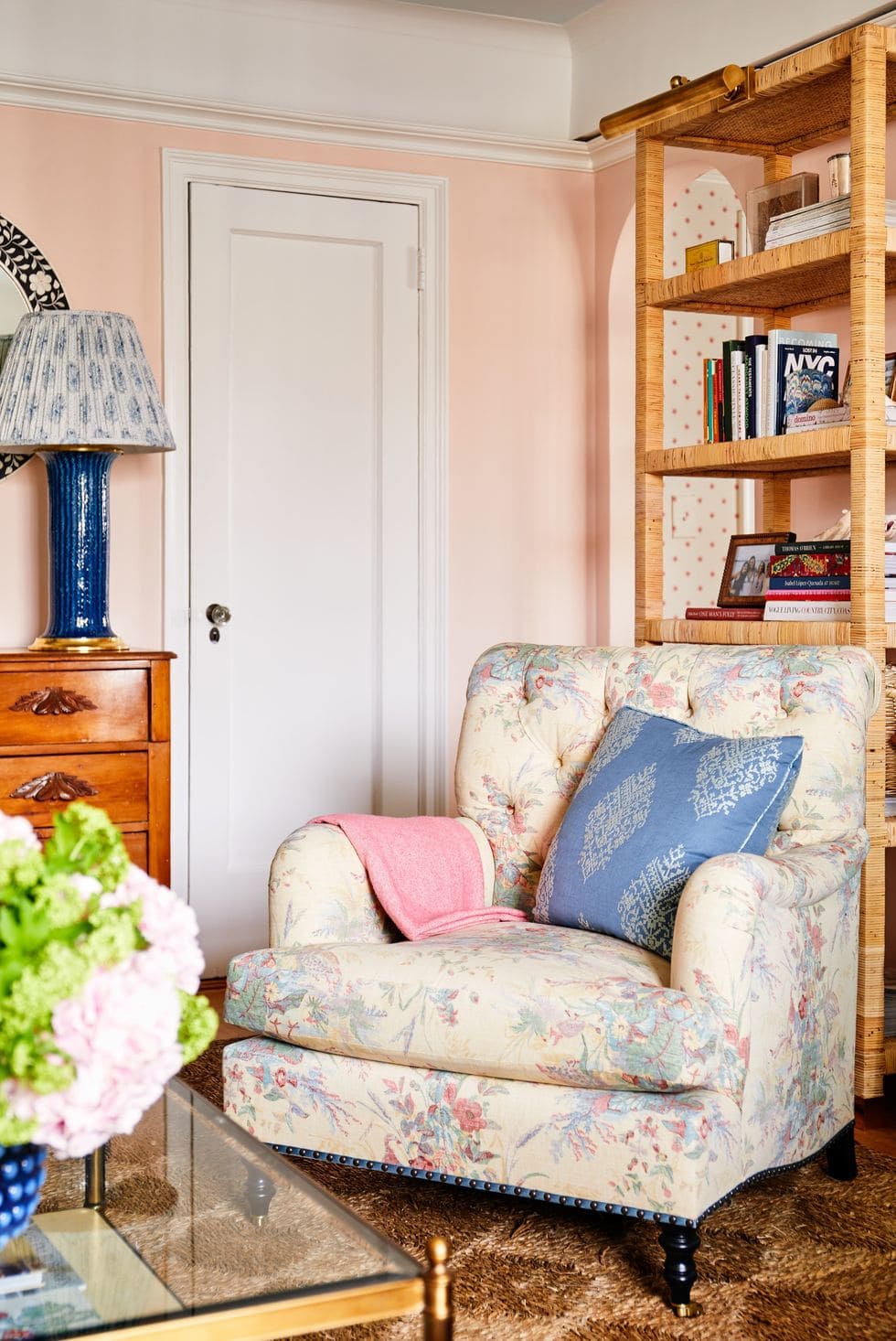
This combination of muted and refined hues serves as the perfect formula to elevate your decor, especially if you’re aiming to welcome spring with a touch of romantic vintage charm.
You can amp up this color palette by incorporating subtle patterns like delicate florals, understated stripes, or contrasting gingham.
These patterns spark playfulness making them the perfect complement to this romantic aesthetic.
Recommended colors:
- Tallow – Farrow & Ball
- Moorstone – Sherwin Williams
- Pink Ground – Farrow & Ball
- Warm Blush – Benjamin Moore
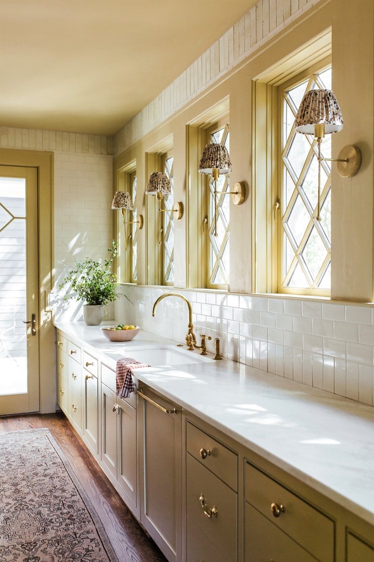
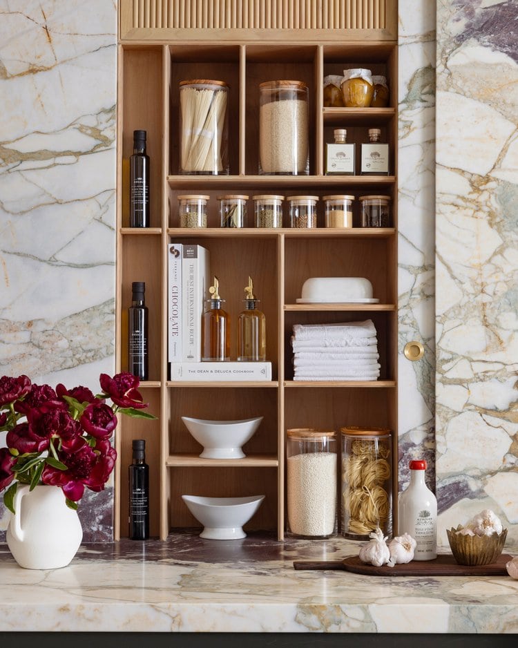
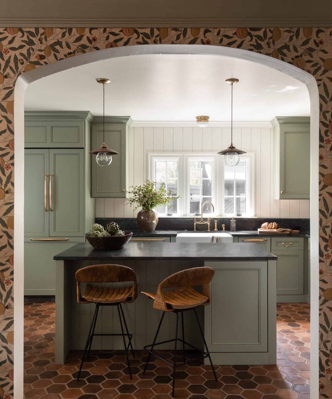
Neutrals with Earthy Flair
Neutrals will always be a staple in the interior design world when it comes to color palettes.
These colors can make spaces feel open and uncluttered on top of enhancing natural light. But, after so many seasons where neutrals were synonymous with minimalism, this spring neutrals come back with a twist – a warm twist.
Instead of stark cool-toned hues, neutrals are more grounded in earthy colors, mimicking natural shades as an alternative to flat beiges.
Pale rust, clay ivory, ecru, “greige” and even the palest of greens are a new way to go neutral.
The best about this spring color palette is that if you already have a neutral decor style, you can update it easily for spring.
You can do it with little changes like swapping pillows, rugs, and other textiles. Painting your walls in a warmer white hue is also another simple option as well as introducing accent pieces within this color scheme.
Recommended colors:
- Wevet – Farrow & Ball
- Analytical Gray – Sherwin Williams
- Old White – Farrow & Ball
- Anew Gray – Sherwin Williams
Bold Revamp
You can transform your home with the lush and creative vibes of jewel tones, featuring navy, mustard, beige, and a hint of red for artistic flair.
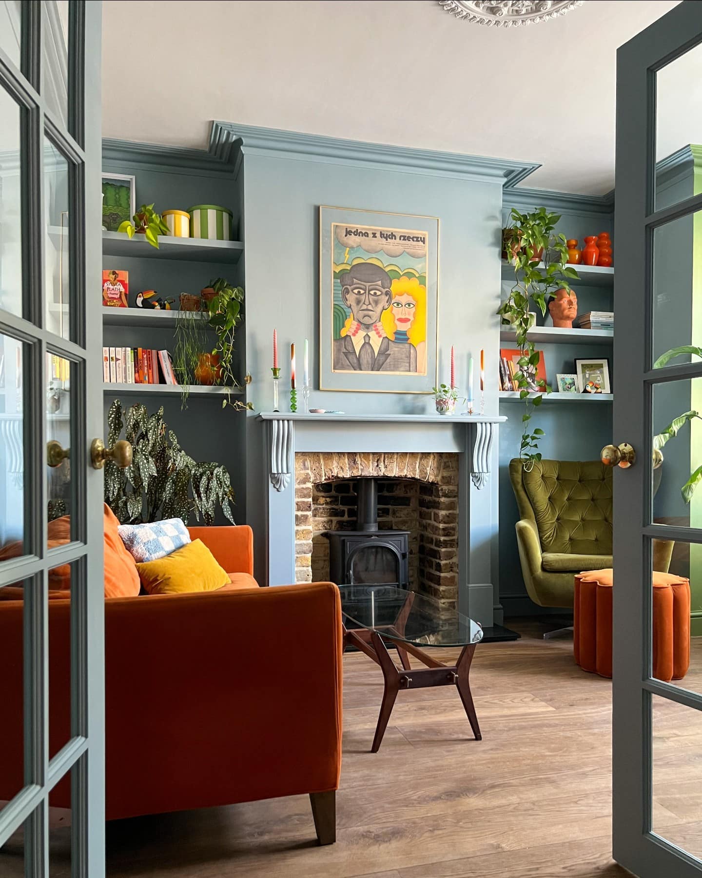
This is a captivating spring color palette to play with for those who are seeking a dramatic change and are ready to introduce bolder colors to their decor.
This daring and vibrant color combination makes spaces feel opulent, chic, and distinctly artistic.
Reflecting the vibrant energy of the new season while maintaining a harmonious elegance, this spring color palette flows together beautifully.
These colors can either exude a rich vibrancy or embrace a moodier aesthetic.
It all depends on which color you want to dominate the space and how saturated it is.
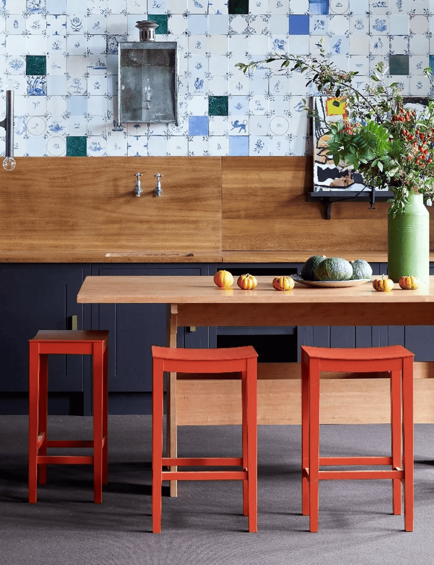
Darker shades with lower saturation lean towards a more subdued mood, offering you the flexibility to add bold accent elements in small doses while accomplishing a similar effect.
If you prefer something lighter, you can also opt for keeping things neutral with the less dramatic colors and sprinkle in some unexpected accents in the more eye-catching colors like red and mustard.
Recommended colors:
Tonal Tranquility
A space enveloped in different hues of the same color family is already a fool-proof way to elevate a room. But when done using earthy browns? The result is just stunning as a spring color palette!
This color combo is also a fantastic option for those craving change but may feel a bit apprehensive about going out of their comfort zone.
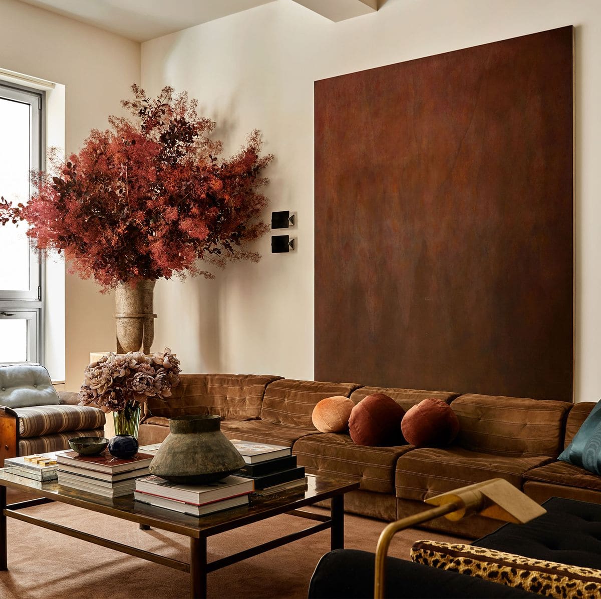
To create this spring color palette, make sure to start with a neutral foundation and then, layer tone-on-tone elements within the brown color family. The colors can range from the lightest shade to the darkest, although to create harmony I would recommend finding a middle ground and only using light and dark to create contrast.
If you want a similar old-world color palette, make sure to pay attention to undertones!
Check if you have any elements in the room that have a brown tint (like flooring, cabinets, windows, wallpaper, etc)
If you do, try to stay within the same undertone to avoid mixing cool and warm hues, as this can create an unharmonious result.
Think of sofas and accent chairs in rich mocca brown, cabinets and walls painted in Farrow & Ball’s Broccoli Brown paired with beige and ecru rugs along with ochre wood accents. Ceramic vases in pale white, art pieces featuring charcoal brown hues, and lamps with a glimmering brass finish to add that extra bit of glitz.
Recommended colors:
Nature-Inspired Glam
This color palette idea is all about the serene beauty of a nature-inspired painting with a touch of glam.
Green takes center stage, harmonizing with creamy ivories and delicately heightened by pink hues.
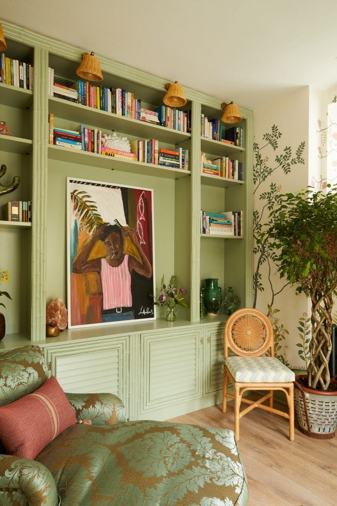
Bringing a touch of nature-inspired character indoors, this color combination is another wonderful choice to upgrade your home for spring. I find it to be my favorite spring color palette of them all!
You can choose from dusty sages to olive greens, and baby pinks to more magenta tints. Soft whites and nude hues team up beautifully with this color combo.
You can paint walls and cabinets or play with the colors through wallpaper, furniture, and textiles.
There’s a certain cottage feel to this color mix which I adore!
Recommended colors:
- Pink Ground – Farrow & Ball
- Vert de Terre – Farrow & Ball
- Tailor Tack – Farrow & Ball
- Willow Tree – Sherwin Williams
As with any other color palette, you determine which is the dominating color and which ones are the secondary and accent ones! It’s all about creating a color palette that reflects your style and enhances your space and your vision.
Spring invites us to take color risks and embrace change, making it an ideal season to experiment with new and vibrant palettes.
Don’t be afraid to try new colors, mix unexpected palettes, and inject life into your living spaces. Whether it’s a subtle change or a bold transformation, experimenting with colors is a simple yet powerful way to refresh your home. Happy decorating!
You can read a bit more of my previous posts about interior design theories and color inspiration. Check them out:
What is your favorite color palette for spring? Let me know in the comments below!
I loved this post! Thank you!
So glad to hear that Lisa!
I enjoyed the use of minimal color shades in the first photos. I now want to add some color to our whites. Love this.
Hi Lori,
My walls are currently all white as well and it’s tempting to add some color!
Janet
What is the name of the paint in pastel green used on the door facings and window ledges?
Thanks DaleAnn
Hi DaleAnn,
I have what I believe is the color used linked under the Vintage Pastels ( Moorstone – Sherwin Williams )
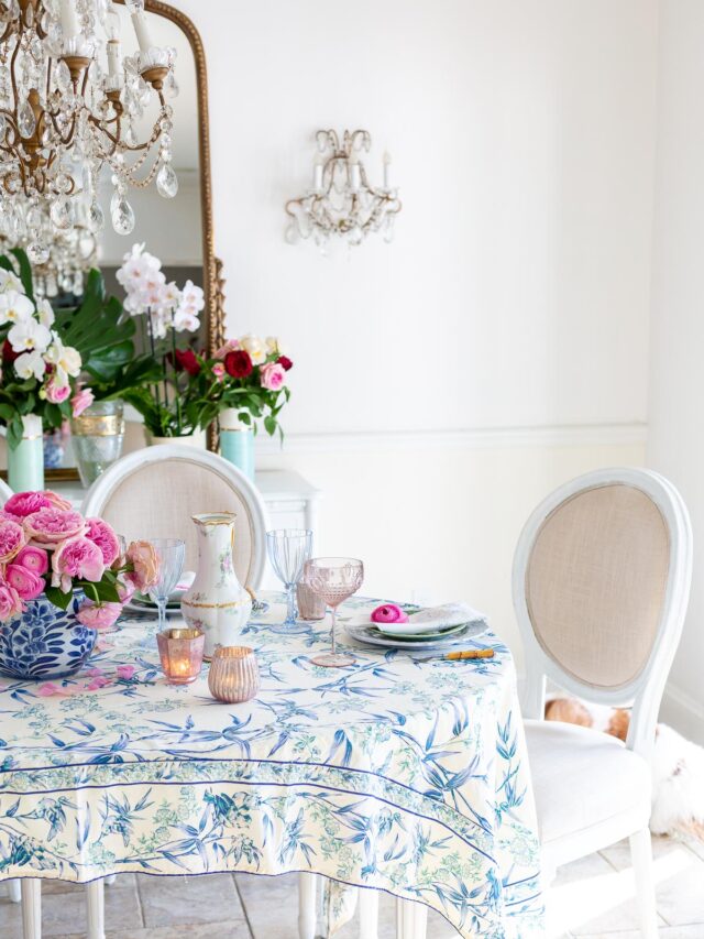
What is the soft gray (white) wall paint color in the last photo of a round table with a blue floral tablecloth and soft pink upholstery on the chairs?
The wall color is Benjamin Moore White Dove—a soft white with subtle gray undertones.