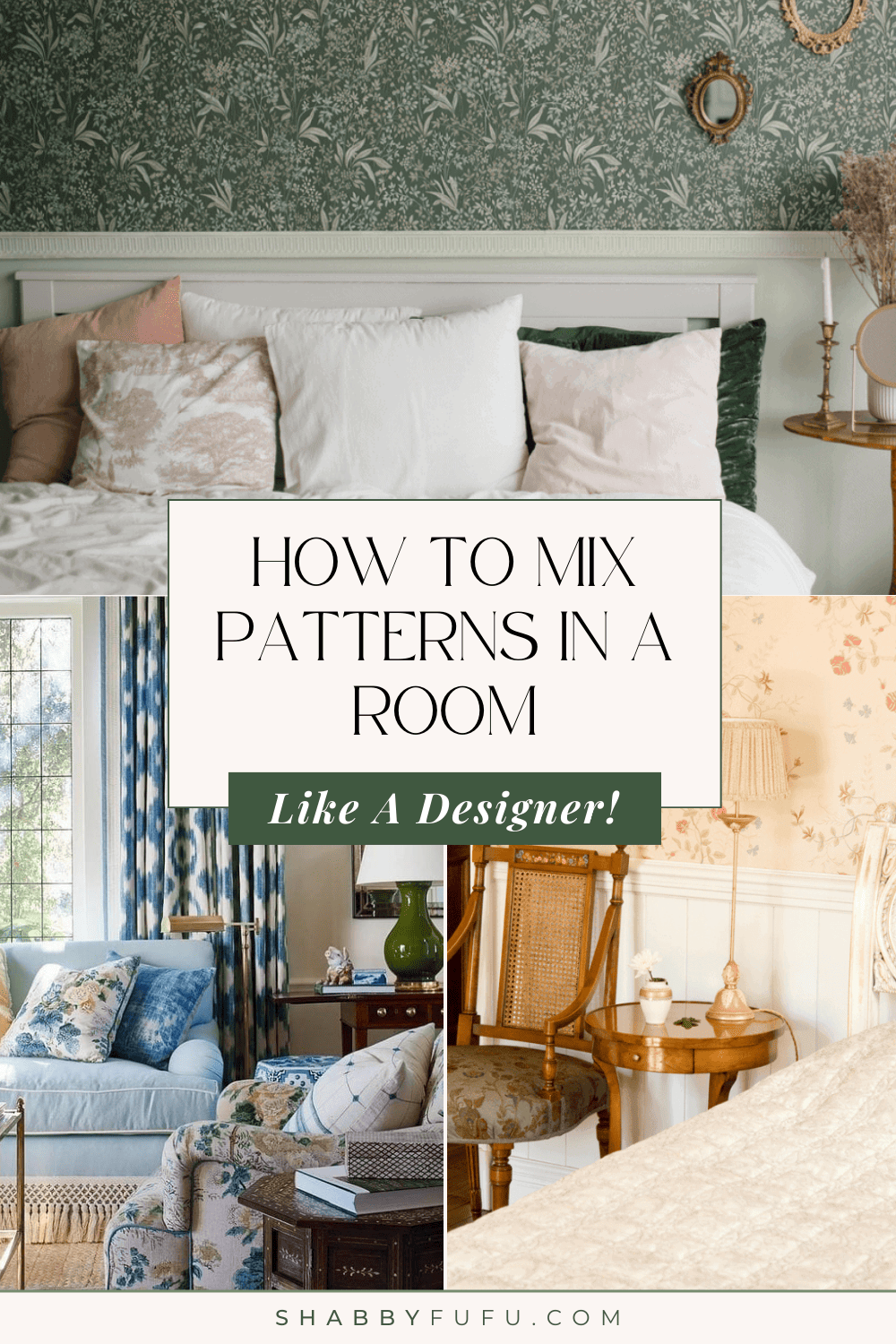
How To Mix Patterns In A Room Like A Designer
This post may contain affiliate links. For more information, please see our disclosure policy.
Get expert tips on how to mix patterns in a room like a designer and discover how mixing patterns like a pro can elevate your home to create a beautiful space that reflects your unique sense of style.
Master the art of mixing patterns and elevate your home decor game!
Table of Contents
How To Mix Patterns In A Room Like A Designer
We have some expert tips on how to mix patterns in a room like a designer and discover how mixing patterns like a pro can elevate your home to create a beautiful space that reflects your unique sense of style.
Mixing patterns in interior design may initially seem like a daunting task, but fear not! With the right approach and a few simple guidelines, it can be an effortless process.
Don’t get intimidated by the idea of combining prints and textures; instead, embrace your creativity and discover the endless possibilities of mixing patterns in your interiors.
I’m seeing so many stunning examples of patterns used in interior design on my Instagram feed and, with spring nearby, I thought it may be a good idea for us to go over some guidelines on how to mix patterns!
This is not a new trend, of course. But, with the rise of Maximalism and Grandmillennial styles, patterns and mix-and-match styles have gained a newfound appreciation, making it easier than ever to find beautifully patterned elements that reflect your authentic style.
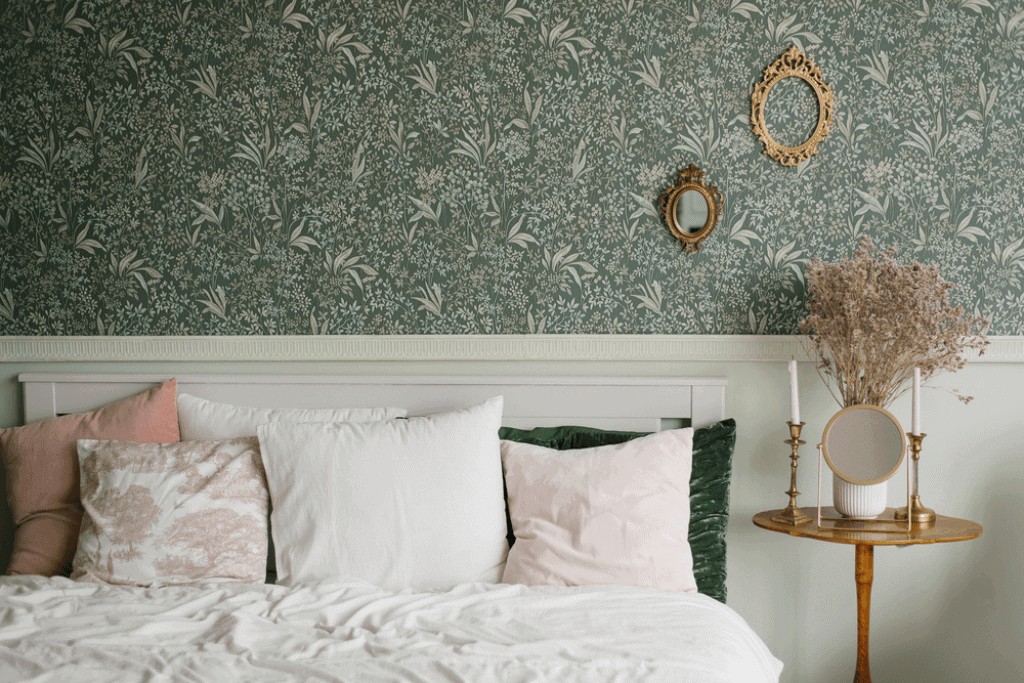
Have a Color Scheme
Before you start mixing fabric patterns, you need to focus on choosing a color scheme.
Having a color scheme is key no matter the style you’re going for but it’s especially important when mixing patterns. These colors will act as a guide and help you choose patterns that complement each other and elevate the final look.
The colors in a color scheme should work together and evoke the feeling you’re trying to evoke in the room.
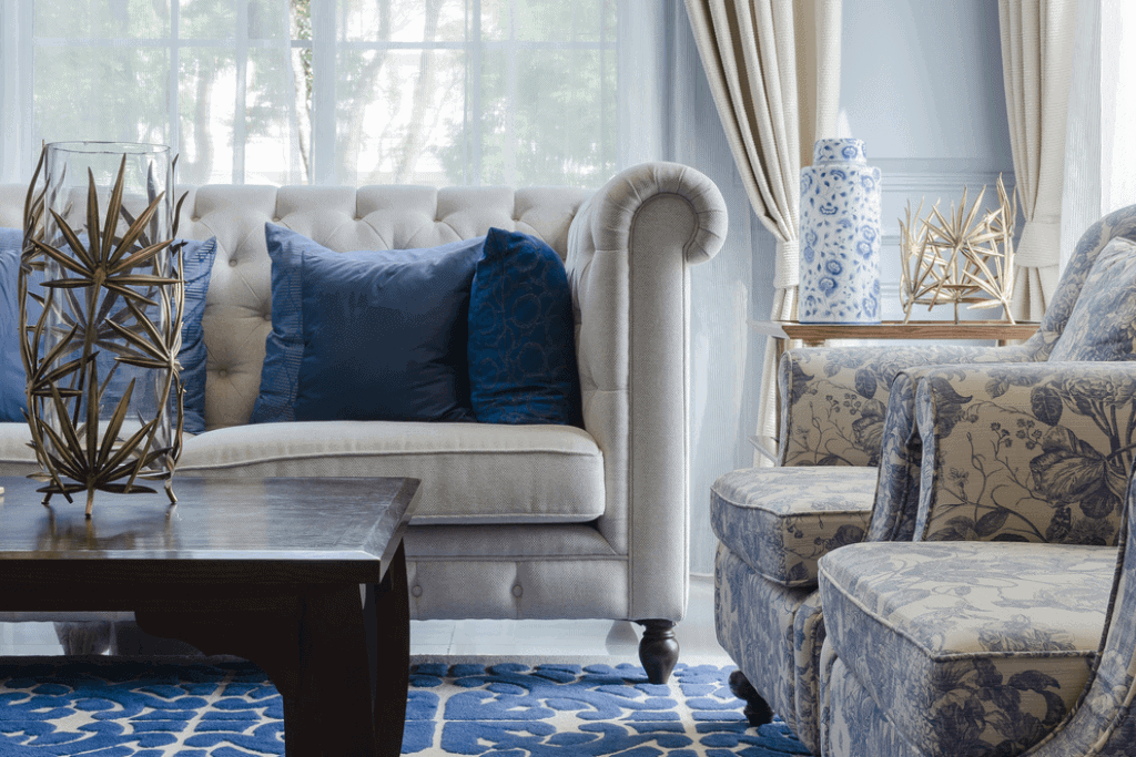
For example, if you like the airy coastal home decor style, you would pick a dominant color like navy blue, ivory, light blue, or sea green.
For your color base, I strongly recommend neutral colors, whether they are dark or light, cool or warm.
If you use neutral colors as the foundation, you can have a consistent look that will let you try different patterns and textures while keeping the appearance balanced.
Once you have your base color, you can start selecting patterns that complement it.
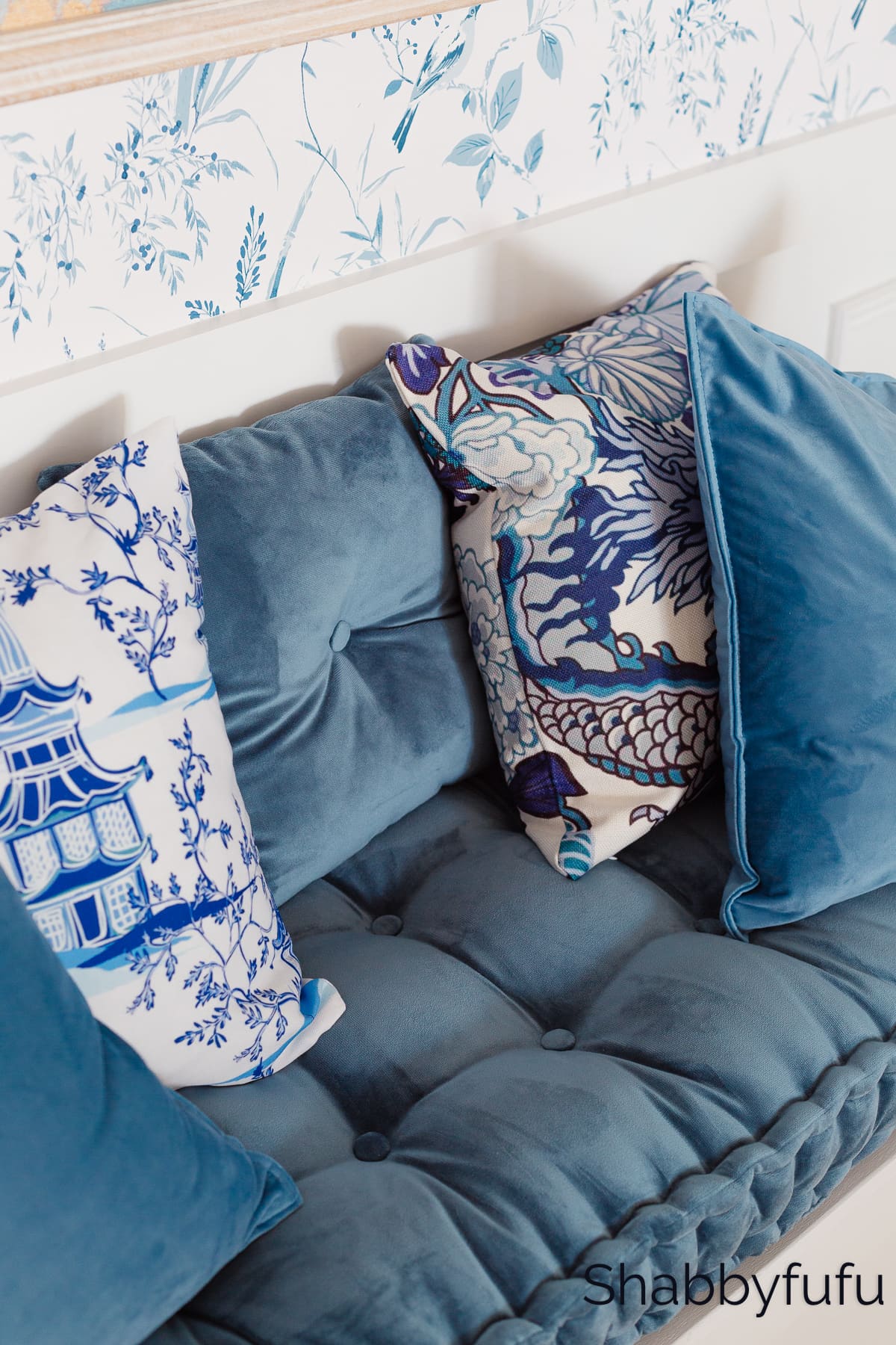
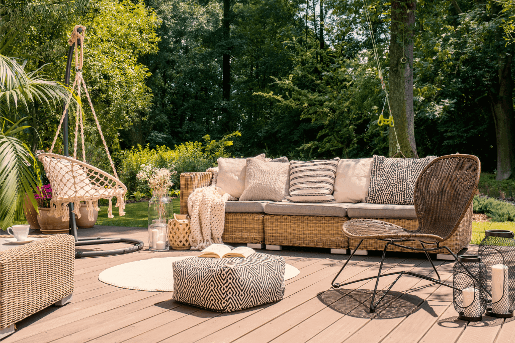
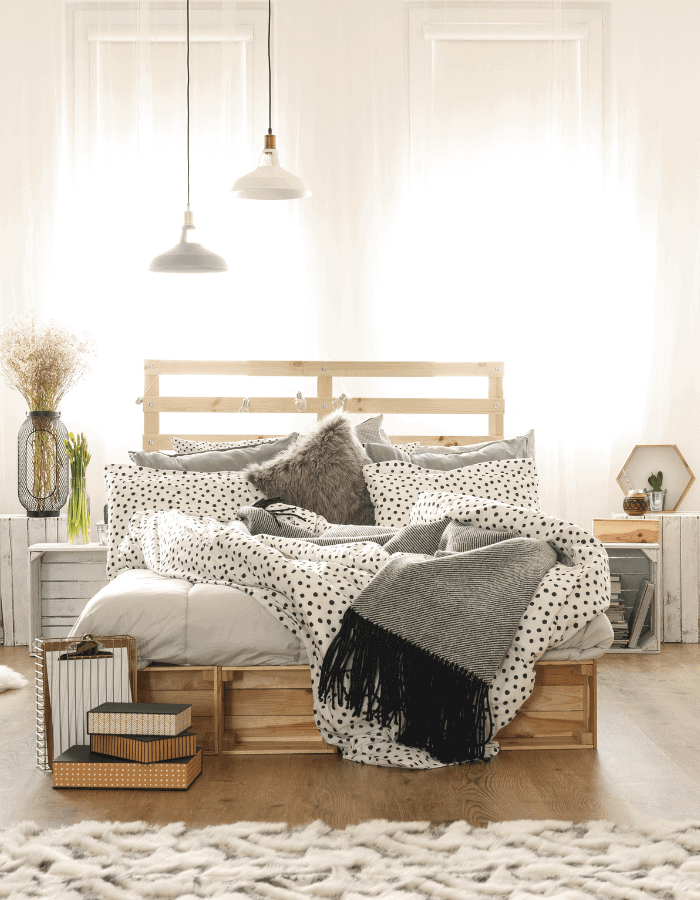
Play With Scales And Proportion
To guarantee success when matching patterns like a pro, try to play with the scale of your patterns!
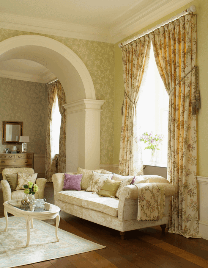
Balancing busy patterns with simpler ones -like polka dots and herringbone or large florals with thin stripes is a way to ensure a lovely result that won’t overwhelm your space.
For example, if you have a bold floral wallpaper, you want to balance it out with a more subtle pattern on your throw pillows, like a small geometric one. The only thing to keep in mind in those situations is color balance, which takes us to our next point…
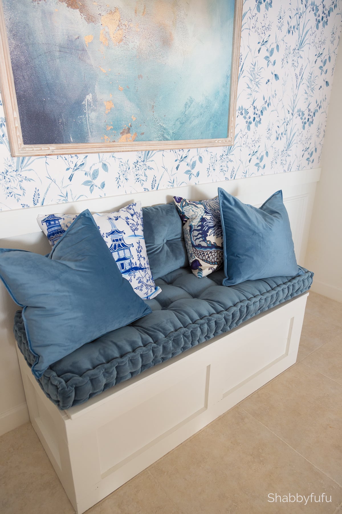
Use Color And Balance
Mixing patterns in interior design is all about achieving harmony. An essential key to achieving this is the use of balance and color to achieve a beautiful composition. My favorite way to do this is by replicating one or two similar color hues that run throughout the patterned elements in other areas of the room. This way, you create a “connecting thread” that ties everything together.
In almost all situations, this creates a balanced composition that will look harmonious, no matter the pattern combo you choose.
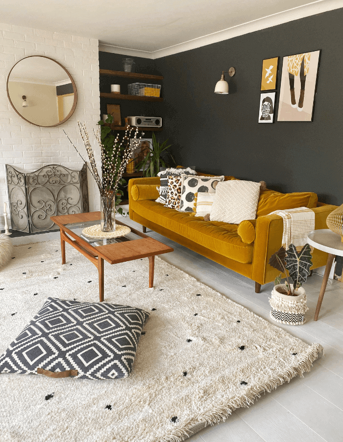
Use Solids To Break Up Busy Patterns
Too much of a good thing can turn sour quickly and this applies to mixing patterns. Too many busy patterns can be overwhelming for a space and make it feel cluttered, so it’s important to give our eyes a visual rest. How? You’ll want to use solid colors within your color scheme to break up your patterns. In a room with one large pattern (a busy wallpaper on an accent wall, for instance), you’ll want to counter it with elements in solid colors and other patterns facing the wallpaper rather than next to it.
Using solid colors and placement, you’ll break up an overwhelming pattern and balance the visual composition.
Experiment With Texture
Mixing patterns is not just about combining prints, it’s also about experimenting with texture. Textured solid colors are a more gentle way to introduce patterns to your spaces and are much easier to combine with bolder patterns.
If you’re bold, you can also use textured solids instead of plain solid colors, to create a layered and lush look in your space.
Although not patterns per se, mixing texture allows you to add depth and interest to the space similarly to classic patterns.
Test It Out
If you’re still unsure about how to go about it, my biggest advice is to test it out! This should be a fun process, but it can be challenging, so trying things out and gradually adding patterns to your decor is foolproof.
One way to test pattern mixing is by laying out different scraps of fabrics and swatches together to see how they look. This allows you to see how patterns work together, check if they clash, how the colors work with the room, etc.
Adding small decorative items with interesting patterns is also an easy way to try your hand at patterns and composition without disrupting your decor too much.
Patterned finds I’m loving and you can SHOP THE POST BELOW!
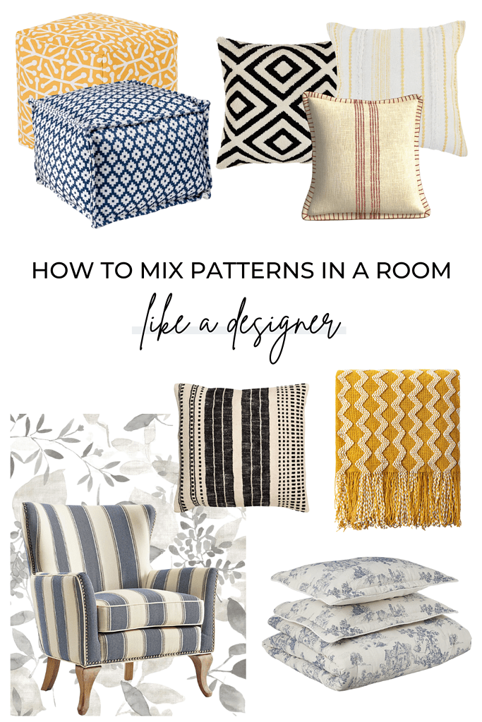
CLICK BELOW TO SHOP THE POST!
yellow striped pillow | black & tan embroidered throw pillow | black & white geometric pillow cover | natural and red pillow cover | peel & stick floral wallpaper | blue and white geometric pouf | yellow geometric pouf | light blue & white comforter set | striped accent chair | yellow & white throw blanket
Frequently Asked Questions
How many patterns can you mix in one room?
There are no hard-set rules but you shouldn’t mix more than 3 or 4 patterns together.
How can I mix patterns without making my room look cluttered?
The biggest mistakes in mixing patterns in interior design are using too many competing patterns and ignoring negative space. You can avoid these issues by picking patterns that complement one another and breaking up busy patterns with solid colors to give the eye a rest.
What patterns go well together?
- Thin stripes + Thick Stripes + Textured Solids
- Toile + Herringbone
- Ticking Stripes + Large Florals + Chevron
- Damasks + Polka Dots + Florals
- Botanicals + Geometrics
Related Posts
Decorating Floral Easter Eggs, Spring Vignettes & More – The Style Showcase 178
Luxury Kitchen Design Reveal – Complete Renovation With Photos!
Blue Living Rooms – Ideas For Every Style
Good advice
I’m going to try some new pillows!
New pillows can really refresh for the seasons DaleAnn!