Say Goodbye to Cool Tones: The Rise of Rich Warm Neutrals in 2025
This post may contain affiliate links. For more information, please see our disclosure policy.
Wave goodbye to cool tones interiors! Rich warm neutrals are bringing soul back to our homes in 2025. Discover how to transform your space with these sophisticated earth tones today!
The reign of cool gray is officially over, y’all. Those stark cool-toned hues are stepping aside for a more soulful color scheme: rich warm neutrals. And trust me, y’all will love it!
The Warm Neutral Renaissance
The shift from cool shades with cool undertones to warmer alternatives has been in the works for a few years, but lately it seems to have gone official. From the uber expensive design stores to the most affordable retailer stores, we now have absolutely stunning decor options in rich warm neutrals when before there was only cool toned ones.
And as a huge fan of rich warm neutrals, I say it’s time to embrace the warmth!
Y’all may wonder what makes these colors so special. And I get it! The undertone of your color scheme doesn’t seem like a big deal at first. But don’t let this simple detail fool you. Undertones are absolutely essential when decorating our homes. That’s their ultimate magic.
Warm and cool undertones have the amazing power to make -or break- the harmony in our spaces.
What makes warm neutrals so versatile is how beautifully they play across different design styles. In your modern farmhouse or minimalist apartment, shades like caramel and oatmeal create that same crisp, clean backdrop I’m sure y’all loved about grays, but with an added layer of sophistication that feels more intentional. For those of y’all with traditional homes or vintage-inspired spaces, these warm tones enhance all those gorgeous architectural details while adding the old-world charm traditional homes carry so well.
Cool neutrals give your spaces a more crisp feel, edging on almost stark and even cold.
Rich warm neutrals bring to the table a more earthy approach, grounding your interiors in a sophisticated way while allowing you to play with more eclectic pops of color.
My personal favorite about rich warm neutrals is how much more room it gives us all to just play with our decor.
Unlike cooler tones that sometimes can be more limiting, these muted earth tones welcome more bold color accents. From bold jewel tones to pared-down natural elements, there’s a beautiful flexibility in a rich warm neutral palette.
Rich Warm Neutrals: Room-by-Room Transformation Guide
So whether you’re an all-white decor fan looking to dip your toe into something with more depth, or a design enthusiast ready to embrace the cocooning effect of color drenching, give rich warm neutrals a chance!
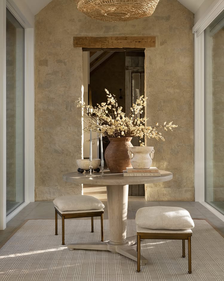
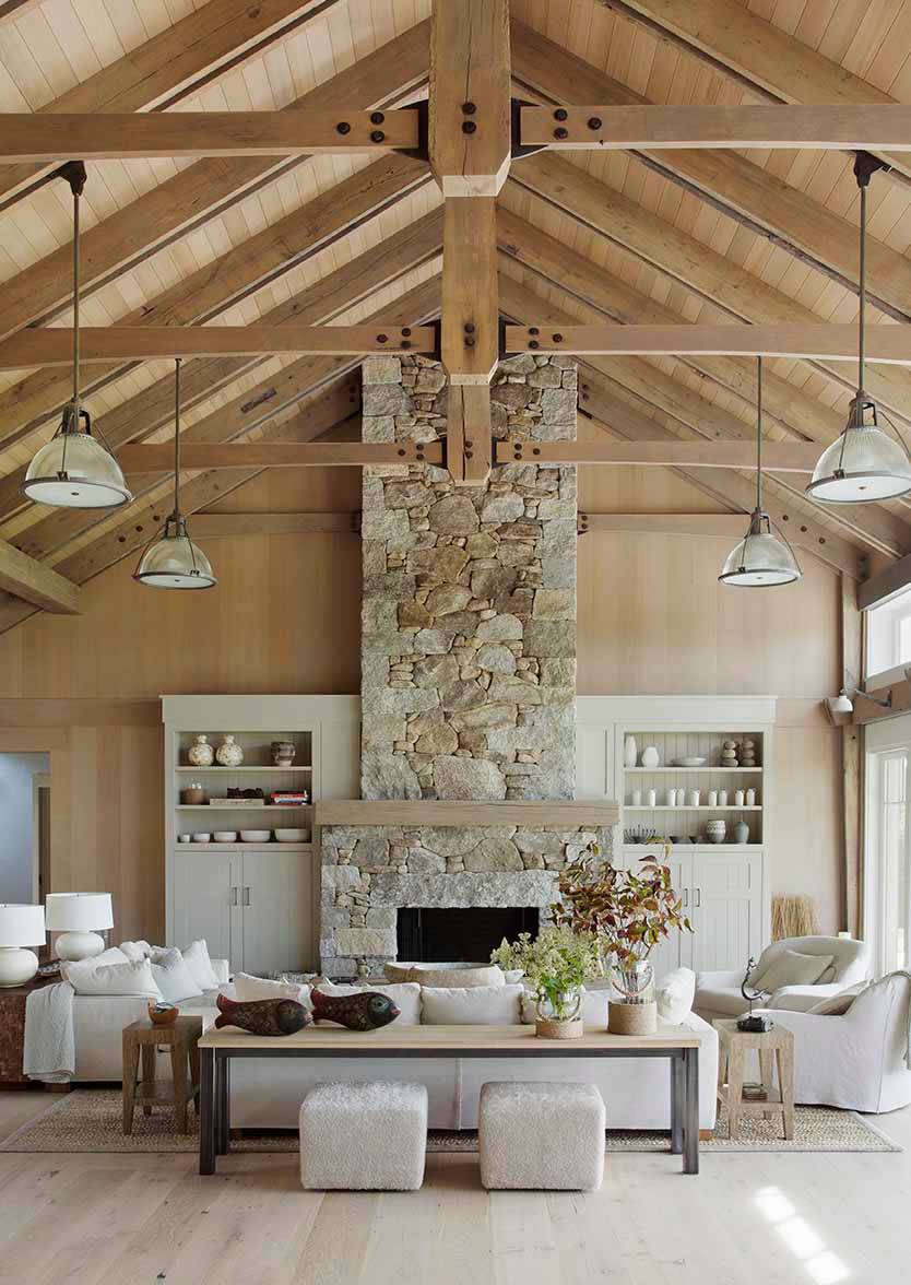
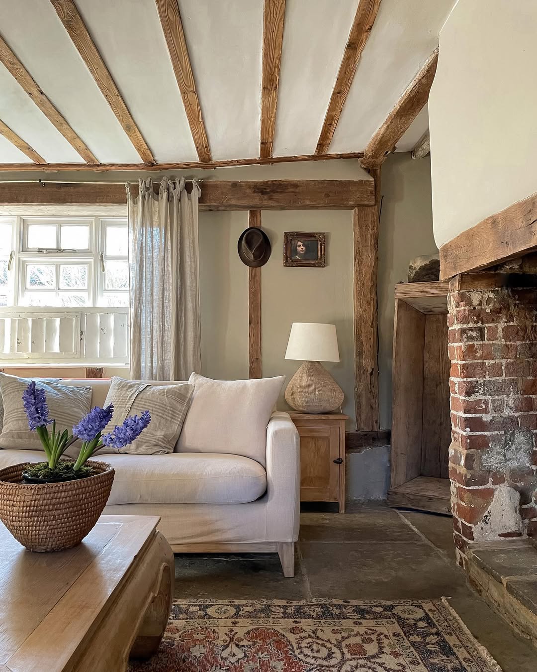
Living Spaces: Where Rich Warm Neutrals Means Welcome
While modern and clean lines certainly have their appeal, there’s something about the way warm tones instantly make a space feel established and thoughtfully designed.

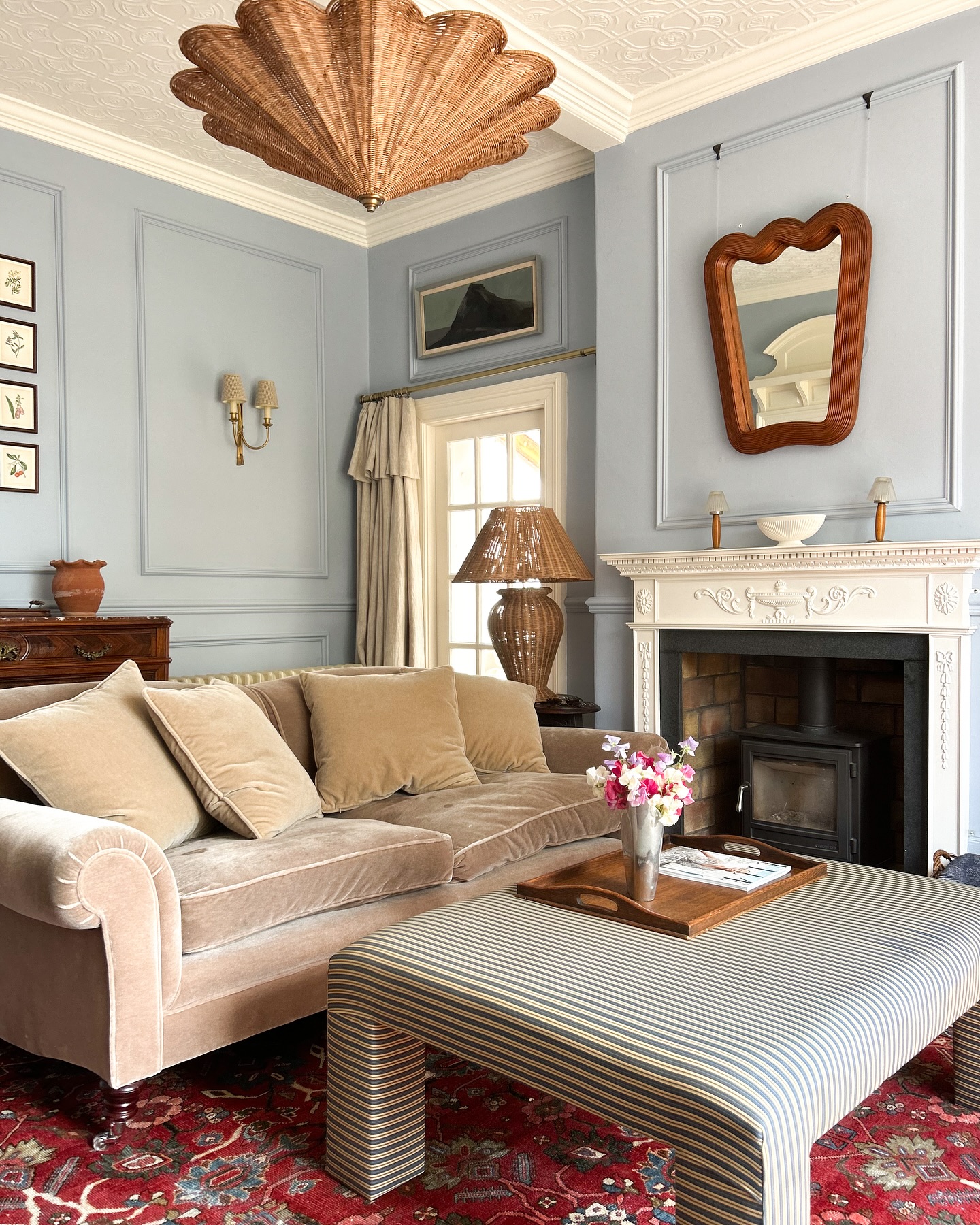
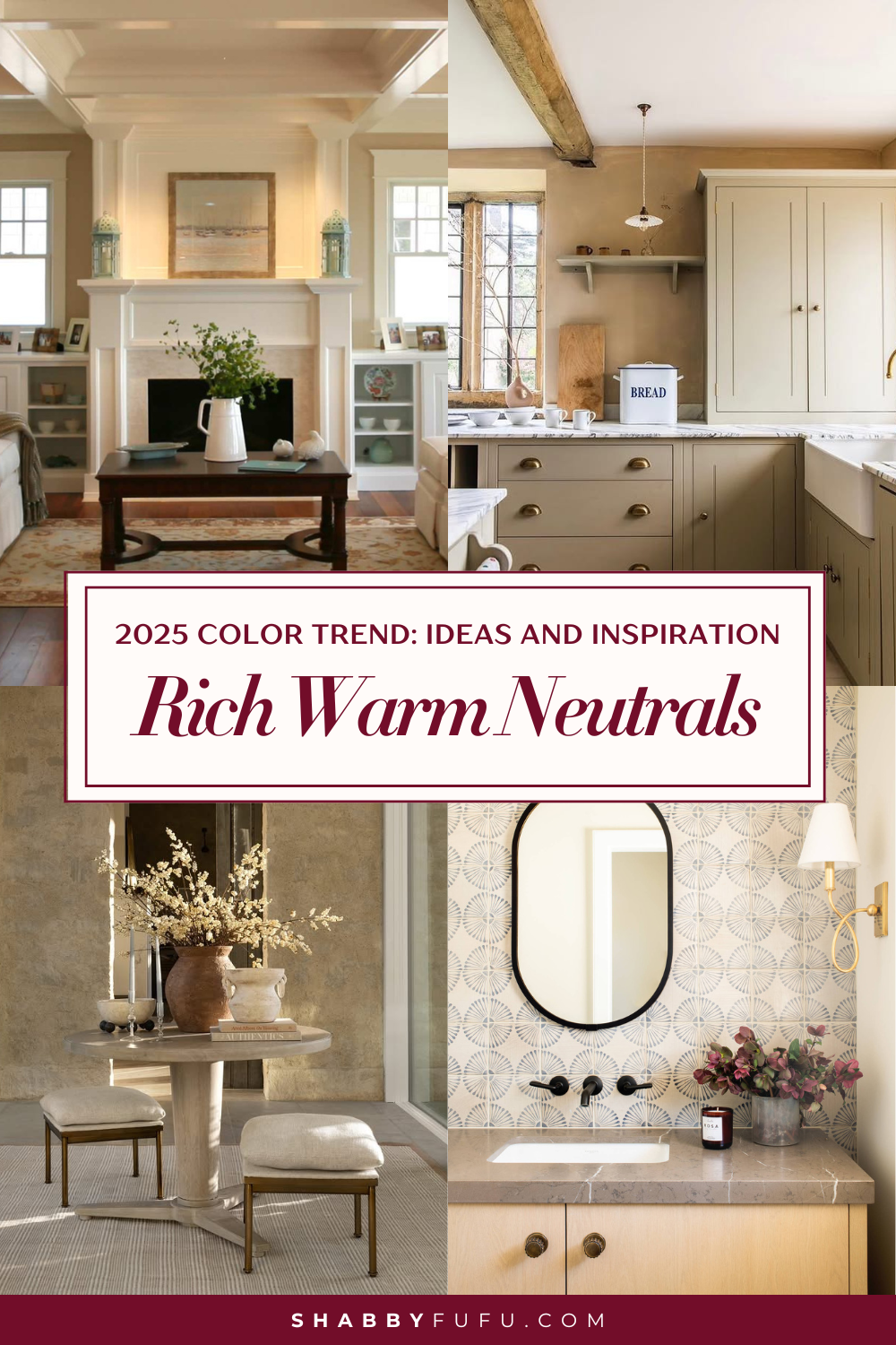
Just look at that first living room example with the coffered ceiling – the soft creamy walls paired with rich wood tones create an instantly inviting atmosphere that draws you right in without trying too hard.
The essential starting point to nail this decor look is the walls. A warm ivory or soft wheat creates will elevate the space, acting as a backdrop that feels sophisticated without being too overwhelming.
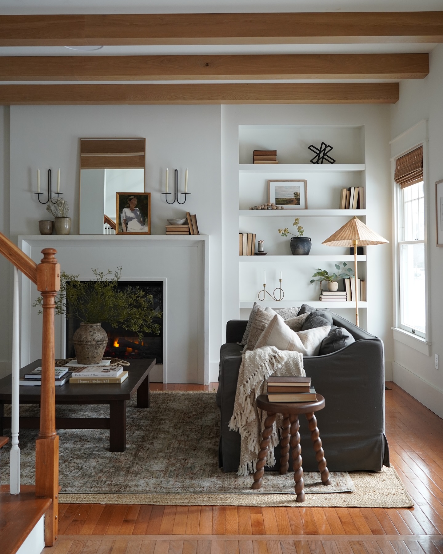
For y’all who have open concept homes, take a look at this example. The stunning exposed beams, wall colors and decor create natural transitions between spaces while letting architectural elements shine.
Upholstery choices make a huge difference too! Think buttery caramel leather that patinas beautifully over time or textured fabrics in oatmeal that add incredible dimension.
These pieces work equally well for busy families needing durability and empty-nesters, creating sophisticated entertaining spaces.
For those of y’all hesitant to fully commit, try layering in warmer elements through textiles first. Add throw pillows, table lamps or flower vases in terracotta, amber, or even a rich mossy green—all colors that sing against a warm neutral base.
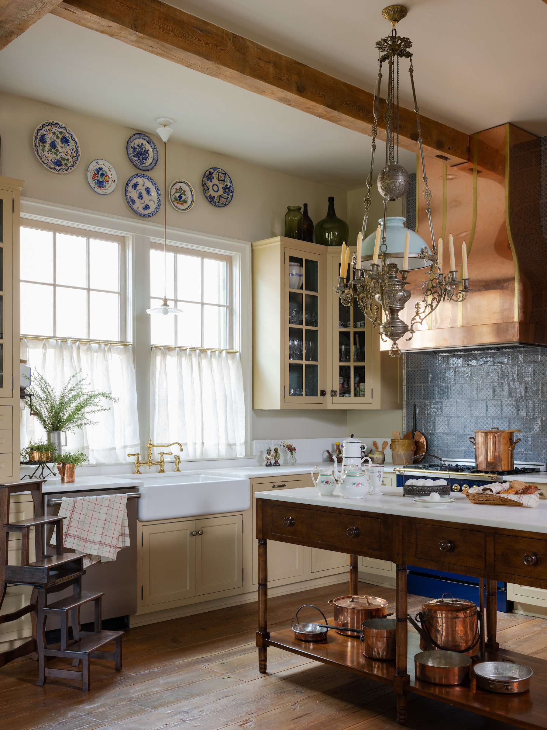
Kitchens: Embracing Warmth and Character
Kitchens are where we see the most dramatic shifts with warm neutrals, and these gorgeous examples show exactly why!
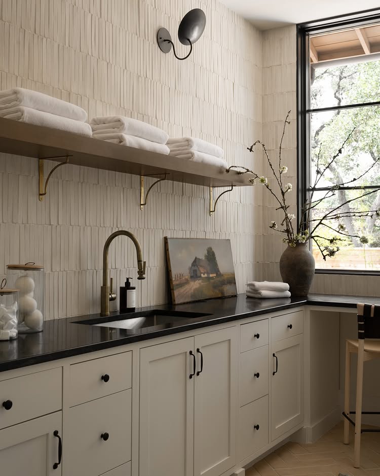
While crisp white and cool toned hues still have a strong fan club, there’s an even stronger pull toward more cozy and inviting kitchens that call to a more refined style. Stark grey cabinets turn to beige creamy ones, paired with copper accents instead of crisp silver, like in our third image of that cottage-inspired kitchen.
Here in this stunning example, y’all can see another huge color trend: a muted mushroom green paired with rich warm neutral beige. This color combo works wonderfully to create a grounded cooking space while still feeling fresh and timeless.
Notice how the brass hardware pops against the cabinetry without feeling showy—that’s the magic of warm neutrals at work!
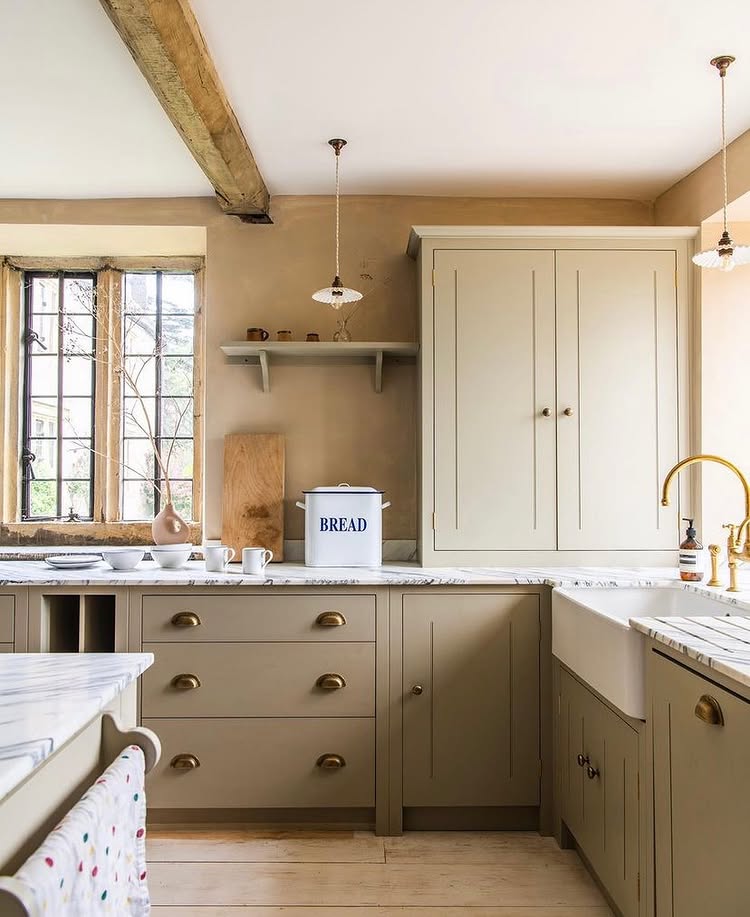
For countertops, materials with natural variation like honed limestone and butcher block are having a major moment. These surfaces create a beautiful partnership with warm cabinet colors, adding depth that uniform surfaces simply can’t match!
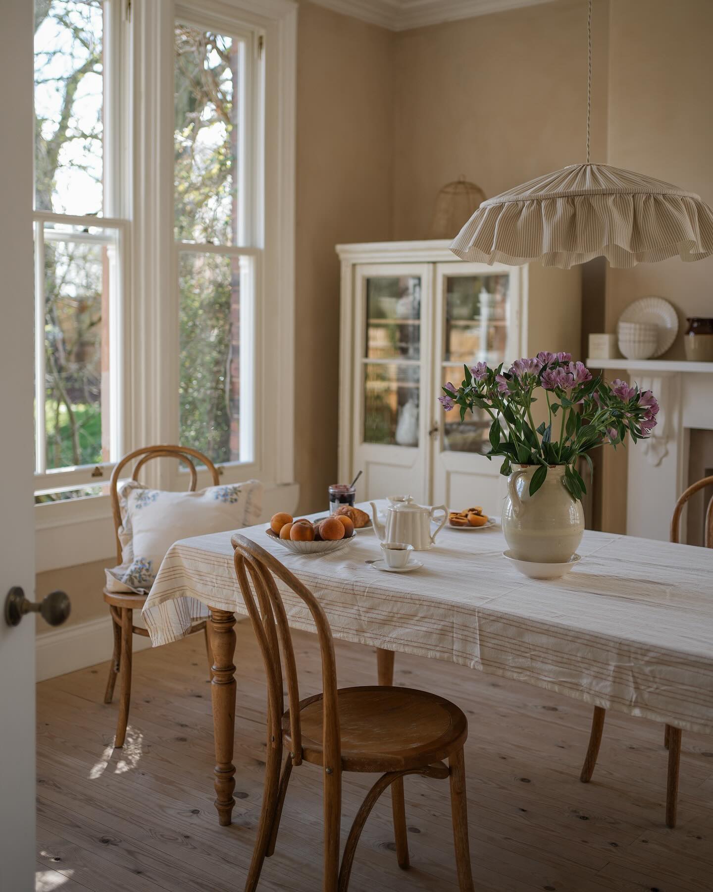
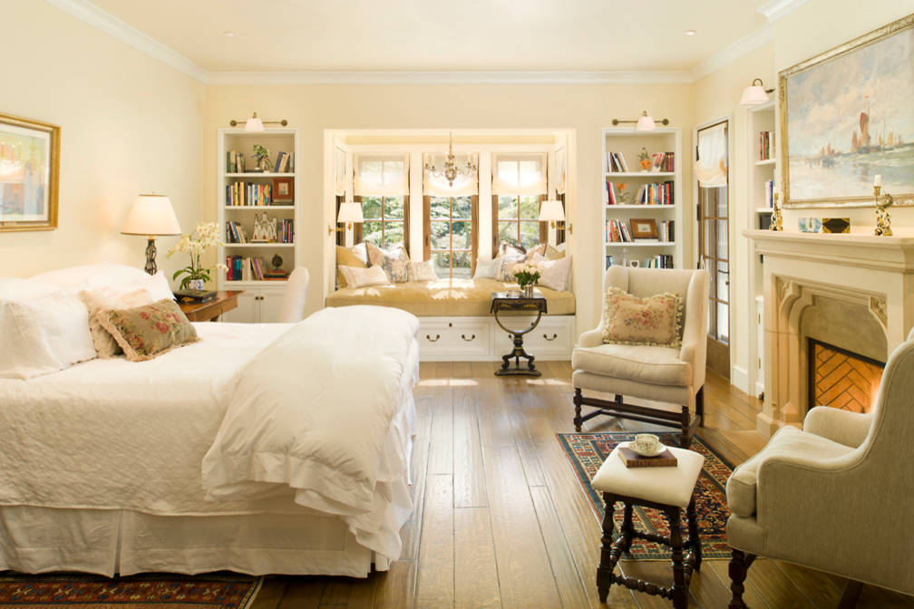
Bedrooms: Layers of Luxurious Calm
If there’s one room that benefits most from the warm neutral renaissance, it’s the bedroom!
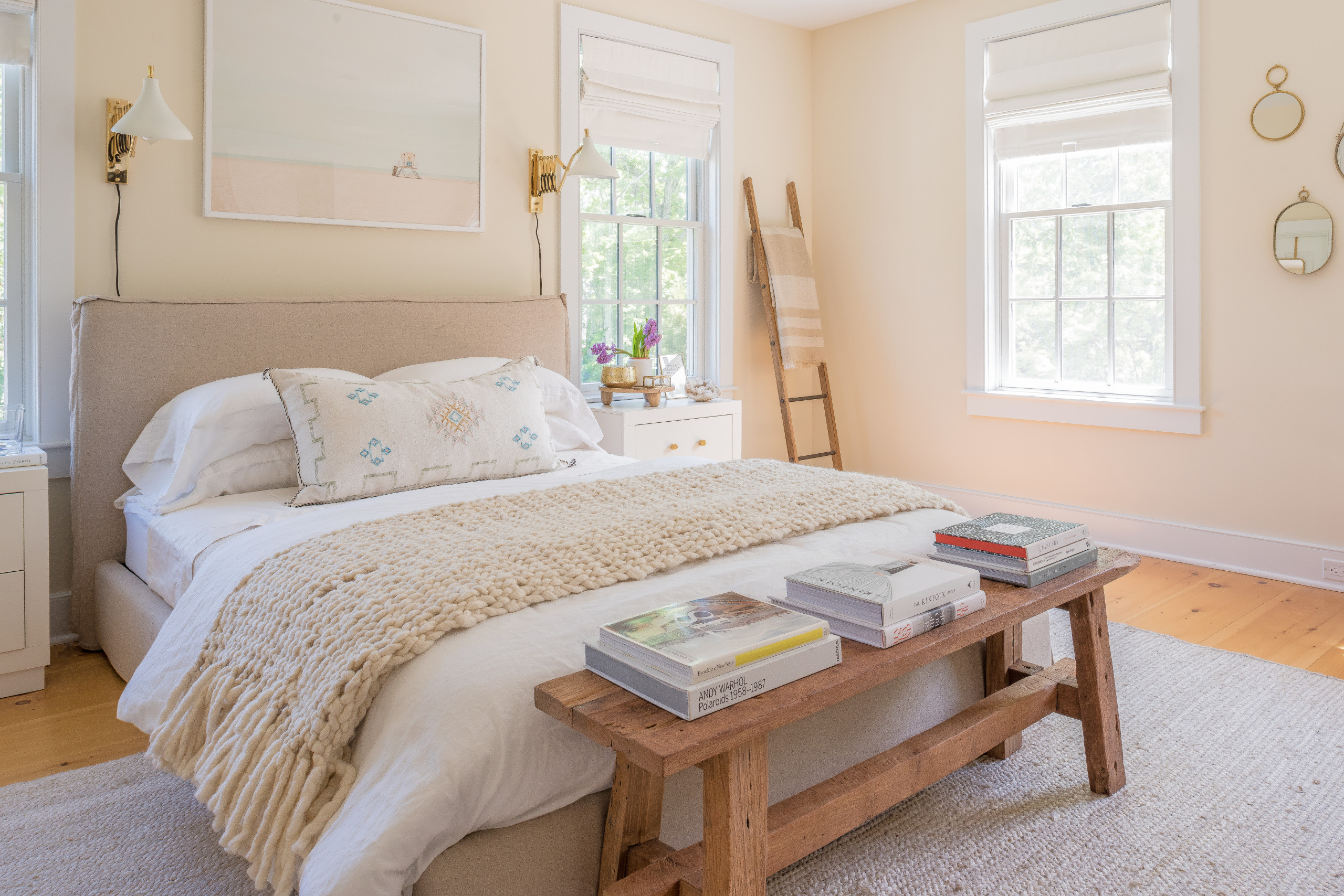
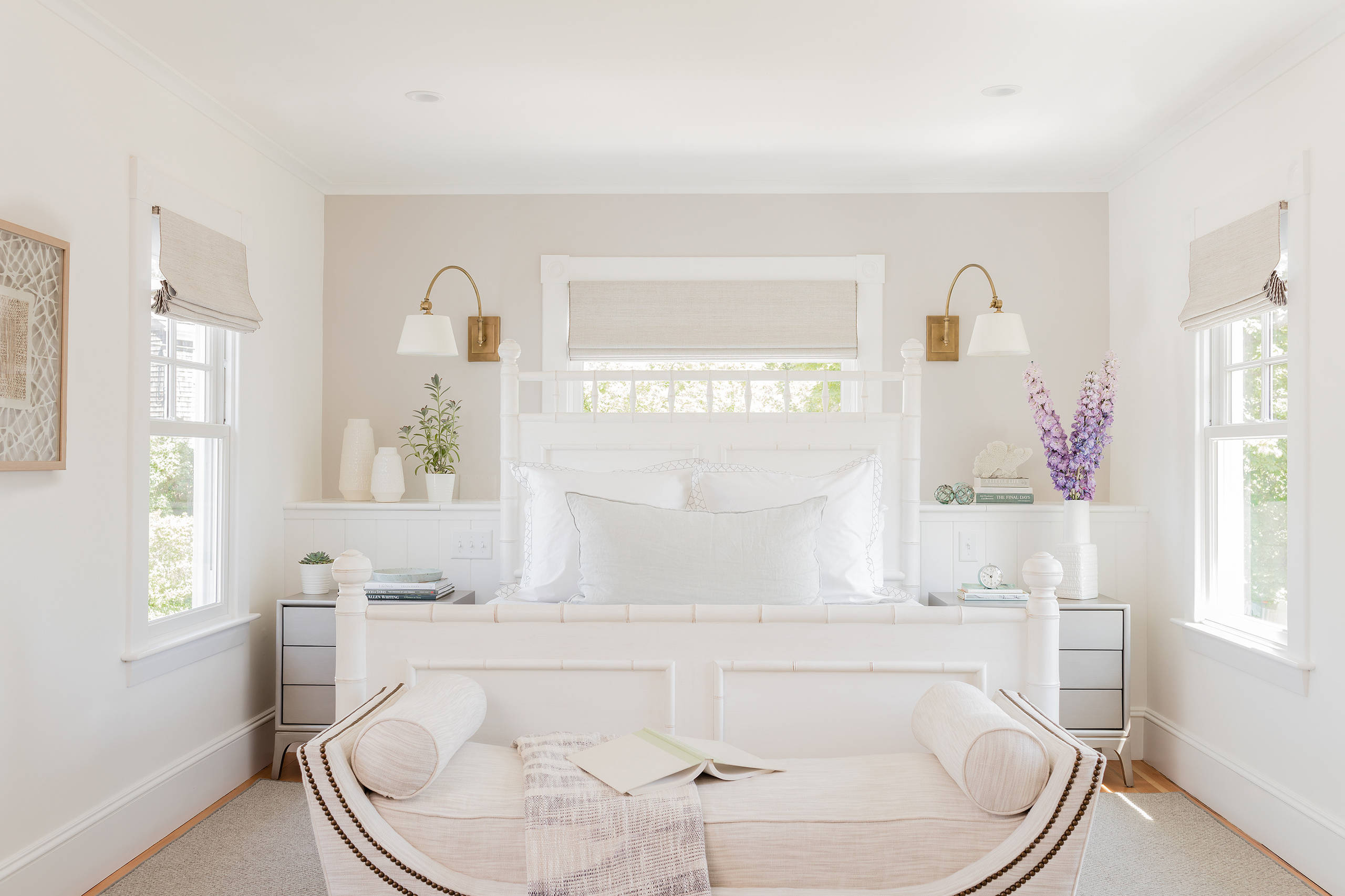
In a room where rest is the goal, a color palette of rich warm neutrals is no-brainer. The best thing about it is that just with a couple of warm additions, even an all-white bedroom can get that inviting and cocooning effect when the undertones lean warm rather than cool, like in this example.
That subtle greige accent wall creates a serene retreat while still feeling cozy rather than clinical-like. It’s perfect for minimalists who crave simplicity but need a little more extra warmth in their color story!
In contrast, y’all can see in this bedroom how the color palette embraces a more traditional approach with soft buttery walls, antique wood furnishings, and layered textiles with a warm hardwood flooring grounds the room. This style looks so beautiful in traditional styled homes.
But it also works for anyone seeking that collected look that never feels trendy or temporary.
A simple trick to get a palette of sophisticated rich warm neutrals without totally redecorating? Bedding! The bed is always the main character in a bedroom, so it’s a simple way to introduce and really play with texture in rich warm neutrals.
Bathrooms: Rich Warm Neutrals for Earthy Sanctuaries
Even the spaces like powder rooms and bathrooms can benefit from rich warm neutrals! Whether you’re working with a tiny powder room or a spacious primary bath, warm neutrals create that perfect backdrop for both relaxation and function.
Play with a spectrum of your favorite neutrals, like in this first traditional-meets-modern bathroom.
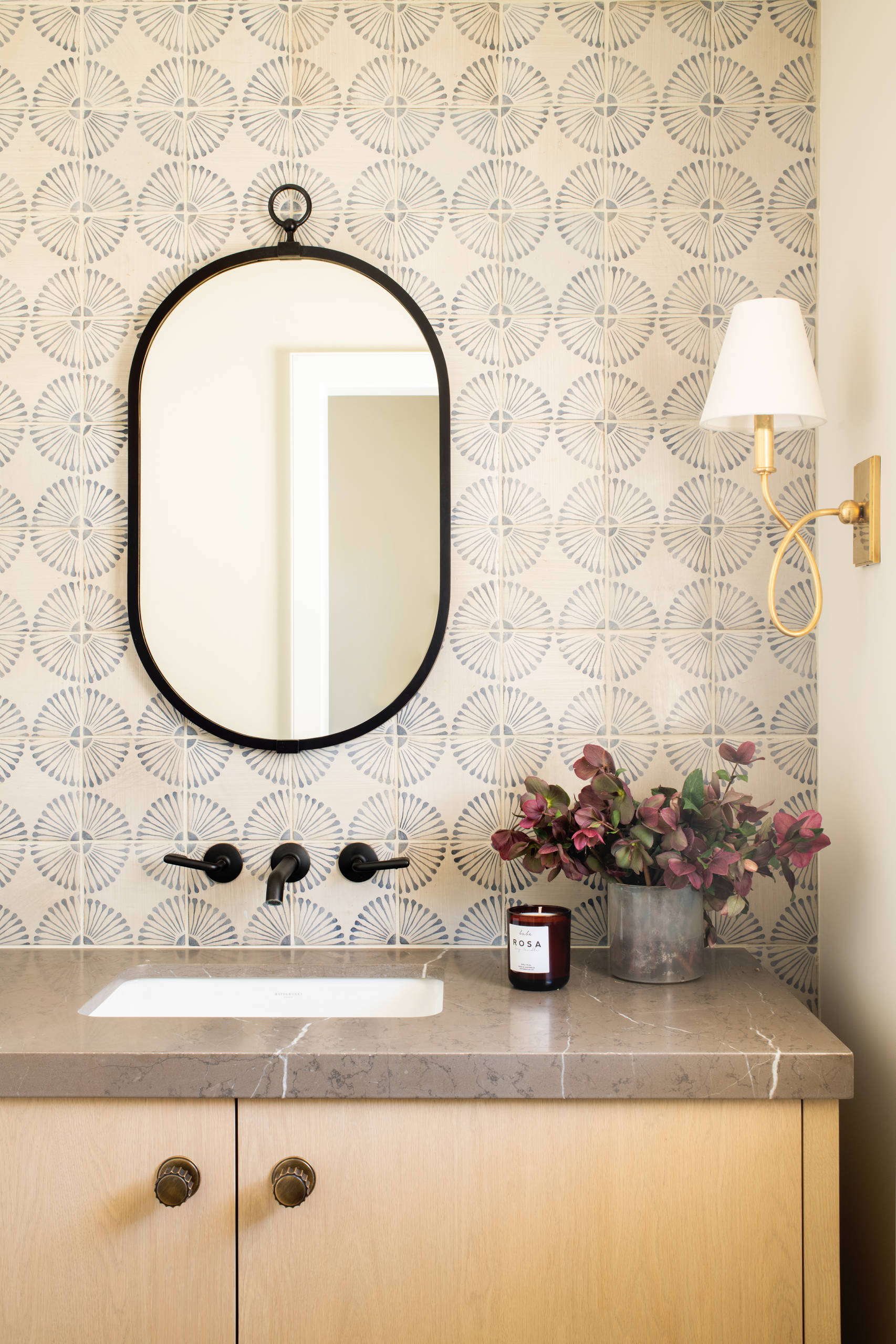
Here, y’all can see how rich warm neutrals contain so many layers when used correctly (and creatively!) as with the patterned wallpaper in cream and soft gray, warm stone countertop, and that gorgeous light wood vanity.
The brass sconce and black fixtures add just the right amount of contrast without stealing focus.
In this more traditional take, the warm and cool elements work together in perfect harmony.
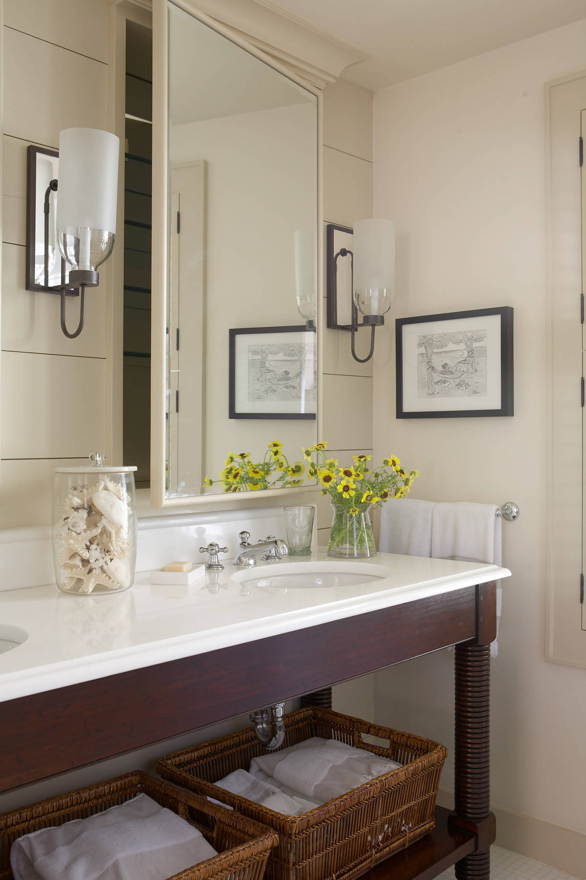
The creamy walls and rich mahogany vanity create immediate warmth, while the crisp white countertop provides just enough contrast. The warm wood tones of the furniture-style vanity add character that standard cabinetry simply can’t match.
Notice how the natural woven baskets and yellow wildflowers instantly bring life to the space. These small touches make all the difference!
Mixing Cool and Warm: The Transitional Home
A huge question that pops up when talking about color undertones is simple: Can you mix cool and warm neutrals?
The short answer? An absolute yes!
Honestly, y’all most of us cannot afford to redecorate our homes every time design trends shift. That’s another reason I just adore rich warm neutrals! You don’t need to toss that gorgeous gray sofa or replace all your cool-toned decor to embrace this trend.
Bridge with Neutrals
If you’re struggling to make cool and warm play nicely together, look for bridge colors that sit comfortably between both worlds.
Certain greiges, soft olives, and muted blues can serve as the perfect mediators between cool gray furniture and warmer wood tones or terra cotta accents.
Area rugs are just perfect for this transitional role. Look for patterns that incorporate both cool and warm hues to tie everything together.
A vintage-inspired rug with faded blues and warm rust tones be the key to balance different temperature palettes.
One surprising thing I learned through trial and error is that existing cool pieces work surprisingly well once warm elements enter the picture. That juxtaposition gives it a collected look, which feels way more personal and unique.
Start Small, Think Big
Paint offers the biggest bang for your buck when transitioning to warmer territories. Even if your furniture leans cool, warm wall colors like soft wheat, pale terracotta, or buttery cream instantly change the feeling of a space.
The best part? It’s a weekend project with the potential of a dramatic makeover. For those not ready to commit to paint, consider these easy warm-up strategies:
- Swap out cool white lampshades for ones in cream, oatmeal or even a soft amber for instant warmth
- Replace sleek chrome or silver picture frames with brass, gold or natural wood alternatives
- Layer in baskets, rattan, and other natural elements that bring inherent warmth
- Add plants in terracotta pots rather than cool-toned containers
- Invest in a quality throw blanket in a warm neutral tone (bonus points for interesting texture!)
Well y’all, I hope this little journey through the world of rich warm neutrals has inspired you to look at your own spaces with fresh eyes! Whether you’re ready to dive headfirst into caramel-colored walls or just dipping your toe in with a few terracotta accessories, the shift toward these soulful hues promises to make your home feel more inviting than ever.
I’d absolutely LOVE to see how y’all are incorporating rich warm neutrals into your own spaces! Snap a photo of your warm neutral corner and tag @shabbyfufu on Instagram or drop a comment below sharing your favorite warm neutral shade!
For more home decor ideas, take a look at some of my previous posts. You’ll love them!
Brunette Flooring: Why Dark Wood Floors Are the Hottest Home Trend of 2025
The 90s Are Back! How to Bring The 90s Decor Revival Trend Into Your Home
Textured Wall Treatments: How to Elevate Your Walls With Limewash, Plaster, and More
You have the best, most informative blog posts! I love reading them, and always learn something. Thank you!
That means so much—thank you! I’m so glad you enjoy the posts and find them helpful. I appreciate you being here! 😊💕