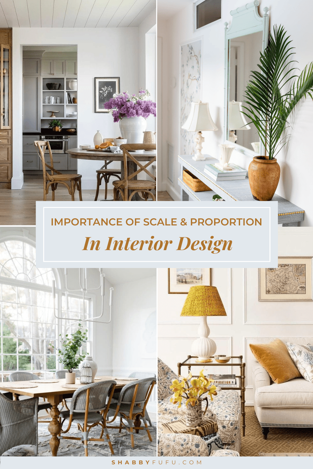
Importance Of Scale And Proportion In Interior Design
This post may contain affiliate links. For more information, please see our disclosure policy.
Learn about the importance of scale and proportion in interior design and how to apply these concepts to your home with simple tips!
A beautifully designed home is more than just selecting pretty furniture; it’s about crafting a space that’s comfortable and feels inviting. But, most importantly, it’s about striking a balance where all the elements in a room come together harmoniously with their surroundings while reflecting your unique style.
One of the critical elements in achieving this balance is understanding the importance of scale and proportion in interior design. So, in this article, we’ll go over what scale and proportion are and my favorite tips to apply them to your home!
Let’s begin by refreshing our definition of scale and proportion!
What are Scale and Proportion in Interior Design?
Scale in interior design refers to how big or small objects are in relation to the room they are in, and how they relate to the people using the space.
On the other hand, proportion is about the relationship between the objects to each other and how they complement one another.
When these concepts are used together effectively, they work as the building blocks to beautiful compositions where the achieved visual balance elevates the space as a whole.
How to Apply Scale and Proportion in Your Home Decor
Once you understand the theory behind it, you can start to see these concepts at play almost everywhere.
I’m sure that you can now pick up why certain things draw our eye more than others, and why some designs just feel “right” while others feel off. That is scale and proportion at play!
But, if you’re still struggling with practical ideas to apply scale and proportion to your home decor, don’t worry! Here are some of my favorite tips:
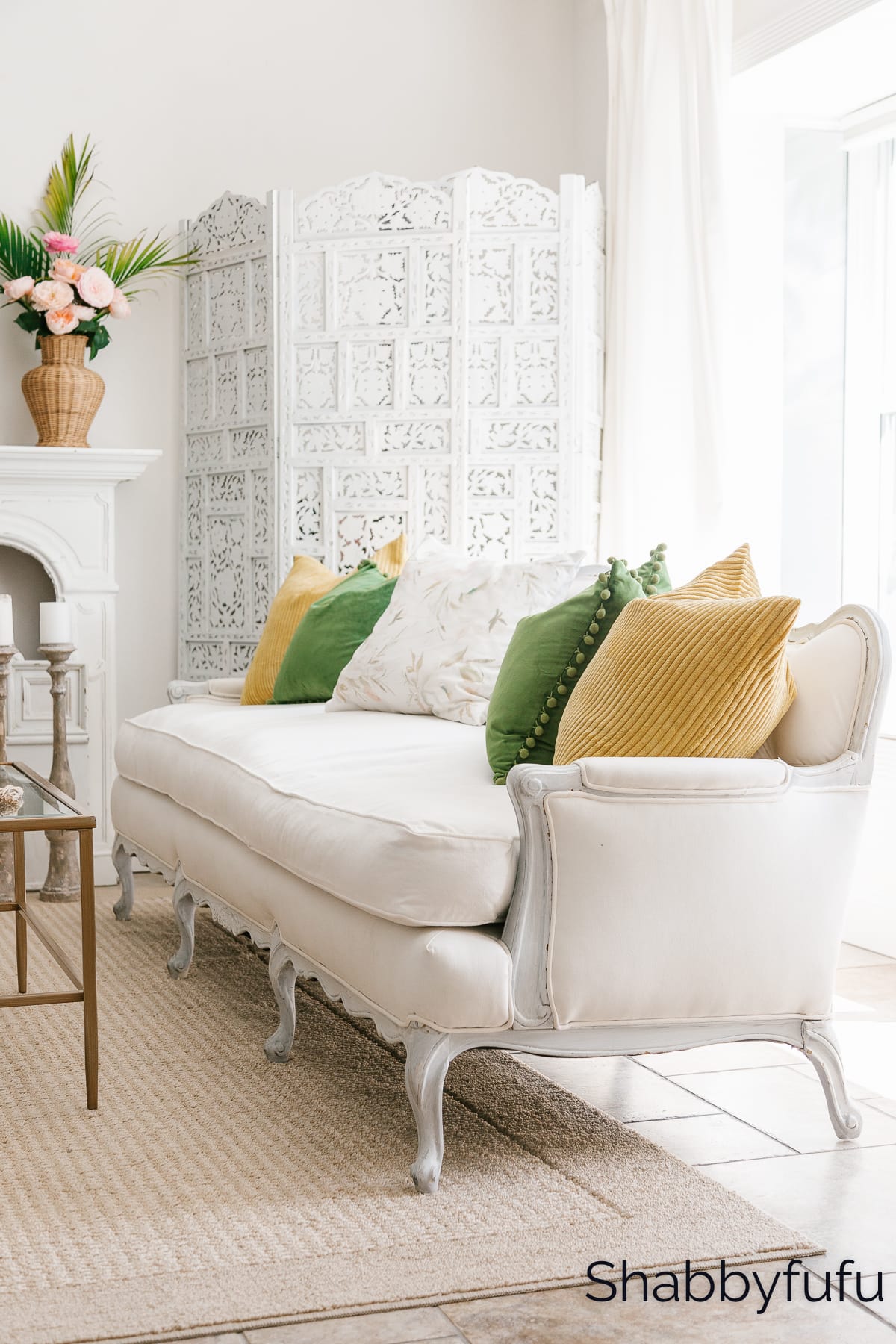
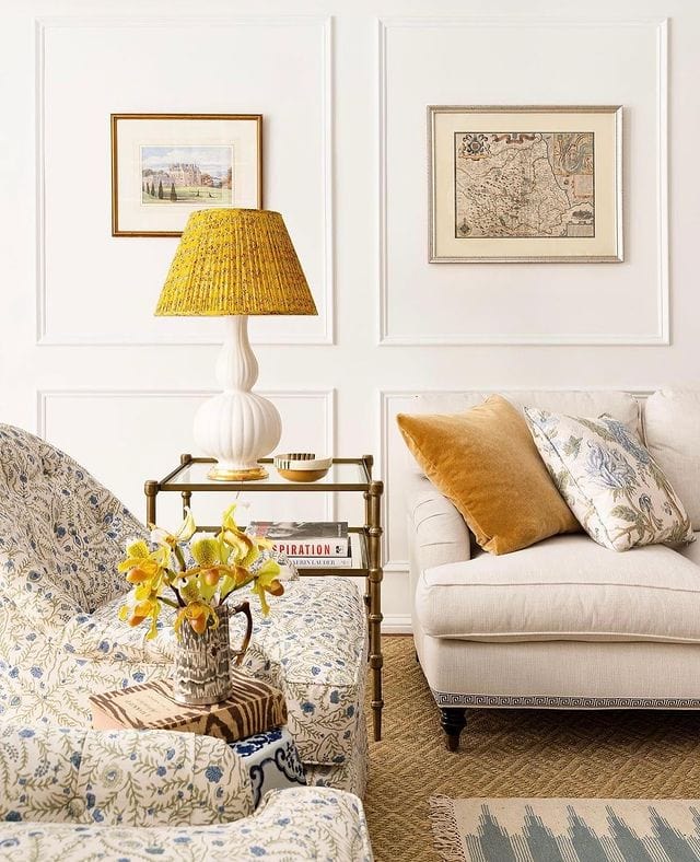
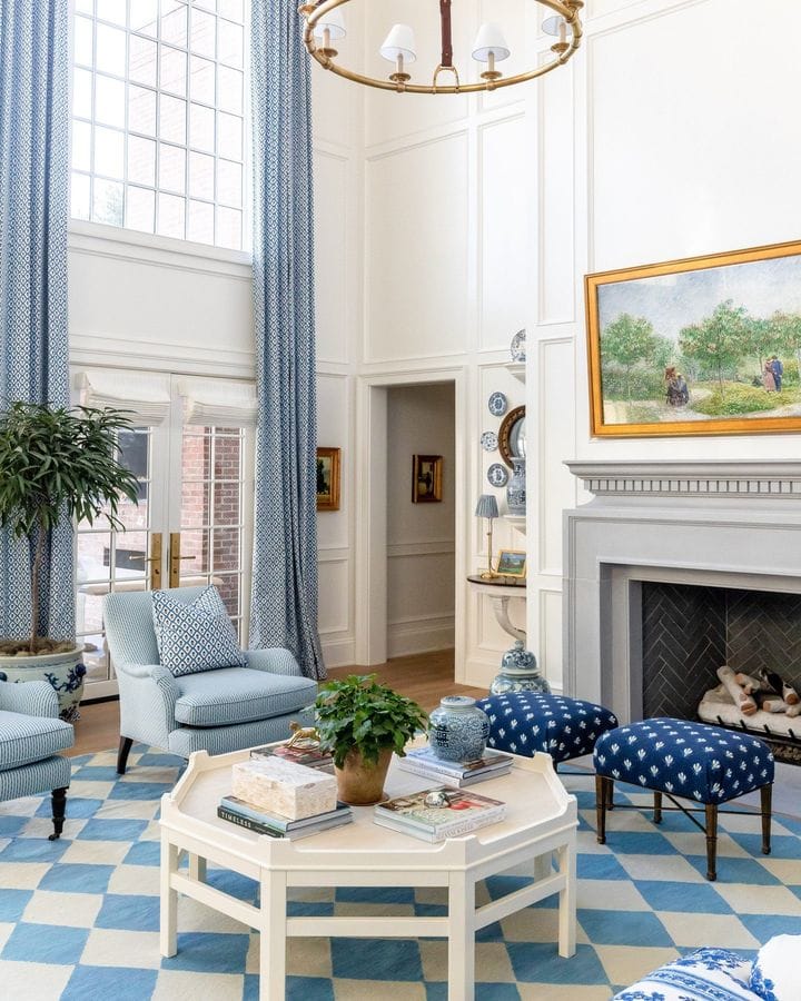
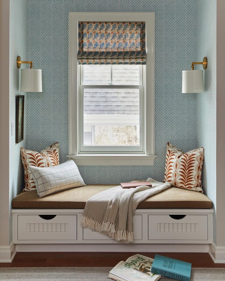
Create a Focal Point
Creating a focal point that anchors the room is a simple yet impactful way to bring a balanced sense of scale and proportion.
Setting the scale with a large focal point will help you create a visual anchor and guide the scale of the rest of the room.
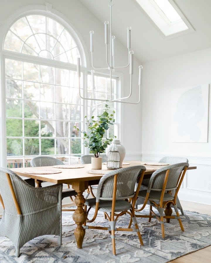
For example, a large painting can be the center of attention in a living room, while a large headboard can be the focal point of a bedroom.
You just need to make sure to choose pieces that are scaled to the size of the room and the people in it.
If you have a very large space, scaling up all your furniture is not always ideal, as it would not be scaled to the human bodies in the room. If you have a lot of foot-square to cover, try to create different areas in the room and visually divide the space without using extra large pieces.
One way to ensure that the size of the focal point is appropriate for the room is to consider the negative space around the focal point. This will help you to avoid cluttering the space with too many other decorative items that could compete for attention.
This takes us to our next tip…
Use Negative Space Efficiently
When we say negative space (or white space) we are referring to the empty areas in a room.
Making sure there’s enough “breathing room” throughout a space will create a more balanced and harmonious composition by giving the room a sense of proportion and scale.
When a room is cluttered with too many furniture pieces and decorative items, it can feel cluttered and overwhelming. By adding more white space, you can create a more airy and light feel.
On the other hand, if you have a large room, using too much negative space can make it feel empty and uninviting. So by doing the opposite and filling the room with more furniture and decor (a.k.a. adding more positive space) you can make the space feel cozier and more welcoming.
Additionally, you can also use negative space intentionally to highlight your design’s focal point and create a more dramatic statement.
A good rule of thumb to use white space efficiently is to use the golden ratio as a guide. The boil down version to use the golden ratio in interior design is to fill 60% of the room and leave 40% empty.
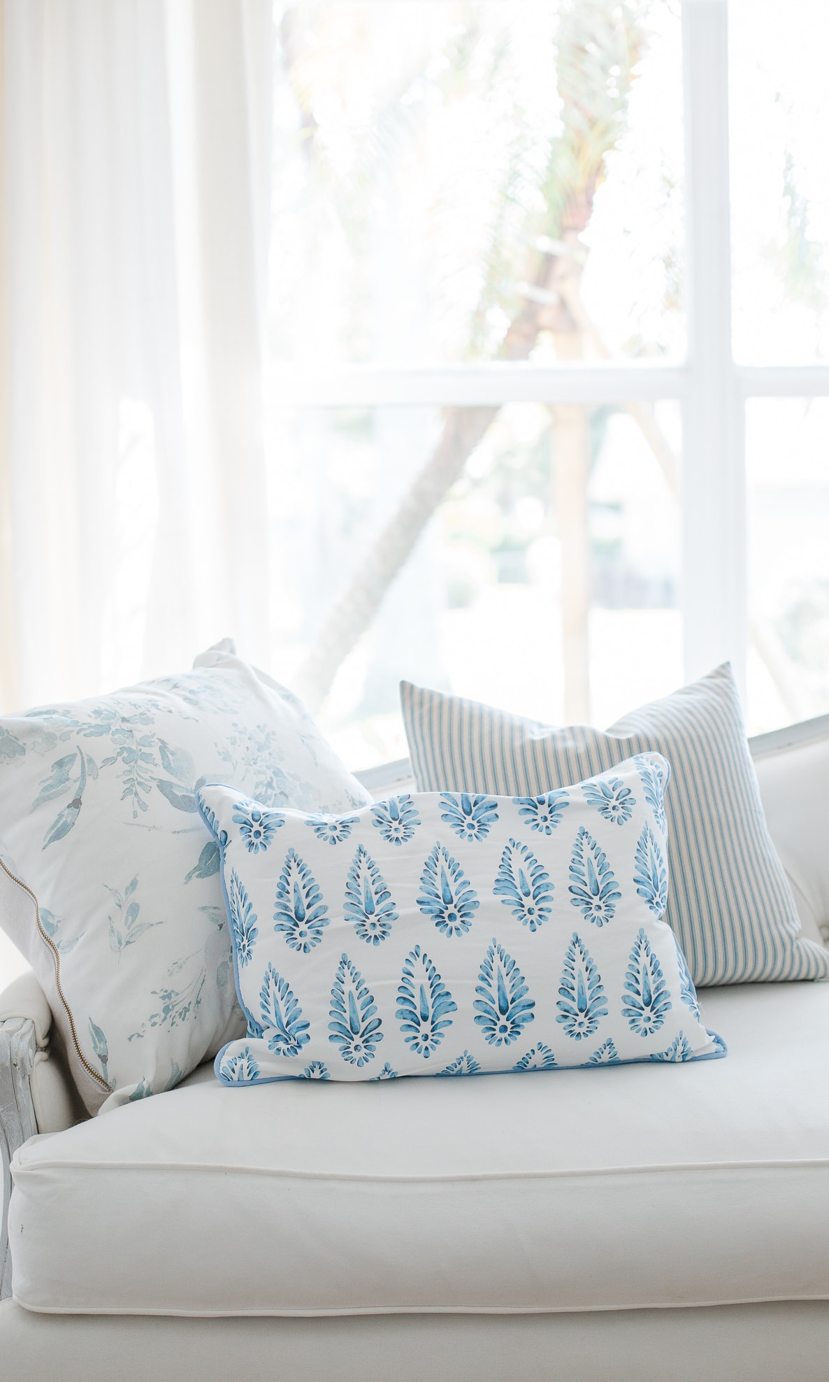
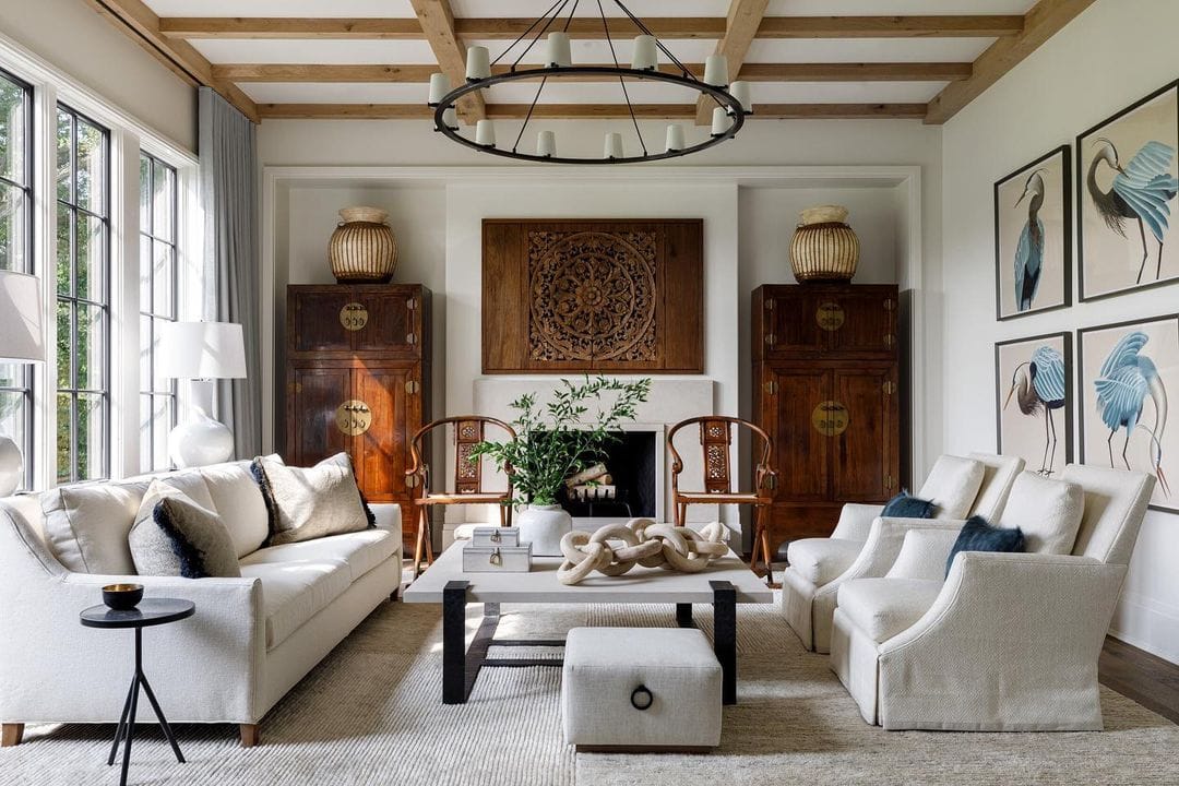
Repeat Proportions
One effective way to improve the scale and proportion of your home decor is to repeat proportions throughout the room. This means repeating shapes and patterns across the room.
When you repeat proportions, it creates a visual rhythm that helps the eye move smoothly throughout the space. This makes any interior design composition have that “wow” factor we are after.
I personally love this tip because of how versatile it is! You can apply it by repeating colors, patterns, shapes, and textures in your decor, which is a simple way to tie together different elements in the room and create a sense of unity.
Use the Rule of Three
If you want to improve the scale and proportion of a room, consider using the rule of three! I’ve written an in-depth post about it previously (click here to read it) but I’ll continue to share it with you, as I think is a simple way to elevate your decor almost instantly!
This design principle states that grouping in odd numbers creates balance and visual interest, no matter the style of the objects or the space.
This formula also allows for a lot of creativity to explore different arrangements without having to worry about keeping symmetry perfectly aligned.
Using this concept, you can draw the eye to certain areas of the room and create a beautiful visual dynamic.
Common Mistakes to Avoid in Scale and Proportion & How To Avoid Them
Wondering what are some bad examples of scale and proportion in interior design? Here are the three most.
Ignoring the architecture of the room (pet peeve):
Some rooms have unique features like high ceilings, slanted walls, or built-in shelves that should be taken into consideration when choosing furniture and decor. Similarly, overstuffing a small room with oversized furniture can instantly disrupt the scale and proportion of every other element in the area, as well as the room as a whole. So, remember to keep your space measurement and architecture details in mind when choosing your furniture.
Not measuring (so important and one that easy to do!):
Accurately measuring the space and furniture is crucial to ensuring the best result. This includes measuring both vertically and horizontally. It also includes following certain standardized guidelines to avoid interrupting the traffic flow and visual balance of the room. For example, sofas should be placed 14 to 18 inches away from coffee tables, leaving around 36 inches of space around your dining table, most artwork should be hung at an eye level of around 56 to 60 inches from the floor, etc.
Using too many small pieces (this is one that I see a lot!):
While mixing small and large pieces can create a beautiful composition with depth and visual interest, scattering around too many small pieces can make a room feel cluttered and unbalanced.
We’ve covered some of the basic techniques to elevate your home using scale and proportion. Do you use scale and proportion in your home decor design?
Related Articles:
How To Mix Patterns In A Room Like A Designer
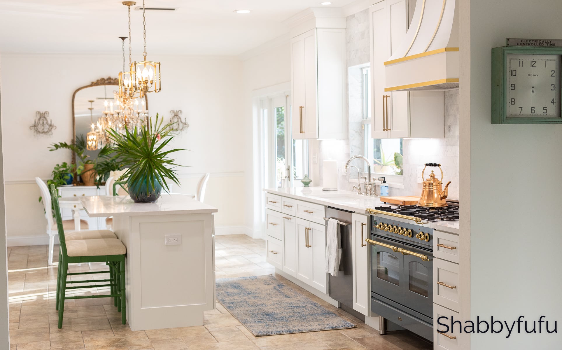
Luxury Kitchen Design Reveal – Complete Renovation With Photos!
How To Arrange Throw Pillows On A Sofa
In my case the biggest proportional challenge was my fireplace.
My living room is 15 x18. It’s a nice size room but the 9′ long fireplace that runs from the center of the wall to the right hand corner always looked wrong. It was all red brick and the mantel was only 7′ deep. The fireplace runs from the center of the room to the right hand corner. The firebox was also off-center. A few years ago, I covered the fireplace with millwork. The new mantle is 20″ deep and new pilasters make the firebox look centered. The last 18″ of the mantle is cut back to 12 inches to create a niche between the edge of the deep mantle and the wall. I had the surround and hearth covered with porcelain marble. I also changed the drapes on the 4′ wide window that’s to the left of the fireplace. Using floor to ceiling drapes that are hung to make the window look 6′ wide made the entire wall look more proportional.
Nancy, it sounds like you have found the perfect formula and solution for this challenging situation indeed. Fireplaces for some reason are often off center and I’m not sure why that’s the case!
hi
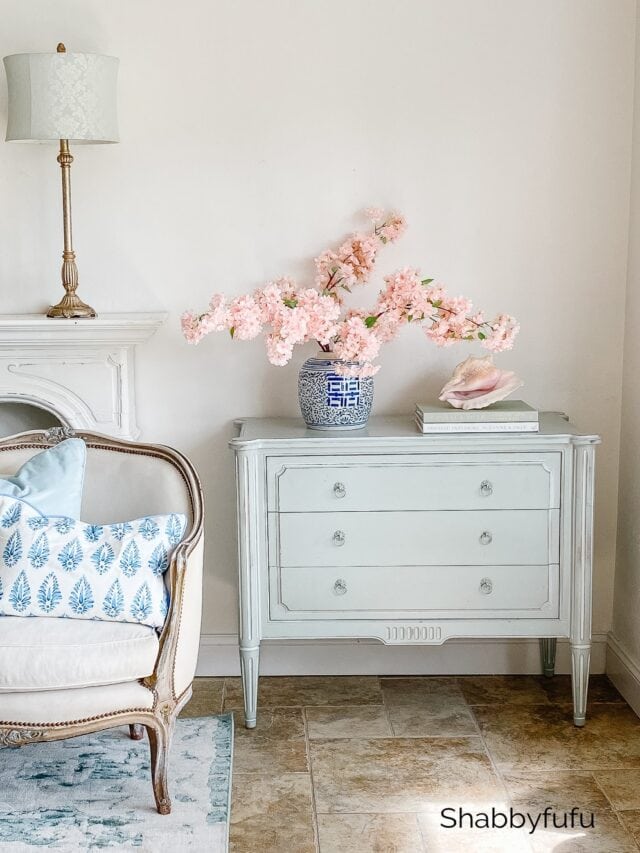
I would like to know where to purchase the light blue console pictured (the first photo under “How to apply scale and proportion….”
thank you
Here is where to find that chest, which is made by Ethan Allen:
https://www.ethanallen.com/en_US/shop-furniture-bedroom-dressers-chests/julian-chest/379201_363.html
Thank you for all this information and although I don’t have a big space , I often get complemented on how I arrange things in my tiny space.
@tisonlyme143
Hi Dorothy! We really appreciate you taking the time to read so many of our posts! While I don’t always have a moment to reply to all comments I do read them. Thank you so much! Janet