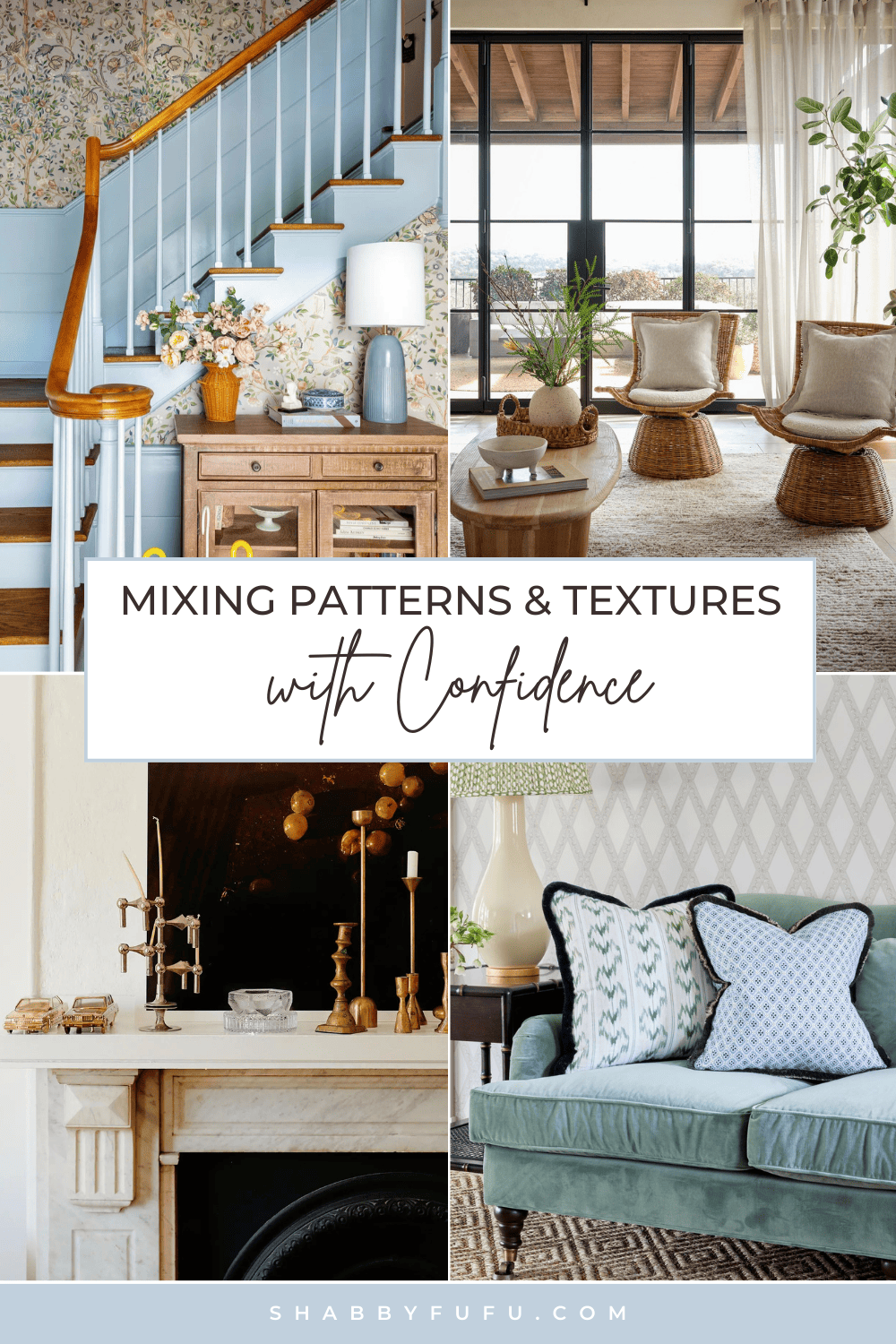
The Magic Of Mixing Patterns and Textures with Confidence
This post may contain affiliate links. For more information, please see our disclosure policy.
Learn the secret of Mixing Patterns and Textures and elevate your home decor!
Ever wondered how some homes effortlessly have that magazine-worthy look?
A lot of times, that magical polished, put-together look comes down to mixing patterns and textures the right way!
It’s not just a few choices here or there- it’s an actual strategy that can totally transform a room, making it feel way more interesting, inviting, and unique.

When you layer complementary prints and varied surface textures, you create depth and visual interest that a flat, monotone space could never achieve. It adds richness and dimension, giving the eye more to explore and appreciate. And it’s not as intimidating as it might seem! With some basic principles and a dash of confidence, anyone can nail that layered and chic look.
Mixing Patterns and Textures: Understanding the Basics
Patterns:
A pattern is any design that repeats in a consistent, regular way. It could be, lines, shapes, colors, or images that are arranged over and over to create a distinct motif.
In interior design, patterns are used on fabrics, wallpaper, rugs, tiles, and other surfaces to add visual interest, texture, and personality to a space.
Textures:
Texture refers to the surface quality or feel of a material. It’s how smooth, rough, soft, hard, matte, shiny, etc. something is.
Different textures absorb and reflect light in unique ways, creating highlights, shadows, and contrasts. This is one of the many reasons why texture is used in interior design to add depth, dimension, and visual interest to a space.
Steps To Consider When Mixing Patterns and Textures
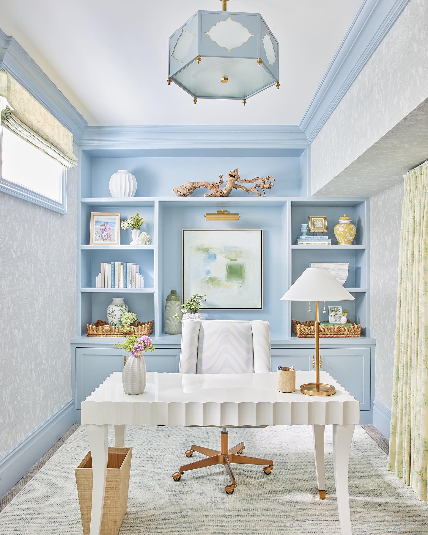
Color Palette
You should always ground your composition in the color palette when mixing patterns and textures.
Whether you prefer a soothing monochromatic scheme, bold complementary hues, or soft analogous shades, the colors you choose will act as a unifying thread in the space, bringing it all together.

When layering patterns and textures, it’s crucial to settle on a cohesive color palette. This will help you have a solid visual foundation where all elements work together harmoniously.
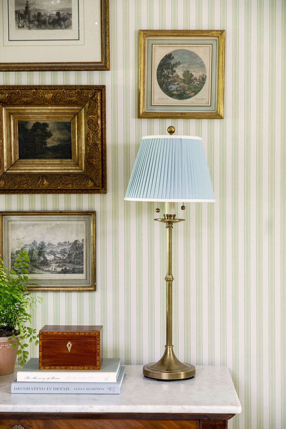
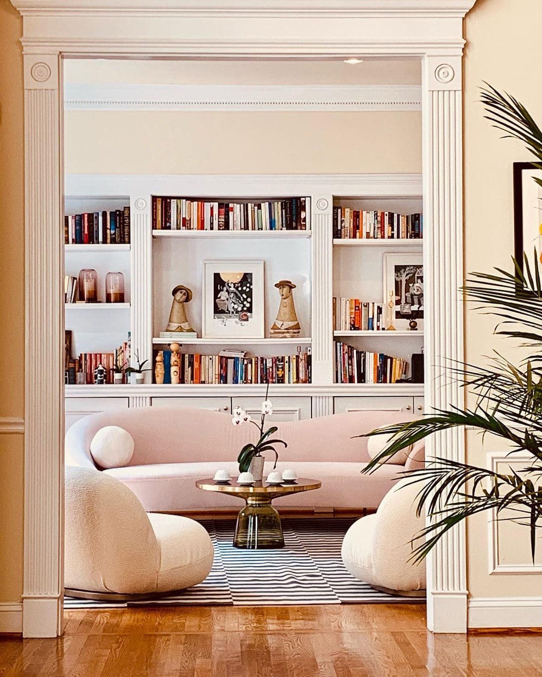
Using Neutral Shades When Mixing Patterns and Textures
Whichever direction you go, don’t underestimate the power of neutrals! Whites, beiges, tans, those are going to be your anchors in the sea of pattern and texture.

Neutral tones like whites, grays, and beiges also play an essential grounding role.
These shades keep things balanced and offer breathing room so the space doesn’t feel overwhelming. Use neutrals liberally!
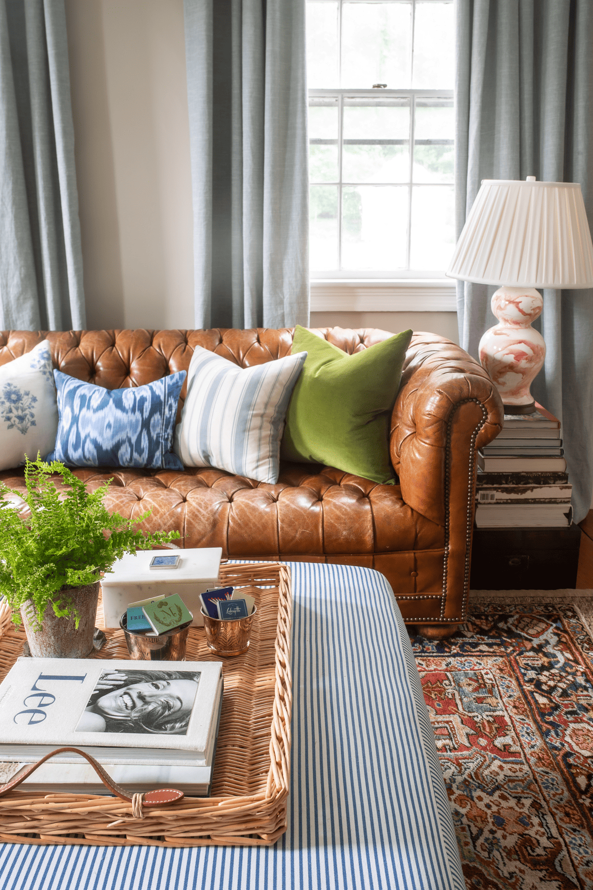
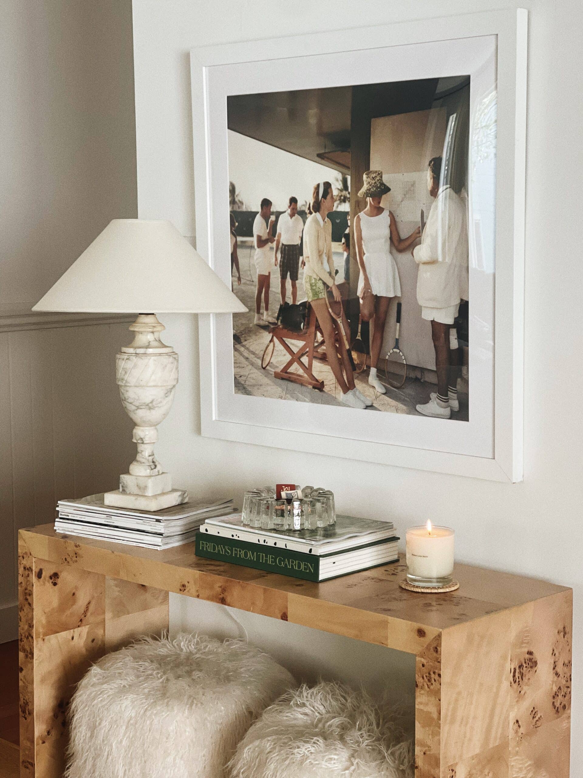
Choosing Complementary Patterns and Textures
Alright, let’s start layering those patterns and textures! First things first, you’ll want to choose one standout print or design that fits with your color scheme.
Maybe it’s a bold geometric rug, a colorful floral wallpaper feature, or even just some graphic accent pillows on the sofa. Whatever pattern speaks to you most, make that your starting point and central focus. Let it set the tone and lead the way for the rest of the space.
Once you have it in place, you can start building up layers around it – bringing in complementary prints, textures, and colors that accentuate and play off that dominant motif. But don’t overcomplicate things at first. Establish that eye-catching focal point first, then enhance it from there.
If you want to add more patterns into the mix, look for prints that share colors or shapes with your main design. This creates a sense of cohesion – maybe it’s another floral pattern that has the same deep blue tones, or a geometric print with similar angled lines.

As you bring in these complementary patterns, have some fun playing with scale. Don’t just stick to one size – mix it up! A large-scale paisley paired with a petite polka dot can be unexpectedly chic. Just make sure to balance the ratio!

You don’t want an overpowering big print dominating a smaller delicate one, so it’s better to distribute your patterns thoughtfully. This way, no single area feels too busy or too bare.

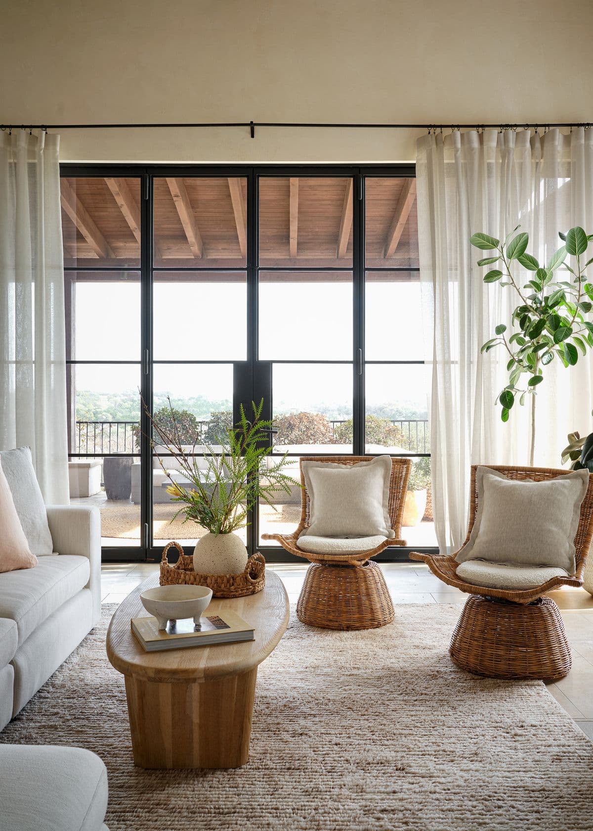
Layering Textures:
When layering texture, the real key is thinking about contrast and balance. It’s not just about how things feel to the touch, but also how they play off each other visually.
A super sleek and shiny coffee table, for example, could use something more nubby and matte alongside it to create breathing room for the eyes. Something like a chunky wool rug in a lighter tone.
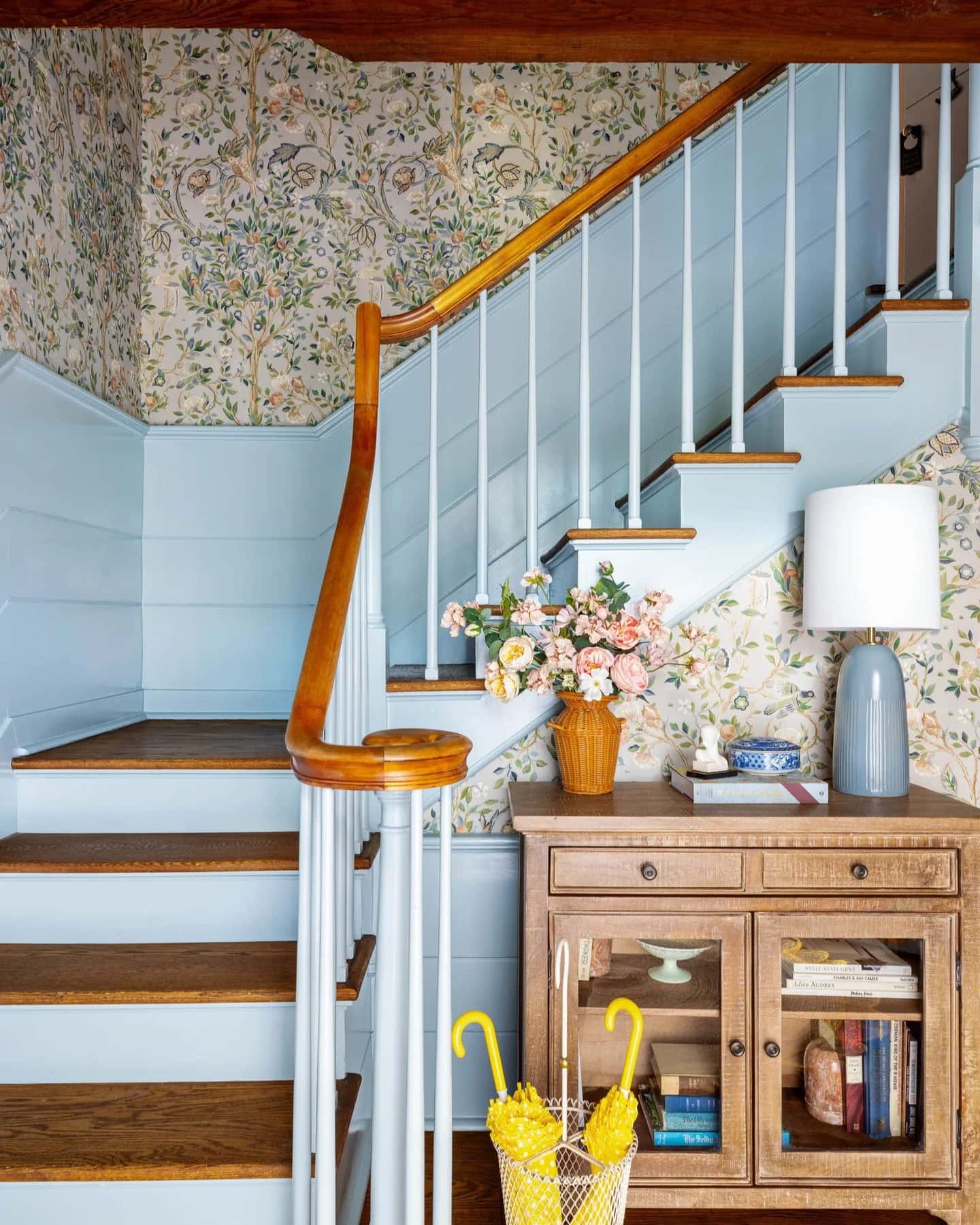
In the same way, pairing a bold floral wallpaper with pastel hues and weathered natural wood creates the perfect counterpoint to soften up the visual noise.
It’s all about finding the right balance. Too many shiny surfaces will start to feel stark. Too many rustic finishings can veer into an unpolished look. The art is in balancing the nubbly elements with the sleek ones and the reflective surfaces with the matte ones.
Pro Tip When Mixing Patterns and Textures
As you get into the groove of layering patterns and textures, it’s important to keep your eye on the overall balance and flow. If you feel it’s starting to feel too visually busy, rein it in by editing out some elements or bringing in neutral elements to balance out the composition. The aim is to maintain visual interest without overdoing it!
And there you go! I hope you enjoyed this guide about mixing patterns and textures in home decor.
If you like this post, you’ll love these too. Check them out!
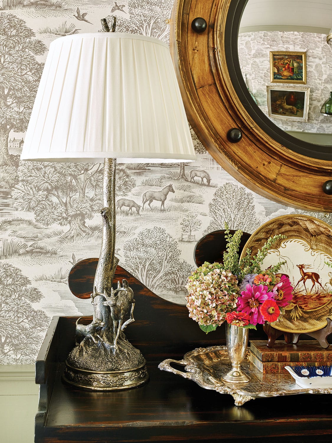
I enjoyed this post, but now I’m tortured! I need that wallpaper in the last photo, grazing horses & pheasant without people. I’ve tried google lens, to no avail. Any leads greatly appreciated!
Hi Callie, the photo is actually from designer James Farmer and I believe that I found what you’re looking for:
https://www.alexanderinteriorsltd.co.uk/category-1445/Royaloakwallpaper.html
Hope this helps ☺️
I enjoy seeing the mix of prints and would like to try to add some small amount of wallpaper but finding that right one that won’t drive me crazy after the first year:0)
Great post!
I also now want that green velvet sofa…and the one they keep showing on Wayfair! Decisions!
I have a hard time deciding when it comes to wallpaper too Lori. That’s why peel and stick is great, for those who may get bored quickly!