Common Decorating Mistakes To Avoid for a Stylish Home
This post may contain affiliate links. For more information, please see our disclosure policy.
From clashing furniture styles without a cohesive vision, to neglecting the power of proper lighting and thoughtful rug placement, these common decorating mistakes can quickly ruin the look and feel of even the most stylish homes. The solutions are simple, luckily!
By sidestepping these frequent common decorating mistakes, you’ll be well on your way to the home of your dreams (and Insta-worthy shots!).
Common Decorating Mistakes To Avoid for a Stylish Home
Consider this your cheat sheet to avoid common decorating mistakes for a fabulously stylish home! Now, let’s dig into the top decorating mistakes to avoid.
Mismatching Without a Vision
While we don’t want our homes to look like cookie-cuter catalogs, bringing together vastly different designs without a unifying thread can leave a room feeling chaotic and disconnected.
The fix is quite simple, luckily. Choose an overarching style as your guide!
Coastal, transitional, farmhouse chic… no matter the style you go for, it’s important to have one for reference and to avoid losing your concept. Having this core aesthetic in mind allows you to build outwards, selecting anchor pieces, coordinating colors, and complementary accents that harmonize with the overall look. It provides a vision to keep you from veering off course.
Having a clear vision to guide you through the decorating process is also important if you want to mix and match more than two styles together for a more eclectic look. It’s an easy way to double-check if you’re keeping a balance between your elements. Identifying an overarching concept first will help you keep everything in balance.
Have a look at my guide on how to create a mood board for interior design that includes a free template. Click HERE!
Common Decorating Mistakes: Scale Snafu
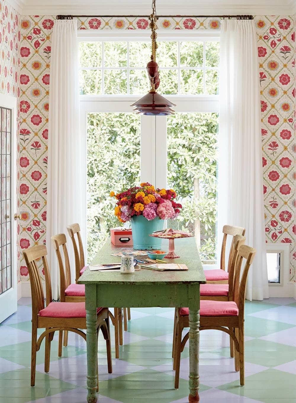
Understanding and using the concept of scale is crucial for a stylish room. All too often, we miss the mark by choosing pieces that are too large and overpowering for the space, or too small for their surroundings.
A common example is pushing an oversized sectional against one wall in a small space, leaving little breathing room. While meant to maximize seating, it makes the entire area feel cramped and is not functional for the room’s primary goal.
The solution to this issue is the right use of scale and proportion. Now, that is a topic on its own that I’ve discussed previously. Click HERE to read it!
But, here’s the essential idea:
Scale and proportion in interior design refer to the relationship between objects in a space. Scale involves the size of objects in relation to the room, while proportion considers how these objects relate to each other in terms of size, shape, and placement, to ensure visual balance.
After getting familiar with the concept of scale and proportion, you also need to measure. Not measuring the space or the furniture is among the most common decorating mistakes.
Before you purchase anything, make sure the measurements will work on your space.
To be extra sure, measure the room where the furniture will be, the specific area where you’ll place it, and some of the items that will surround it.
This way, you’ll get a good idea of how your new piece will impact the flow of the room.
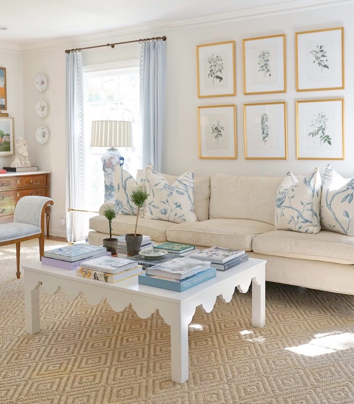
Scale, Proportion, Decor & Rugs
Scale is also a huge issue that comes into play in other aspects of decorating, like with rugs. To keep costs down, many defaults to a small area rug rather than splurging on one of a more appropriate size.
But, a rug that’s too small can throw off the entire room and not properly work for its function.
Generally speaking, your area rug should allow all four legs of the surrounding furniture to at least partially sit on it.
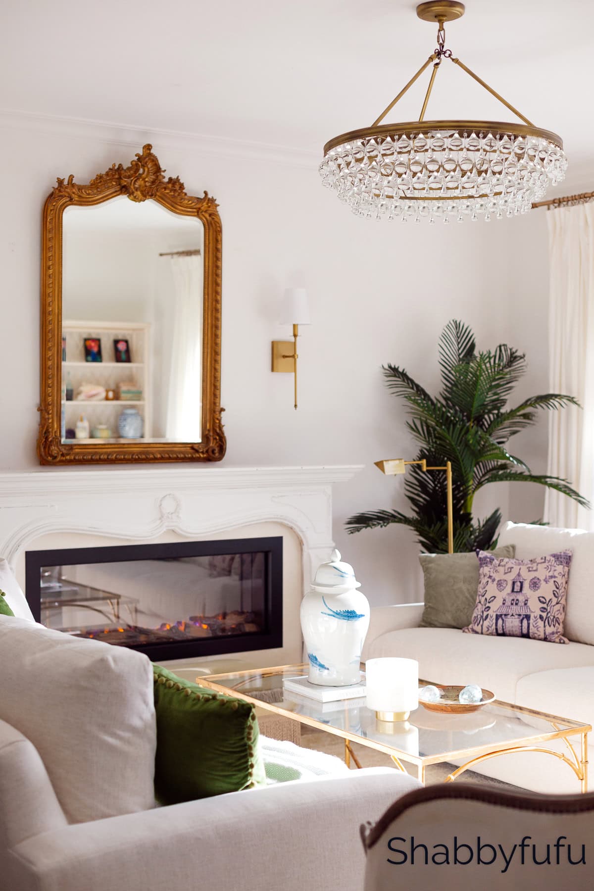
One of the many common decorating mistakes is not considering how scale applies to artwork and lighting. An enormous mirror or chandelier can overwhelm a tiny powder room, while diminutive pieces get lost in a larger space. Remember, balance is key for stylish interiors!
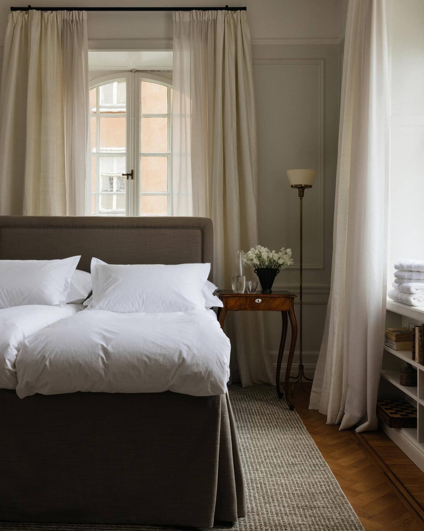
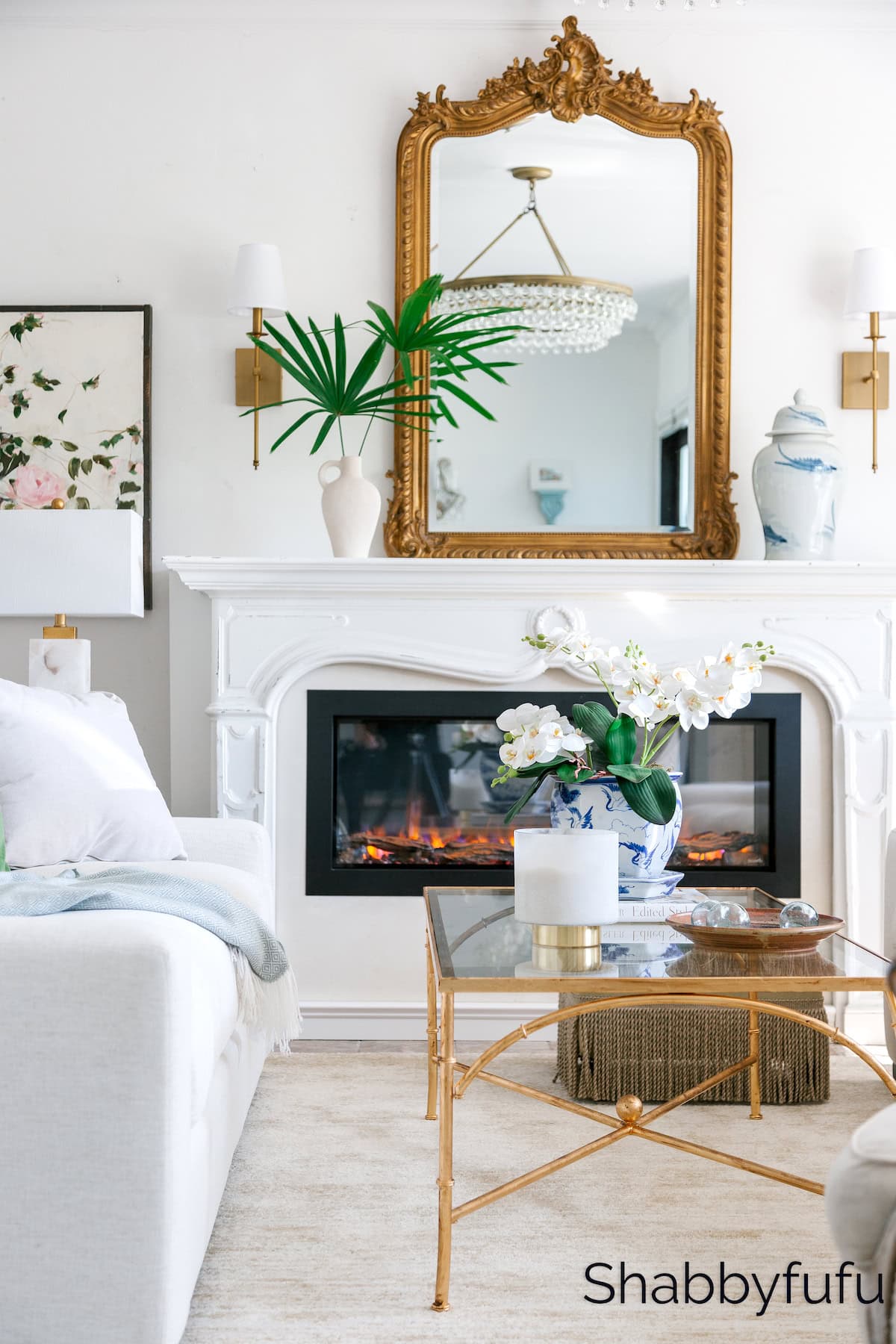
Not Layering Light and Using Cool-Toned Lighting
Lighting is one of the most important elements of good interior design, yet it’s often an afterthought.
Many stunning rooms can come across as lackluster and less than stylish just because of poor lighting choices like harsh overheads or cool-toned bulbs. This detail will suck all the warmth and ambiance out of a room!
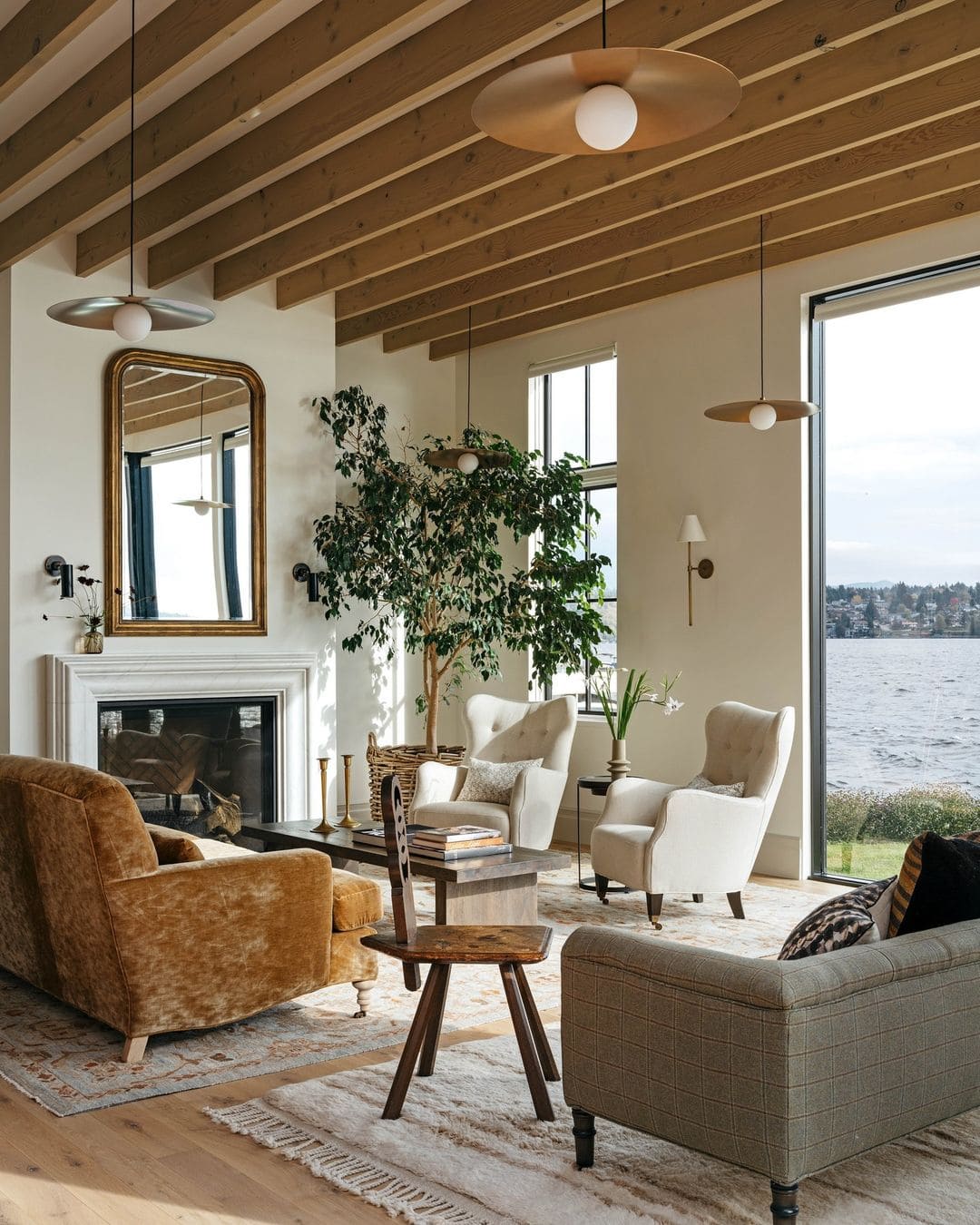
The best lighting is layered. It incorporates multiple light sources at different levels – overhead lighting, task lighting on tables, floor lamps, wall sconces, and even candles or fireplaces. This creates a flattering interplay of brightness and shadow. It also allows you to set different moods, from bright and energizing for working to soft and cozy for relaxing.
Pay close attention to bulb color temperature as well. Bulbs in the warm white to soft white give off an inviting glow that makes a space feel cozy. Cool white and daylight bulbs can cast an unpleasant blue tinge but they are useful in rooms like the kitchen.
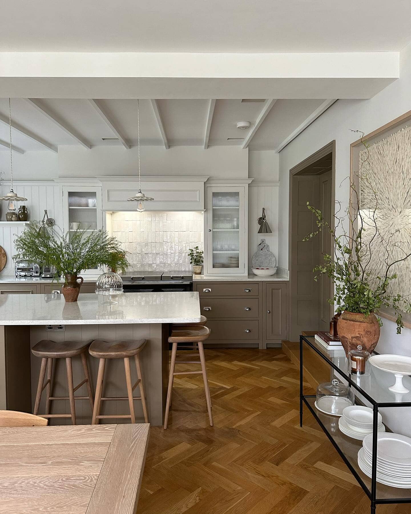
Don’t be afraid to mix lighting types, using different lights for ambient lighting enhanced by decorative fixtures that add style. The key is creating a balanced, layered solution that brings dimension and sets just the right mood.
For more details, check out my guide on the best kitchen lighting. Click HERE to read!
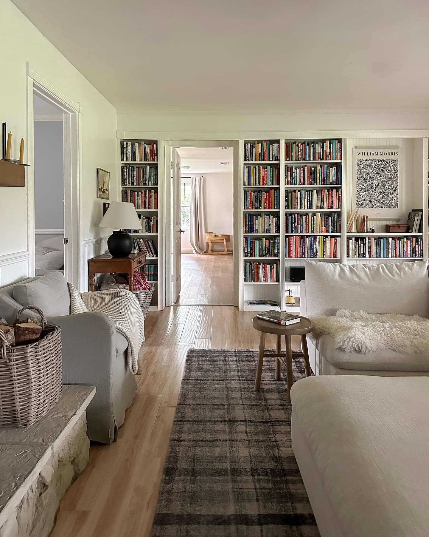
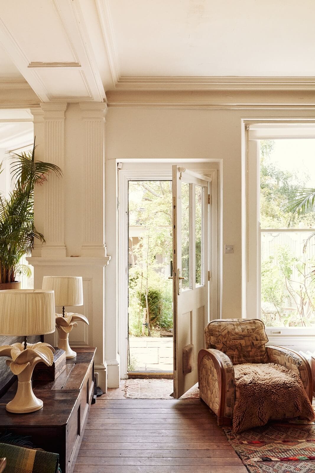
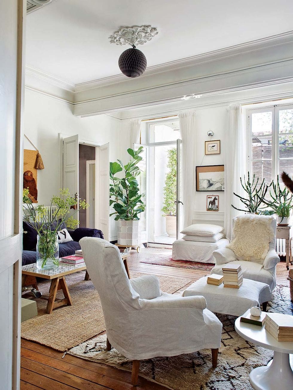
Pushing All Your Furniture Against The Walls
Shoving all your furniture against the walls is a common decorating mistake that can have a dramatic impact on the look and feel of a room.
While it can be tempting to arrange pieces this way, especially in more small spaces, the stylish solution is to place furniture toward the middle of the room. Pulling your sofa, chairs, and tables inward creates functional walkways around the perimeter while fostering a more inviting space.
This allows you to define properly the spaces within an open concept or loft layout without closing them off. For example, you can use a sofa to separate the living area from the dining space, with end tables creating convenient buffer zones.
Of course, in small or narrow spaces, this may not be possible. There are a few different tricks to deal with those layouts. One is to define different areas in your space and only push furniture against your walls when it’s absolutely necessary.
In smaller rooms, leave at least a couple of feet between the back of any upholstered furniture and the walls to allow for better flow. Resist the urge to line that loveseat against the wall – instead, place it at an angle to create a cozy nook.
Common Decorating Mistakes: Not Trying Color Paint Swatches and Wallpaper Samples
It’s easy to be deceived by color cards and online swatches when deciding on paint colors or wallpaper patterns.
The lighting, the surrounding hues, and even the base undertones of a particular color can cause it to read dramatically differently than you anticipated once applied to a larger surface area.
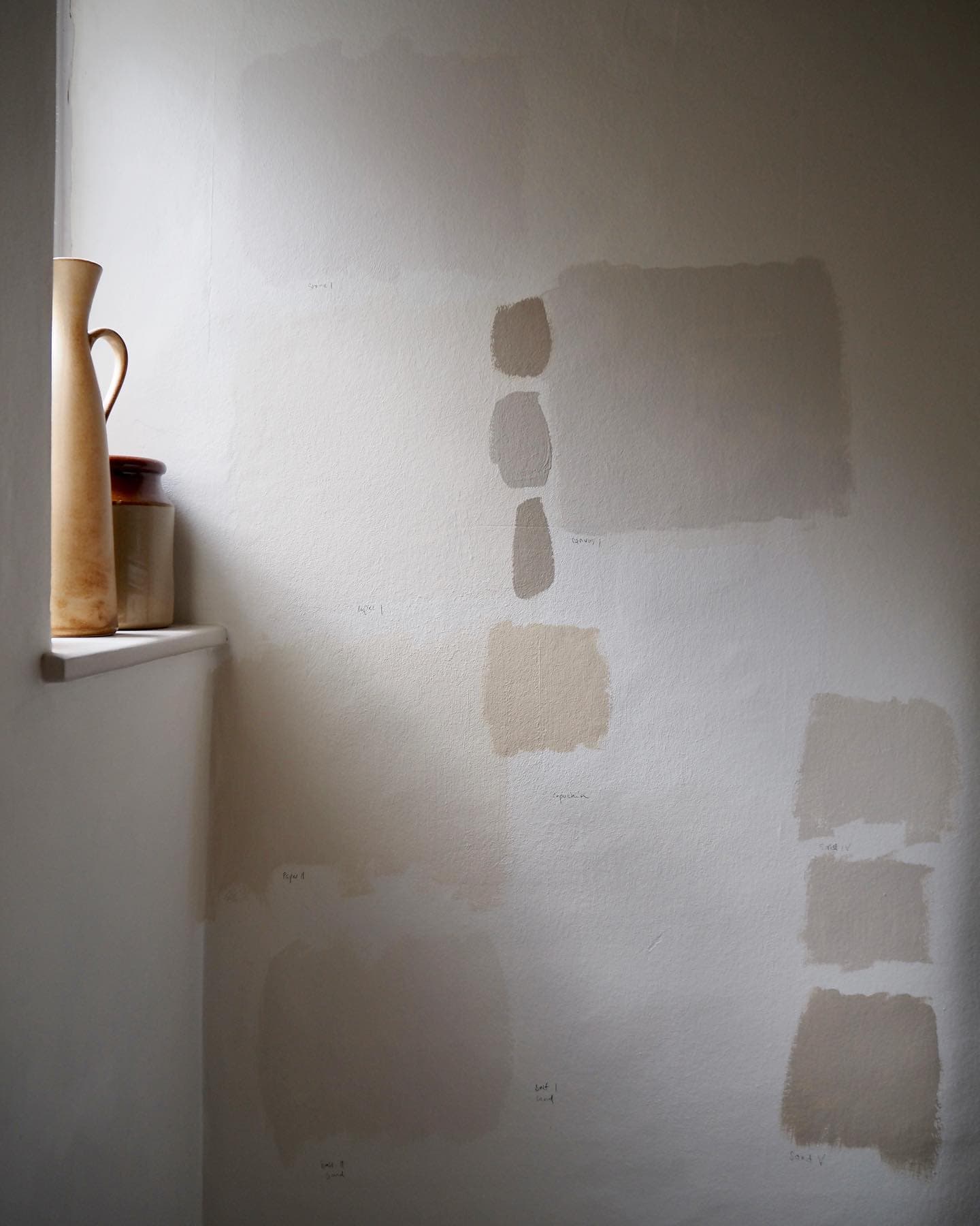
That’s why painting samples directly on your walls before committing to one color is essential and not doing it is one of the most common decorating mistakes. The way the light hits and shadows play at different times of day can completely transform how a paint color looks!
With wallpaper or patterned materials, it’s wise to order a sample swatch to see how the repeat, scale, and texture work in person. You may fall for that oversized floral wallpaper online, only to realize it’s overwhelming once you see it in your space.
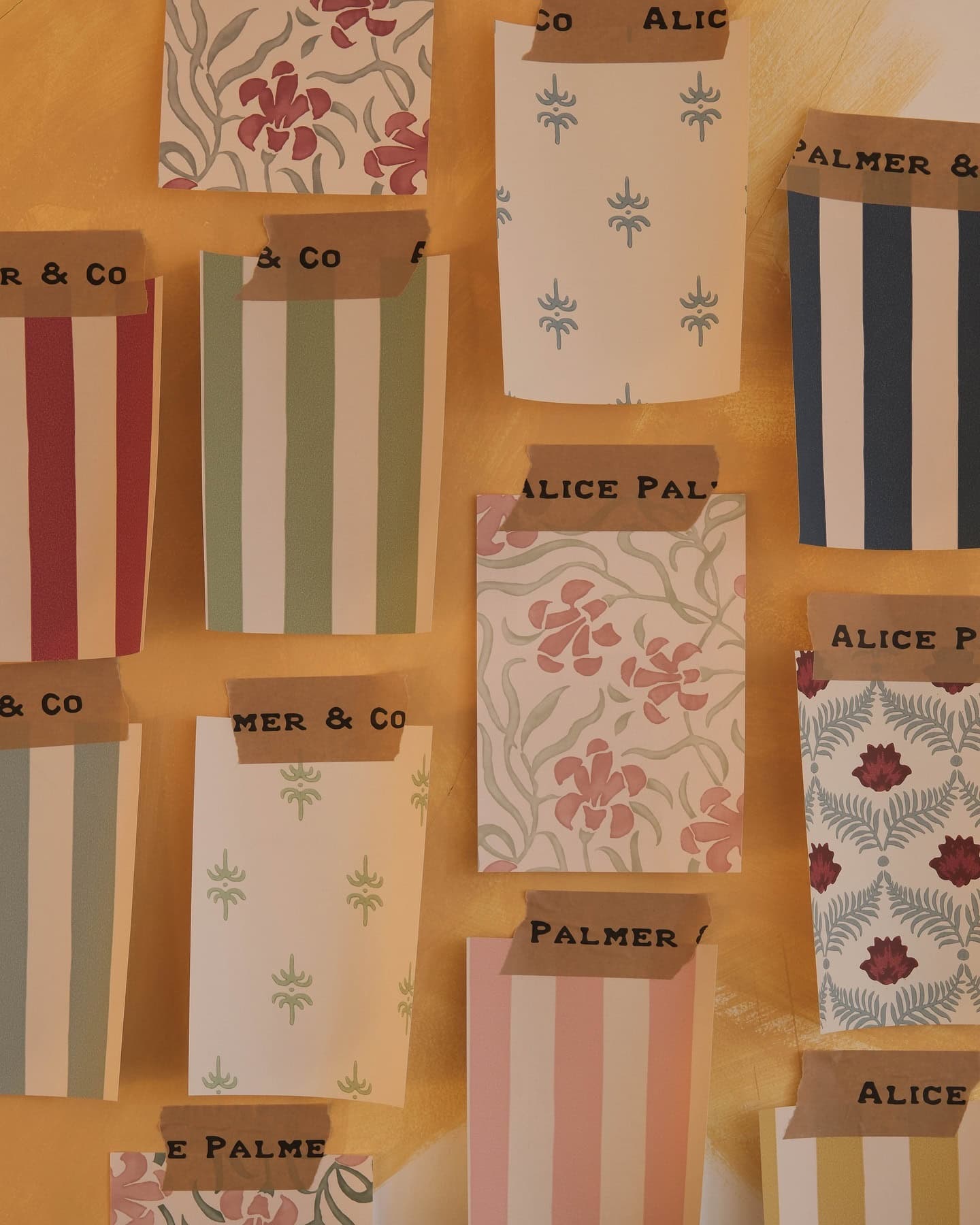
Taking the time to test samples is the easiest way to avoid a costly and labor-intensive fix-up later on.
Exposed Cables and Cords
It may seem like an insignificant little detail, but tangled nests of cables and cords can instantly make even the most beautifully designed room look cluttered and unfinished.
To keep your sophisticated space looking tidy and pulled together, take the time to corral any loose cords.
Depending on the room, the style, and the type of cords you’re trying to hide away, there are plenty of options.
You can use cable covers or cord organizers to neatly route TV, lamps, and electronics wires along baseboards or behind furniture. Wall-mounted cable raceways are another clean solution for concealing them.
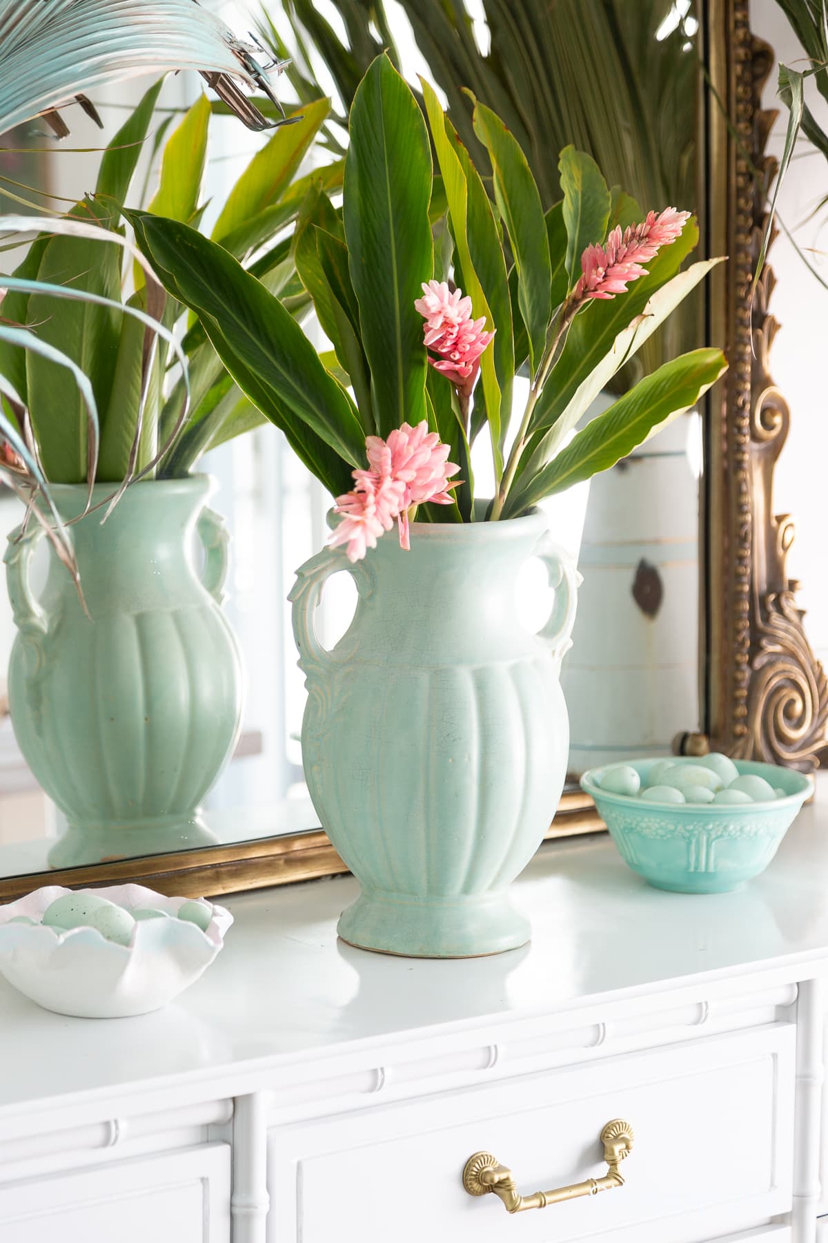
Common Decorating Mistakes: Forgetting about Texture & Contrast
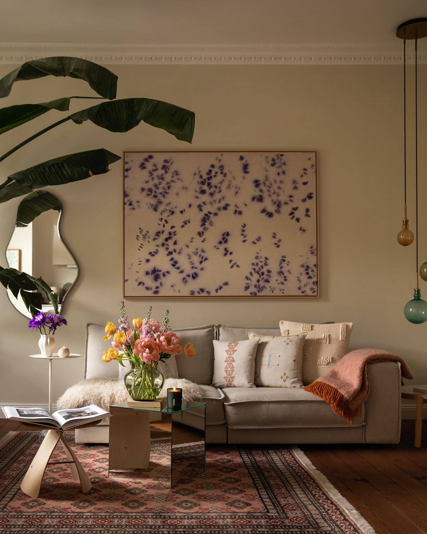
Rooms consisting entirely of flat materials and matching finishes can feel one-dimensional and that’s where the magic of texture and contrast comes in. Incorporating different textures is essential to avoid a flat-looking room.
Nubby boucle upholstery, plush rugs, rattan ottomans, and distressed wood accents are just a few examples.
This mixture of matte and shiny, smooth and rough adds depth and dimension. On top of this, you can add more texture by varying the scale of your patterns. Play with your prints and let smaller prints mingle with larger motifs!
Don’t forget the impact contrast can make too. Playing with light and dark tones, glossy surfaces against matte ones, or tempering ornate elements with minimalist lines draw the eye and elevate the room design.
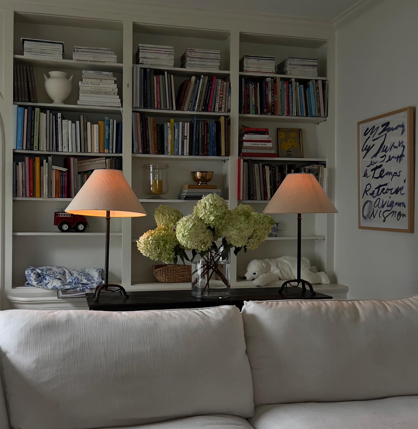
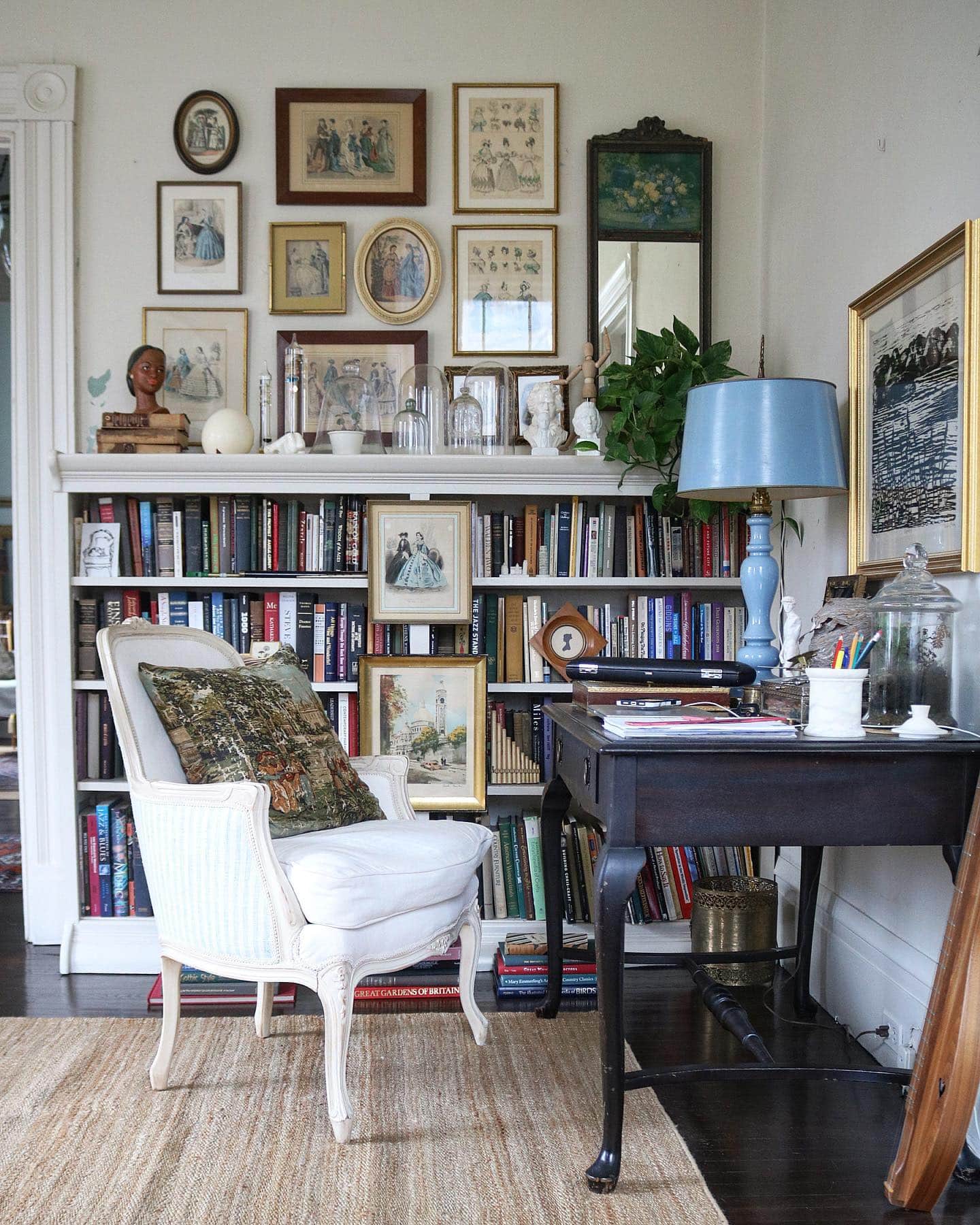
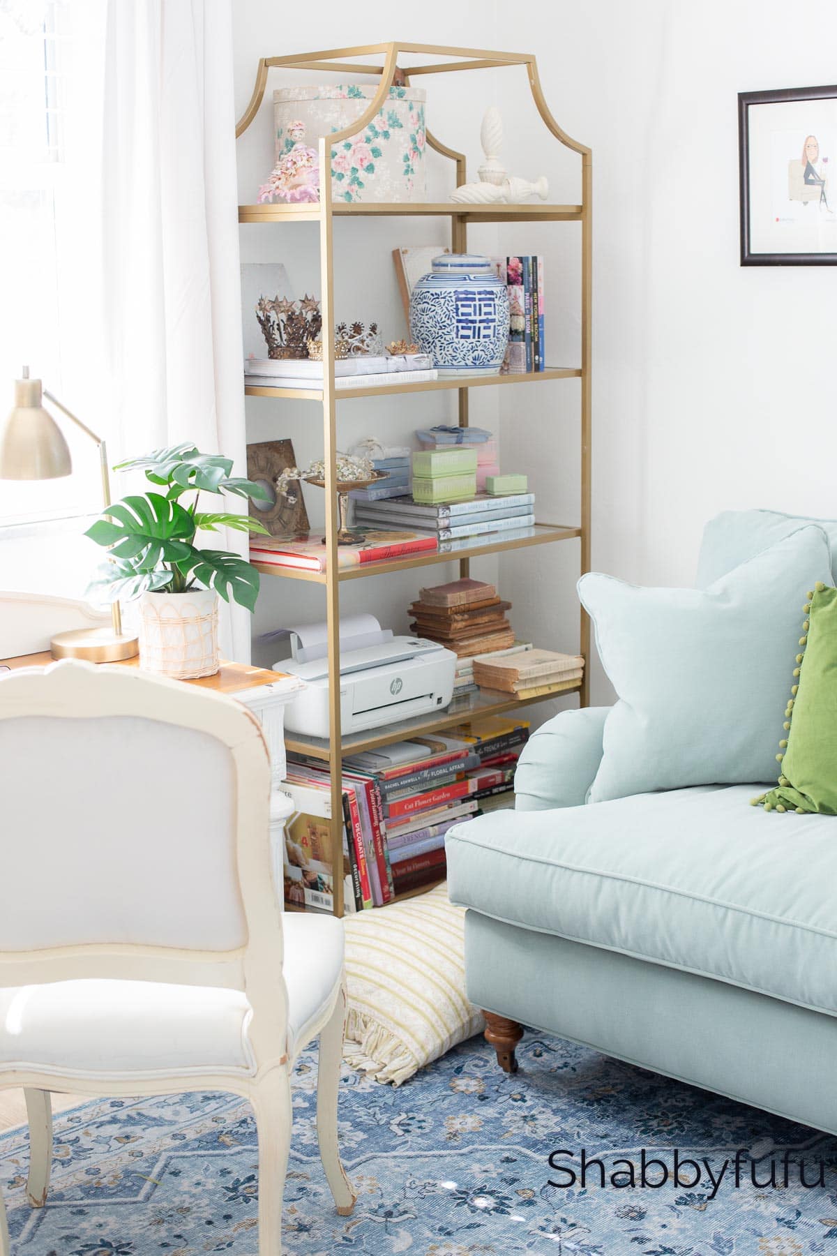
Cluttered Surfaces
While styling bookshelves or mantles with curated vignettes is part of good design, it’s easy to go overboard and end up with a cluttered area. Too many knick-knacks, picture frames, and decor items fighting for attention results in visual chaos!
To make this common decorating mistake easy to avoid, try to apply the rule of three.
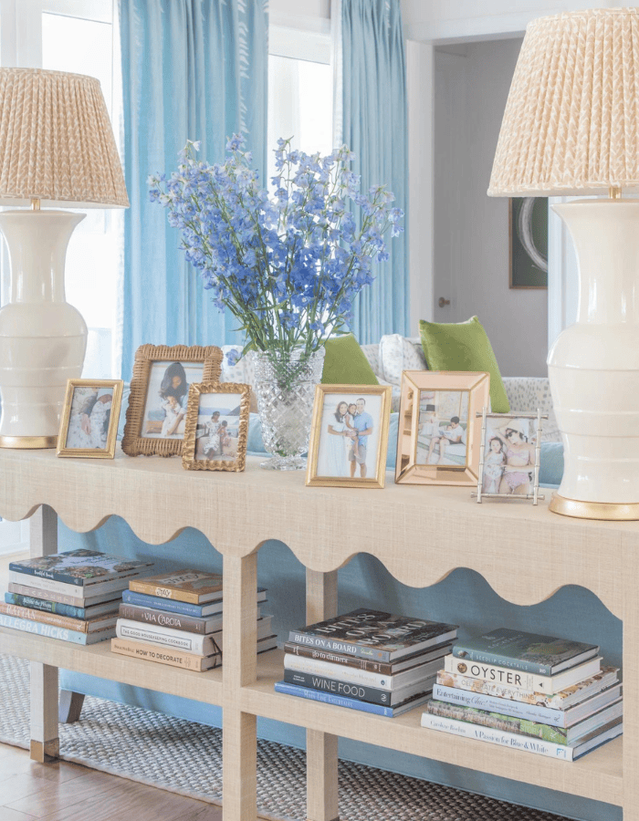
Curated groupings in odd numbers to prevent clutter overload. Stick to just 3-5 objects, varying the height, shape, and texture. Play around and test out rotating in a few larger statement pieces to fill empty areas.
For surfaces like coffee tables or nightstands, try to limit accessories to just 1-2 intentional items like a decorative tray and sculptural bowl. This restraint keeps the overall aesthetic feeling neat and intentional.
And there you have it! These are some of the most common decorating mistakes and ways to fix them to get the elevated interiors you dream of.
If you enjoyed this post, you’ll love these too. Have a look!
5 Ways to Maximize Natural Light in Your Home
How To Mix Patterns In A Room Like A Designer
This is a very helpful lists of things not to do. I am in love with the skirted pendant, so cute. Thank you.
Glad that you found this helpful Diana!
Janet… as always great ideas! We rightsized three months ago. Trusting my instincts more from all the wonderful posts you do as well as others I follow that are featured in the Saturday link! This post was super helpful.
Hi June, I’m so glad that you find these decorating posts helpful as that is our intent! Enjoy designing your home ❤️
Hello!
Thanks for all the great ideas-love all the blue!
Any suggestions on where to search for large chair slipcovers? I have, to no avail, searched for a very long time, with no luck. Thanks a ton! Judy
Glad you enjoy the ideas we present Judy! I would suggest looking on Etsy for someone who does custom slipcovers. There are lots of custom workrooms on the platform. Good luck!